shiny.emptystate - How To Add an Empty State Component to R Shiny

What happens when there's no data to show to the user? This can occur in Shiny apps, where users must upload their own data. Well, one solution is to show an empty screen (an empty state). But this negatively impacts the user experience. A better approach would be to have a dedicated <a href="https://appsilon.github.io/shiny.emptystate/" target="_blank" rel="noopener">empty state screen</a>, and today you'll implement a Shiny empty state screen with Appsilon's latest open-source package.
<blockquote>Do you love Shiny, but your apps are slow, dull, or lacking functionality? <a href="https://rhinoverse.dev/#rhino" target="_blank" rel="noopener">Explore the open-source Rhinoverse and take your apps to the next level</a>.</blockquote>
If we're talking about dashboards, there are numerous places where empty state screens come in handy. For example, you could use them to instruct the user to upload a dataset before proceeding with calculations. Or when there's no data to display at all, potentially due to too many data filters being applied.
So without much ado, let's dive straight in and leave your users in a better state!
<blockquote>Want to measure the performance of your new empty state changes? <a href="https://appsilon.com/shiny-benchmark-measuring-app-performance/" target="_blank" rel="noopener">Try Appsilon's shiny.benchmark package</a>.</blockquote>
Table of contents:
<ul><li><a href="#dashboard-logic">Building a Dashboard Logic for Shiny Empty State</a></li><li><a href="#shiny">Empty State in Shiny - Dashboard in Action</a></li><li><a href="#summary">Summing up Shiny Empty State</a></li></ul>
<hr />
<h2 id="dashboard-logic">Building a Dashboard Logic for Shiny Empty State</h2>
Before actually writing the R Shiny app, we must first discuss the logic it will implement. The app will have two screens:
<ol><li><b>Empty state screen</b> - Instructs the user to upload the dataset, and provides an action button to do so.</li><li><b>Dashboard screen</b> - Renders a chart (combination of a scatter and line chart) that shows the uploaded datasets and results of a fitted machine learning model.</li></ol>
Sounds easy enough, and in this section, we'll deal with the dataset logic and the ways to fit a machine learning model.
To start, let's create a dataset. It will have two columns - <code>x</code> and <code>y</code>, where <code>x</code> is a list of numbers between 1 and 100, and <code>y</code> is identical to <code>x</code>, but with added variation of a number between -3 and +3:
<pre><code class="language-r">library(comprehenr)
library(ggplot2)
<br>x <- seq(1, 100)
y <- to_vec(for (num in x) num + runif(n = 1, min = -3, max = 3))
df <- data.frame(
x = x,
y = y
)
<br>head(df)</code></pre>
<img class="size-full wp-image-17353" src="https://webflow-prod-assets.s3.amazonaws.com/6525256482c9e9a06c7a9d3c%2F65b7af2bd629ed2acfc2a777_2f20fba4_1-1.webp" alt="Image 1 - First 6 rows of the random dataset" width="238" height="299" /> Image 1 - First 6 rows of the random dataset
That's the dataset we'll upload later to the dashboard, so it's a good idea to save it locally. The following code snippet dumps it into a CSV file:
<pre><code class="language-r">write.csv(df, "data.csv", row.names = FALSE)</code></pre>
Awesome! Now, let's fit a simple linear regression model. The variable <code>y</code> is dependent, and the variable <code>x</code> is independent. R's <code>lm()</code> function allows us to easily model that relationship:
<pre><code class="language-r">model <- lm(df$y ~ df$x)
summary(model)</code></pre>
Here's the summary of our model:
<img class="size-full wp-image-17355" src="https://webflow-prod-assets.s3.amazonaws.com/6525256482c9e9a06c7a9d3c%2F65b29f4b629a6d212138798c_2-2.webp" alt="Image 2 - Summary of a linear regression model" width="1114" height="992" /> Image 2 - Summary of a linear regression model
We'll later extract the model coefficients, but first, let's calculate the predictions and assign them to new dataframe columns. Put simply, we're leveraging the patterns the model <i>learned</i> to make predictions on the input variable.
<blockquote>Wait, what is Linear Regression? <a href="https://appsilon.com/r-linear-regression/" target="_blank" rel="noopener">Here's our complete guide to simple and multiple linear regression in R</a>.</blockquote>
In the case of linear regression, this just means solving a line equation with the coefficients from the previous image:
<pre><code class="language-r">predictions <- predict(model, data.frame(df$x))
df$y_hat <- predictions
head(df)</code></pre>
Here's what the dataset looks like now:
<img class="size-full wp-image-17357" src="https://webflow-prod-assets.s3.amazonaws.com/6525256482c9e9a06c7a9d3c%2F65b29f4c2a0388c8b6358bd3_3-2.webp" alt="Image 3 - Random dataset with added predictions" width="413" height="340" /> Image 3 - Random dataset with added predictions
Predictions of a simple linear regression model will always be a straight line. To demonstrate, we'll plot the original data points and predictions.
The <code>get_model_subtitle()</code> function is responsible for extracting model coefficients from the summary and formatting them as a formula string.
Below, there's a call to <code>ggplot()</code> in which original data is rendered as a scatter plot (blue), and predictions are rendered as a black line:
<pre><code class="language-r">get_model_subtitle <- function(model) {
return(paste0(round(summary(model)$coefficients[1], 3), " + ", round(summary(model)$coefficients[2], 3), "x"))
}
<br>ggplot(df, aes(x = x, y = y)) +
geom_point(color = "#0099F9", size = 5, alpha = 0.75) +
geom_line(aes(x = x, y = y_hat), linewidth = 2) +
labs(
title = "X and Y Relationship",
subtitle = paste("Formula:", get_model_subtitle(model))
) +
theme_minimal() +
theme(plot.title = element_text(size = 20, face = "bold"))</code></pre>
<img class="size-full wp-image-17359" src="https://webflow-prod-assets.s3.amazonaws.com/6525256482c9e9a06c7a9d3c%2F65b29f4c3ff6b1693ab1b764_4-2.webp" alt="Image 4 - Chart showcasing actual data (blue) and predictions (black)" width="1741" height="1215" /> Image 4 - Chart showcasing actual data (blue) and predictions (black)
That's the chart we want to display in R Shiny, but only after the user uploads the dataset. In other words, only after the Shiny empty state is passed.
<h2 id="shiny">Empty State in Shiny - Dashboard in Action</h2>
We now have everything we need to write a dashboard in R Shiny. Well, everything except the package itself. You can install it with the following command:
<pre><code class="language-r">remotes::install_github("Appsilon/shiny.emptystate")</code></pre>
The code snippet you'll see below is simple to follow and understand, but let's dissect it chunk by chunk:
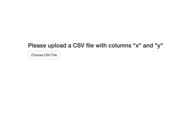
<ul><li><code>get_model_subtitle()</code> - The function you saw in the previous section, it's responsible for extracting coefficients from a linear regression model and formatting them as a string equation.</li><li><code>empty_state_content</code> - HTML content that'll be rendered while the state is empty. In our case, it includes a heading and an action button responsible for uploading a CSV file.</li><li><code>ui</code> - The user interface of our app once we get passed the empty Shiny state screen. If you're using <code>shiny.emptystate</code> package, you must include a call to <code>use_empty_state()</code>.</li><li><code>server()</code> - Shiny function responsible for handling application logic. It must include an instance of <code>EmptyStateManager</code> class in which you define by the <code>id</code> element which element of your dashboard should be covered with the empty state content.<ul><li>The <code>server()</code> function here also contains a call to <code>show()</code> and <code>hide()</code> methods of the empty state manager to, well, show or hide the empty state screen depending on a condition.</li><li>Finally, the <code>server()</code> function is responsible for applying a machine learning model, calculating predictions, and displaying the chart. You might want to extract this logic when building more complex dashboards.</li></ul>
</li>
</ul>
If you prefer code over words, here's everything you need to start using Appsilon's <code>shiny.emptystate</code> package:
Let’s run the app to check if everything works:

Image 5 – Shiny app demonstrating shiny.emptystate package
We’ve saved the dataset to a CSV file in the previous section, and used it here. As you can see, the app successfully goes from a Shiny empty state to a dashboard screen, which is just what we’ve wanted.
Let’s make a brief recap next.
Summary
R Shiny was designed to be easy for developers, but that doesn’t mean it lacks advanced functionality. This article is a perfect example of a logic you don’t want (nor need) to implement from scratch. It can be included in any app to improve the user experience and instruct the user on what to do.
Long story short, whenever you need to implement an empty state screen in your Shiny apps, look no further than shiny.emptystate. The link contains more examples that might be easier to grasp for newcomers to Shiny. If you get stuck, don’t hesitate to leave a comment below this article, or ping us via Twitter – @appsilon.
Does R Shiny sound like a promising career? Here’s how to get started.
