Shiny Assistant for Python - How to Build Shiny for Python Apps with GPT and GenerativeAI
We were impressed with Shiny Assistant’s performance for R Shiny apps - but you already know that.
Will Shiny Assistant for Python impress us the same way? You’re about to find out. This article will show you how we used Shiny Assistant to build a Python application around the earthquakes in Japan dataset. This article will not show you a general introduction to Shiny Assistant - we already have that covered.
If you’re considering trying out Shiny Assistant for Python, keep these two things in mind:
- Shiny Assistant is still in open beta (as of September 2024). Feel free to join the waitlist.
- Shiny for Python is around a decade younger than R Shiny. The community is smaller and there are just fewer examples and questions online. The documentation is superb, however.
We’ll keep both of these in mind as we write the prompts and give our final verdict.
Keep in mind that the article you’re about to read is long. Very long. It’s a journey through ups and downs. If you’re only interested in our experience in using Shiny Assistant for Python, scroll down to the Pros and Cons section.
Shiny Assistant wasn’t the only thing announced at posit::conf 2024. Read about our experiences from the conference.
Table of Contents:
- Should You Be Skeptical About Shiny Assistant for Python?
- Shiny Assistant in Action - Let’s Build a Shiny for Python App from Scratch
- Shiny Assistant for Python Pros and Cons
- Summing up Shiny Assistant for Python
Should You Be Skeptical About Shiny Assistant for Python?
As we said in the introduction, Shiny for Python is a new technology.
Like 2023 new.
On the other hand, R Shiny was released way back when the Higgs boson was discovered and Gangnam Style was all the rage. That was in 2012.
Nostalgia aside, Shiny for Python doesn’t have as many users as R Shiny, and it’s not used by the same types of developers and companies. In theory, you shouldn’t expect the Assistant to offer the same level of performance and refinement between the two.
Nevertheless, you can switch from R to Python in Shiny Assistant with a single toggle (assuming you have access to the beta):

Since the switch is so effortless and doesn’t raise any disclaimers in the app, it left us wondering. So, we decided to build a complete app from scratch. We’ll try to follow the same steps we used for R Shiny Assistant to keep things fair, while keeping these differences in mind.
Shiny Assistant in Action - Let’s Build a Shiny for Python App from Scratch
This is the app we managed to build in 19 iterations (prompts):
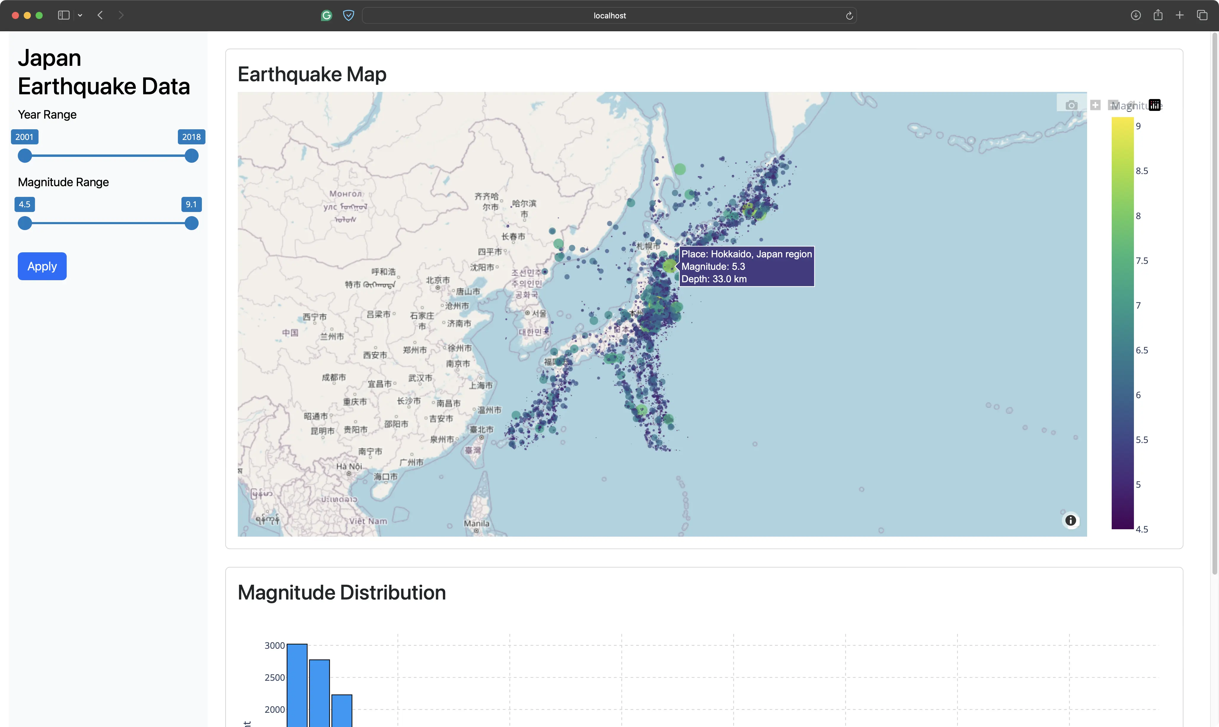
It’s based around the Earthquakes in Japan dataset, and allows the user to control the year range and the magnitude range. As soon as the user is satisfied with the filter criteria and hits the “Apply” button, the map and the histogram are updated.
The map shows a scatter plot of all earthquakes that match the filter conditions. Lighter-colored and larger bubbles indicate stronger magnitude and vice versa.
The histogram shows the count of the earthquakes in 0.1 magnitude bin sizes.
You can find the source code for the app at the end of this section.
Let’s start with the first prompt!
Prompt #1 - Data Familiarization and App Requirements
The idea is to start small and not ask too much at once.
In the first prompt, we want to give the dataset context to the Assistant. We pasted the first 10 rows (but only a few selected columns) and instructed it to make a Pandas DataFrame from it to avoid referencing a file that doesn’t exist.
Next, we told the assistant to create a sidebar layout with range sliders for the earthquake year and magnitude. Below the filters, there should be an action button that updates the app content when pressed.
Nothing will be displayed in the content area for now except for a brief message string to ensure filters work as expected.
Here’s the prompt:
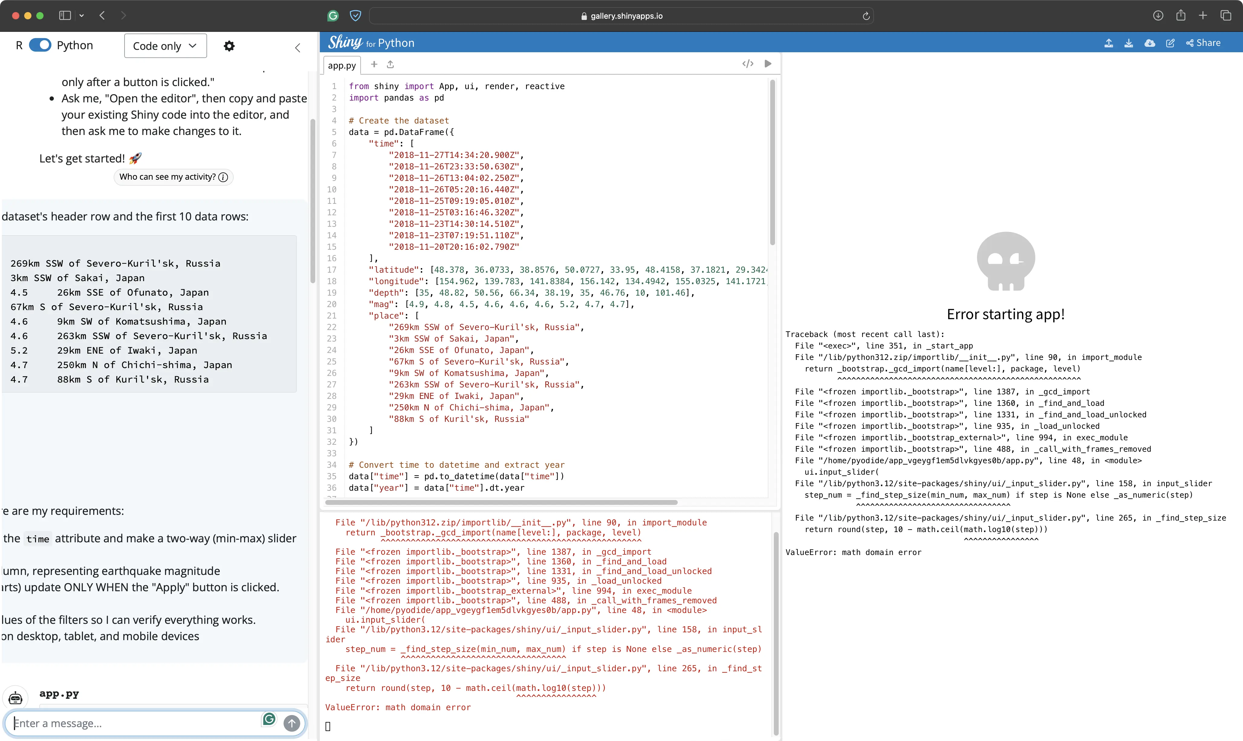
The preview feature of Shiny Assistant didn’t work at the time.
But the code it generated gave us confidence that we were on the right track. Both sliders were there, and the Assistant even generated a title for the app:
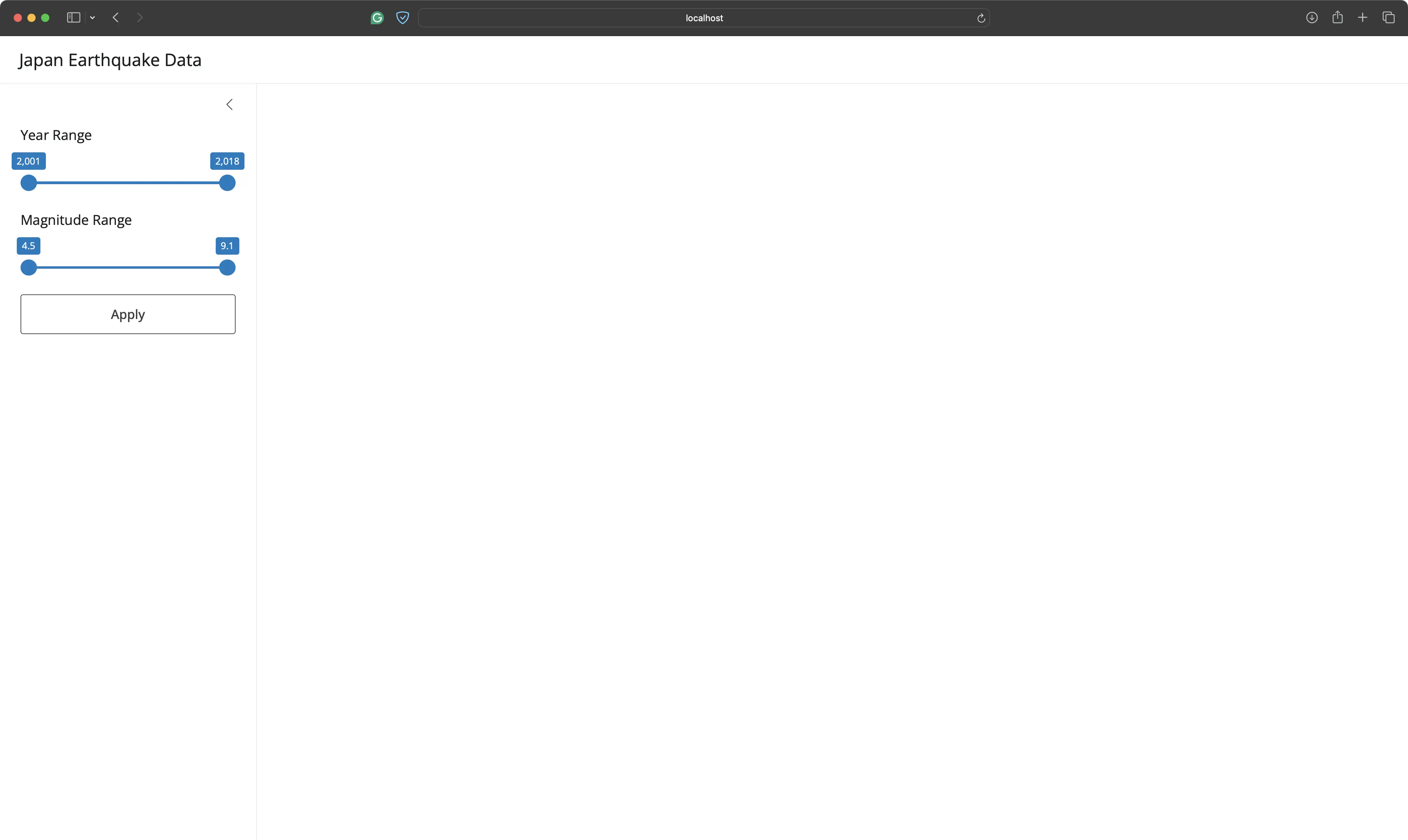
You can change the filters and click on the “Apply” button to test if the input components are successfully connected:
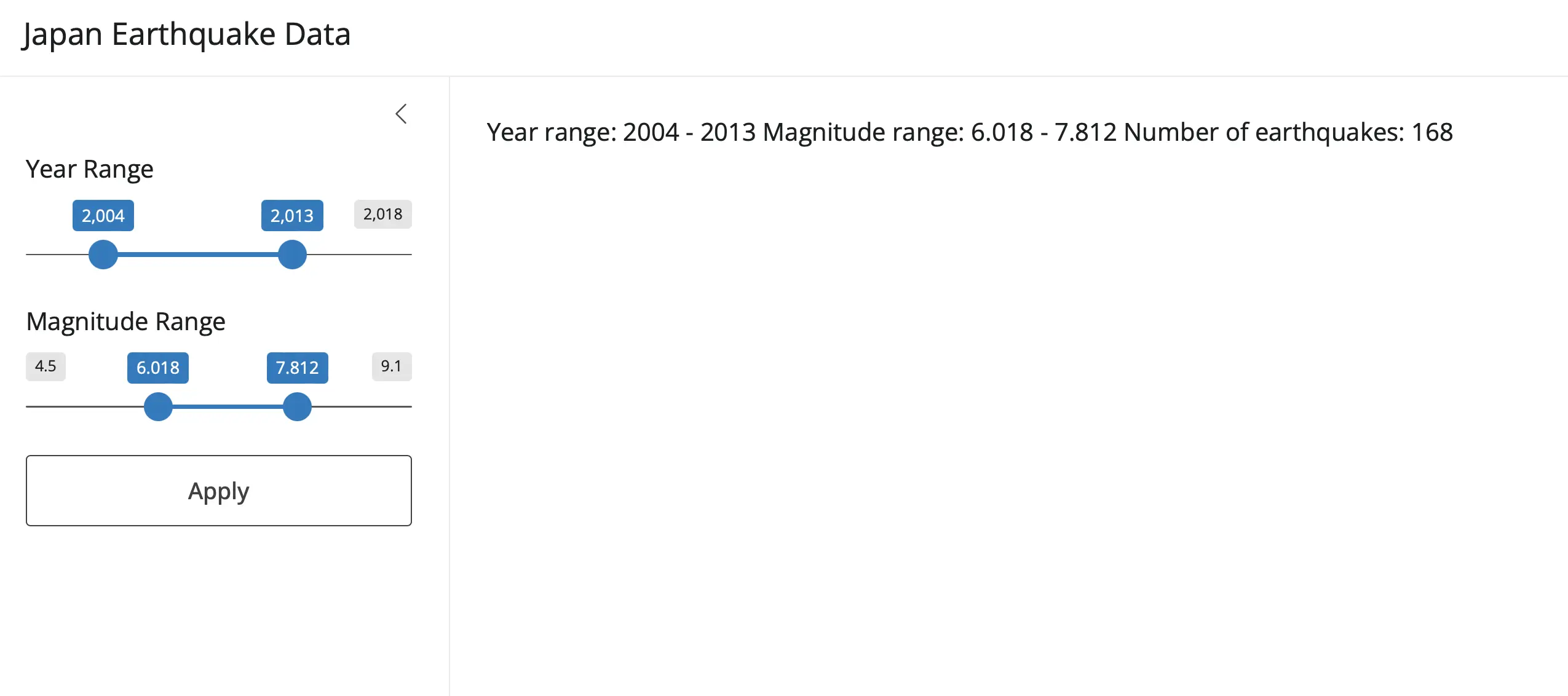
There are a couple of issues - no initial value is shown (before clicking on the button), and the value formatting could be improved.
Let’s work on the latter first.
Prompt #2 - Fixing the Filter Components
The following prompt instructed Shiny Assistant to remove commas from the year values and to always round the magnitude to a single decimal point:
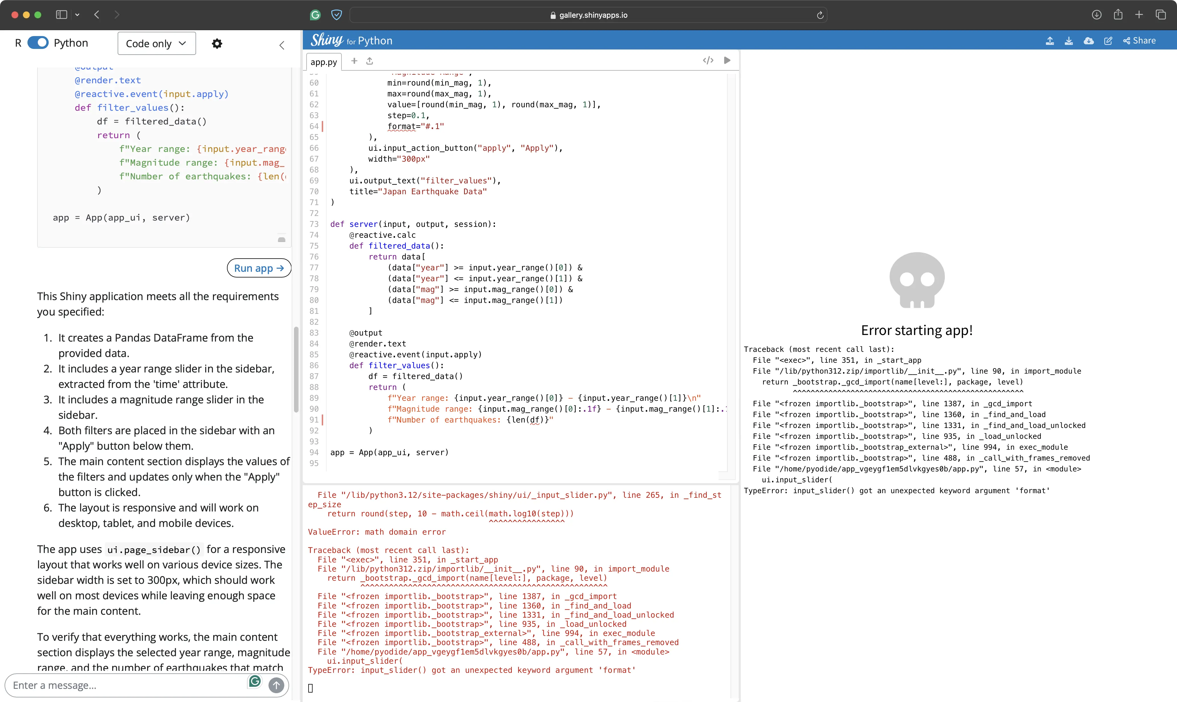
The generated code brought us to the first error.
Shiny Assistant used a keyword argument that’s not available in the function. Let’s see if it can solve this bug with minimal instructions.
Prompt #3 - Input Slider Bug Fix
The following prompt told the Assistant that the keyword argument doesn’t exist in the function, and that it should try to figure out another way to format the magnitude value:
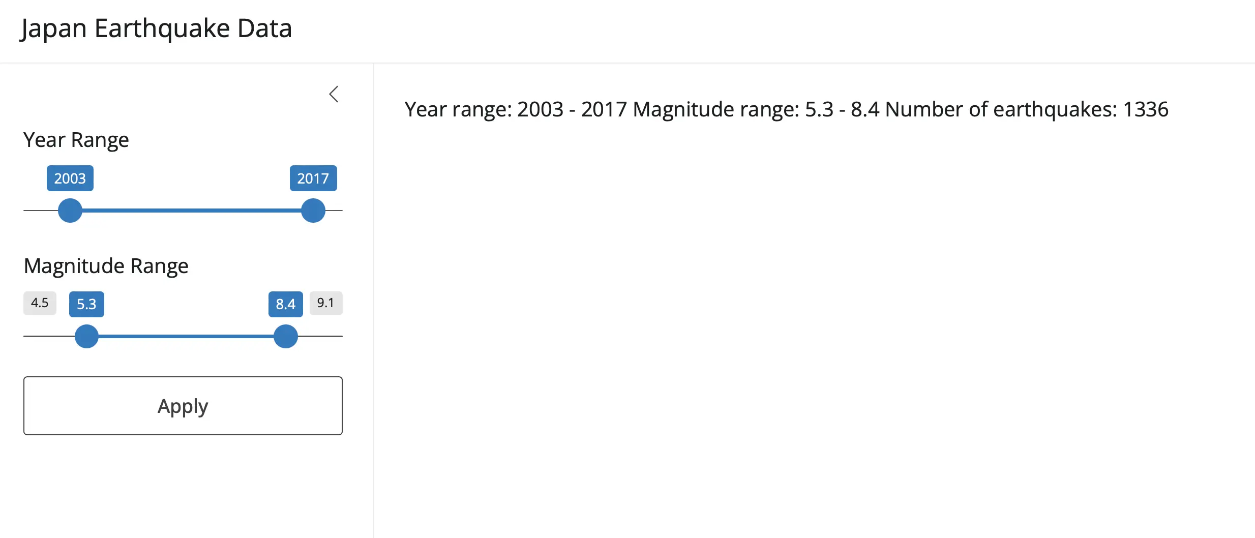
The Assistant removed the `format` keyword and managed to meet our requirements in some other way.
Everything worked, but that’s about to change.
Prompt #4 - Map with Plotly
The sidebar was more or less finished.
The next order of business is to construct a map component. We wanted the Assistant to use Plotly to create a scatter map centered around Japan, having red marker points on the earthquake coordinates. The size and color of the marker should depend on the magnitude:
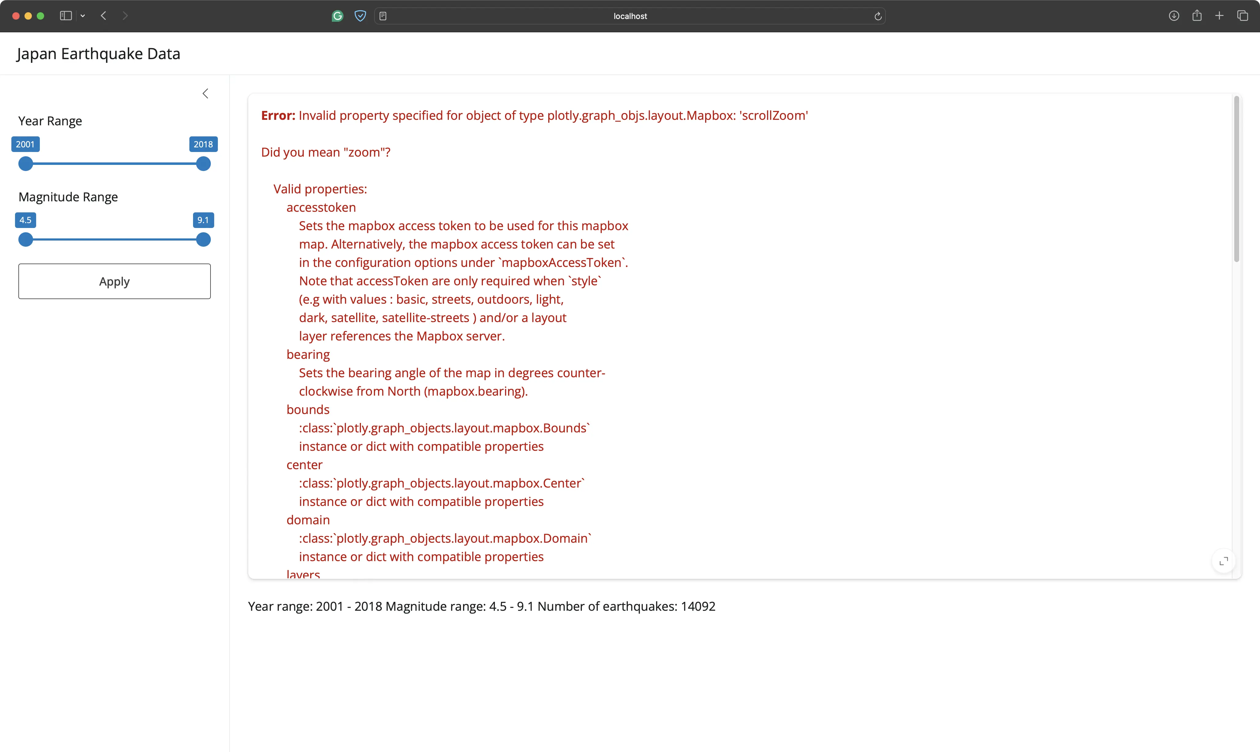
Once again, Shiny Assistant for Python used a property that doesn’t exist. Keep in mind that this error message was shown only after we clicked on the “Apply” button.
Will the fix be as simple as before?
Prompt #5 - Map Invalid Property Bug Fix
The next prompt instructed to Assistant to solve the invalid property error and also to provide a default map (from default filter values) when the app is first launched.
This way, the user won’t be left with a blank screen before playing around with the filters and clicking “Apply”:
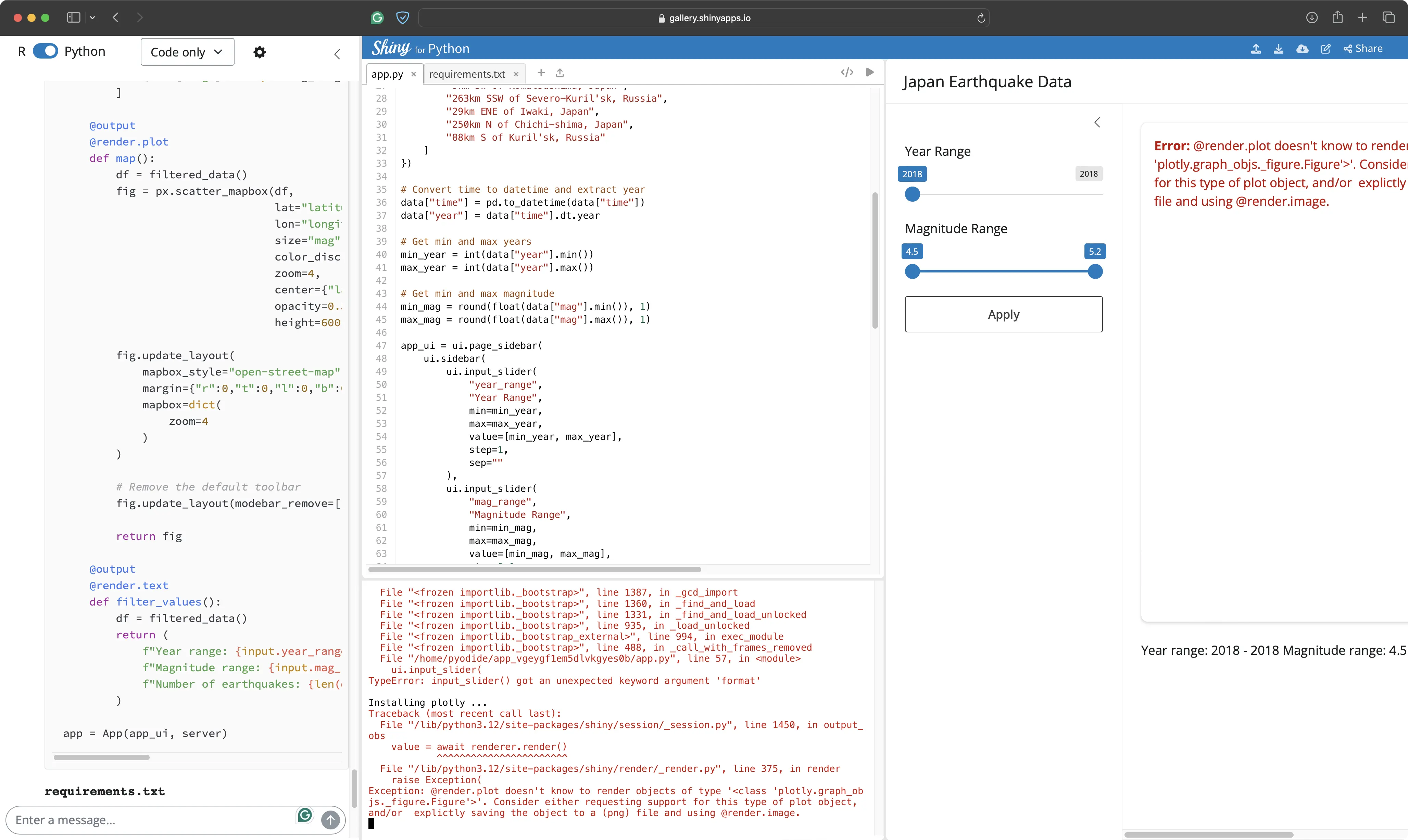
This was the place where the first bit of frustration took place.
The error concerning an invalid property name was replaced with a specific Plotly error. It seems like the Assistant doesn’t know how to render Plotly objects.
Prompt #6 - Map Render Plot Bug Fix
To mitigate, we’ve pasted the error message into the chat window.
There was also something else we noticed when inspecting the code. The Assistant has used Plotly Express to create the map chart. Our preference is to use Graph Objects when possible, as it offers more customization.
The following prompt should address both:
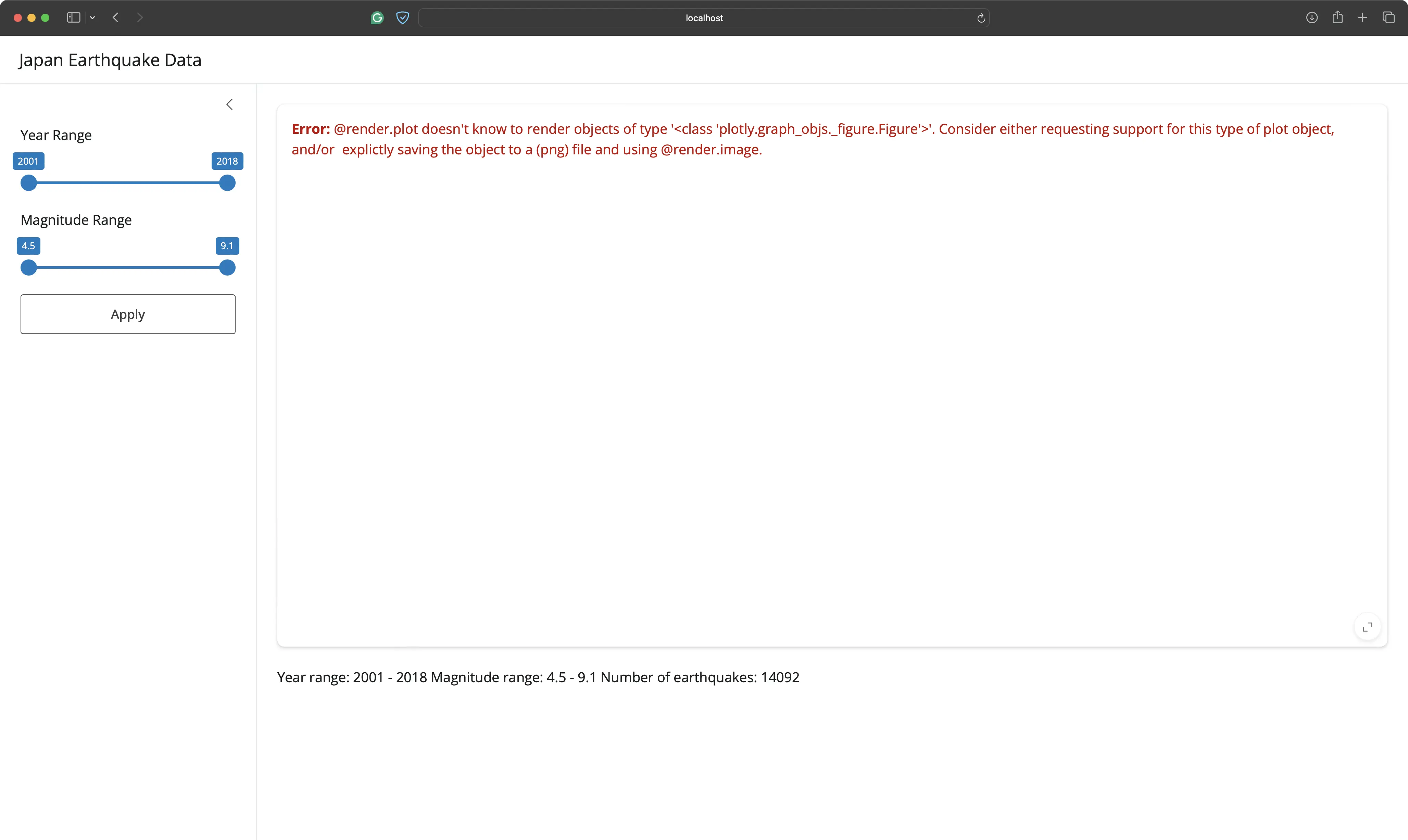
The generated code was updated to use Plotly Graph Objects, but the same error still shows.
It’s time for a manual intervention.
Prompt #7 - Map Render Plot Bug Fix (2)
Upon inspecting the docs, we saw that a Shiny for Python application should use the `output_widget()` function in the UI and `@render_widget` decorator in the server to render a Plotly chart.
That’s what we’ve included in a follow-up prompt:
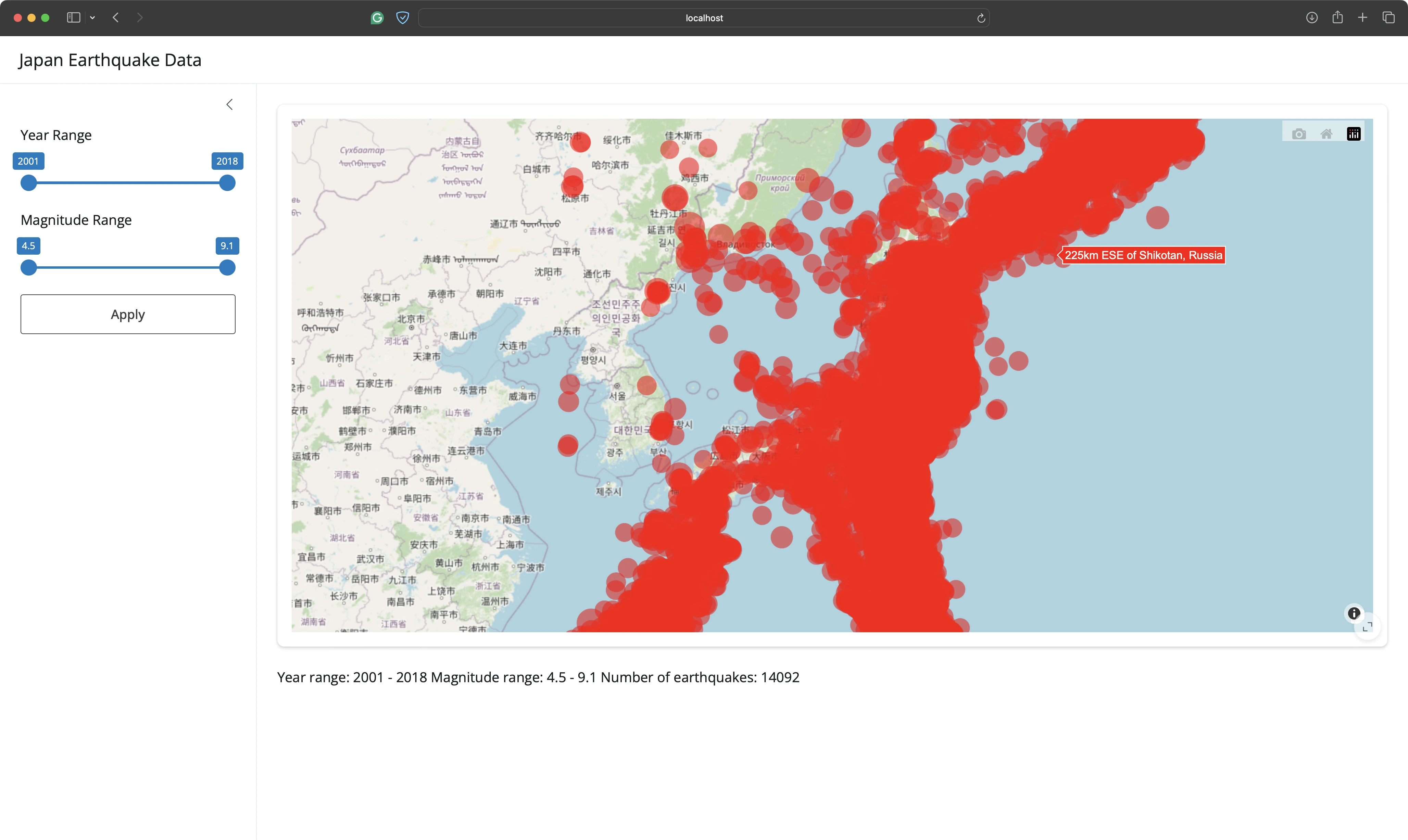
The map looks horrible, but at least it works!
If you change the slider values, the map updates to show only the earthquakes that match the filter criteria.
The problem is - it happens immediately, and not only after the “Apply” button gets clicked.
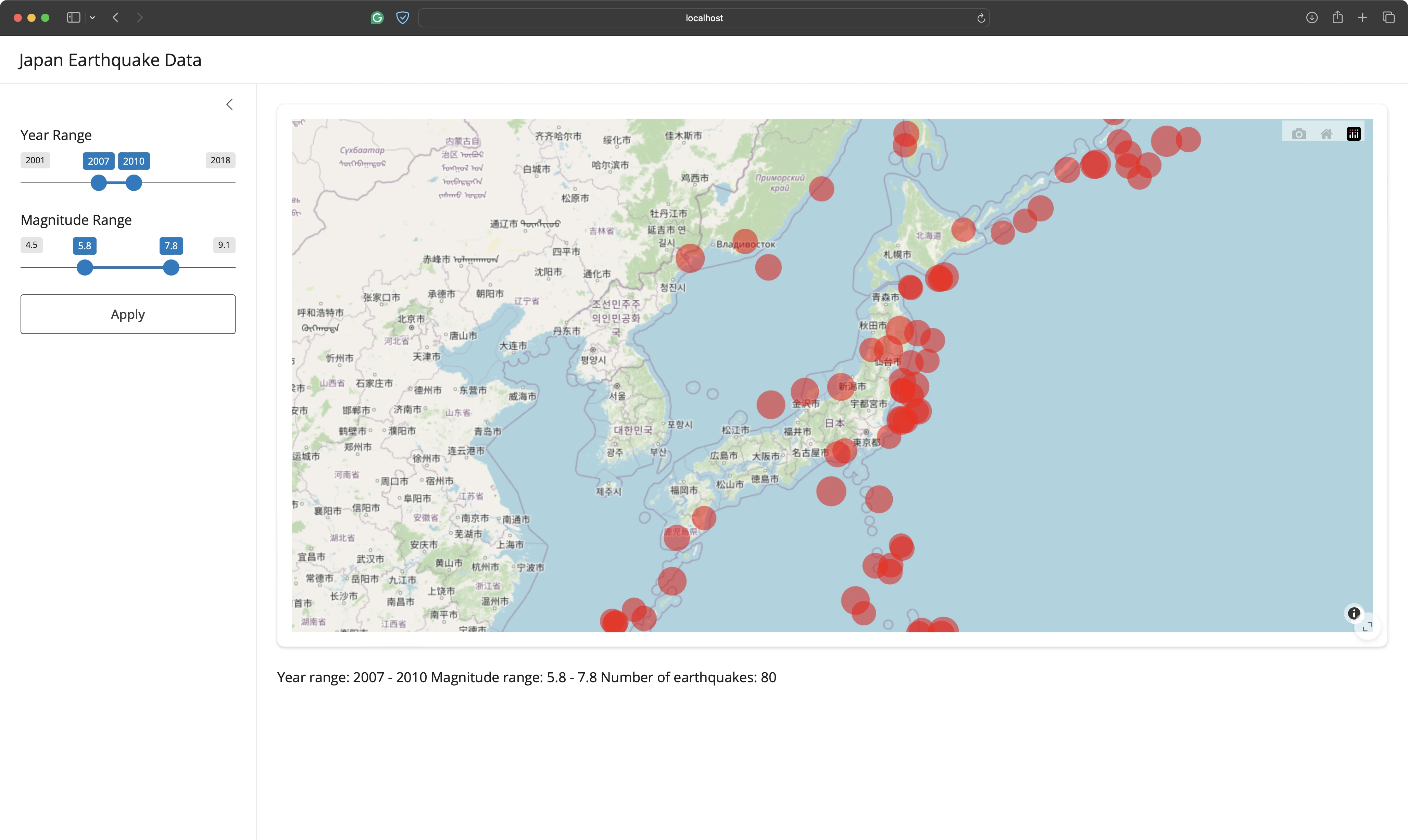
Let’s tweak the looks of the map next.
Prompt #8 - Map Update Bug Fix
A map with the default filter values should be displayed when the app is first launched. When the user changes the sliders and clicks on the “Apply” button, only then should the map be updated.
The following prompt tries to address this issue, and also tweak the map marker styles and zoom level:

The map is now almost exactly where we want it!
The only problem is that we can’t zoom in or out. It’s entirely our responsibility, as we told the Assistant to completely remove the toolbar.
Prompt #9 - Map Toolbar Bug Fix
The toolbar should include the option to zoom in and out, and also to reset the zoom level and map position:
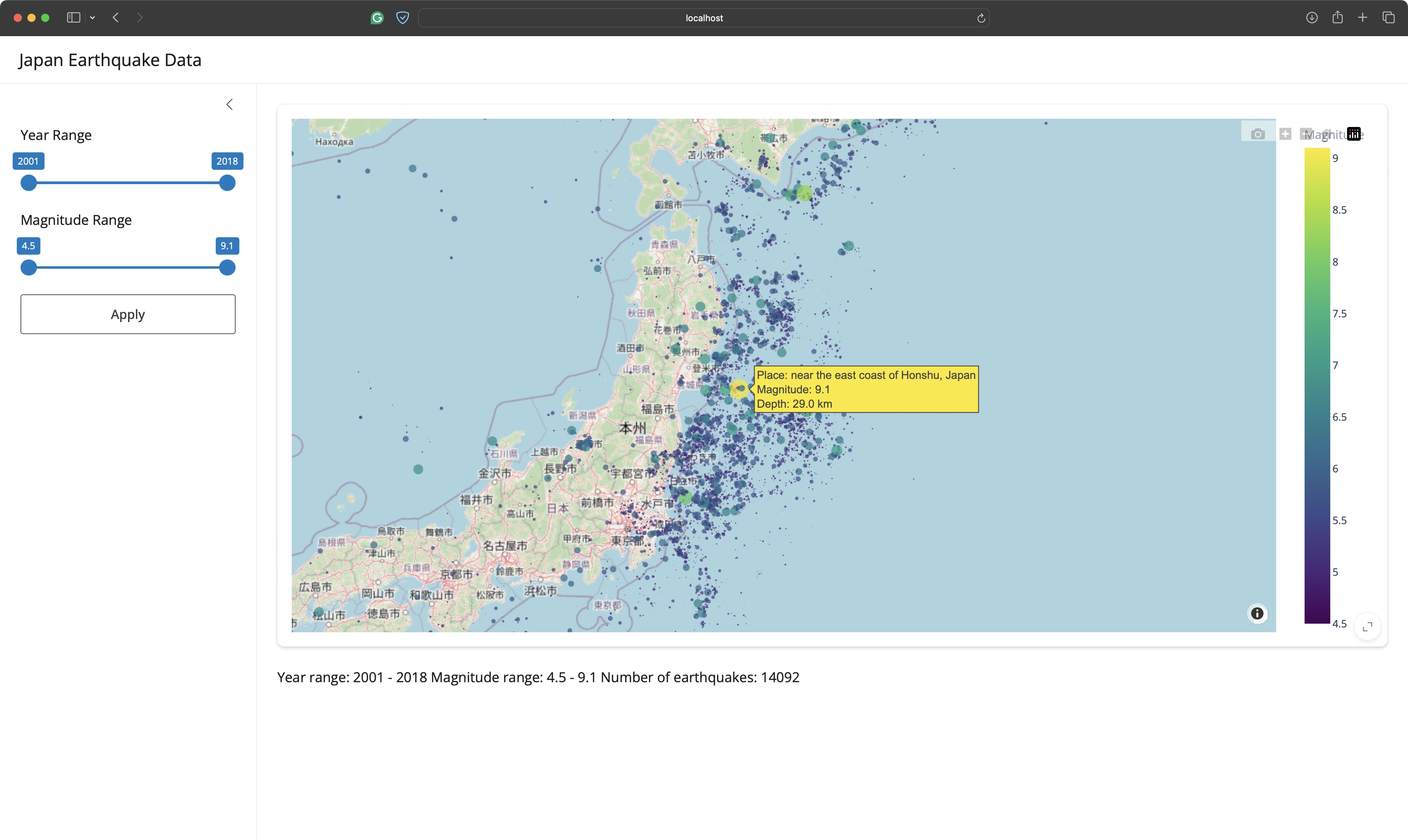
Works like a charm!
You can tweak the map aesthetics further if you wish, but we’ll call it a day. Let’s shift our efforts to a new chart component next.
Prompt #10 - Magnitude Histogram
We want to show a histogram with earthquake counts by magnitude in 0.1 increments below the map.
Our instructions were fairly detailed, as you can see from the prompt below:
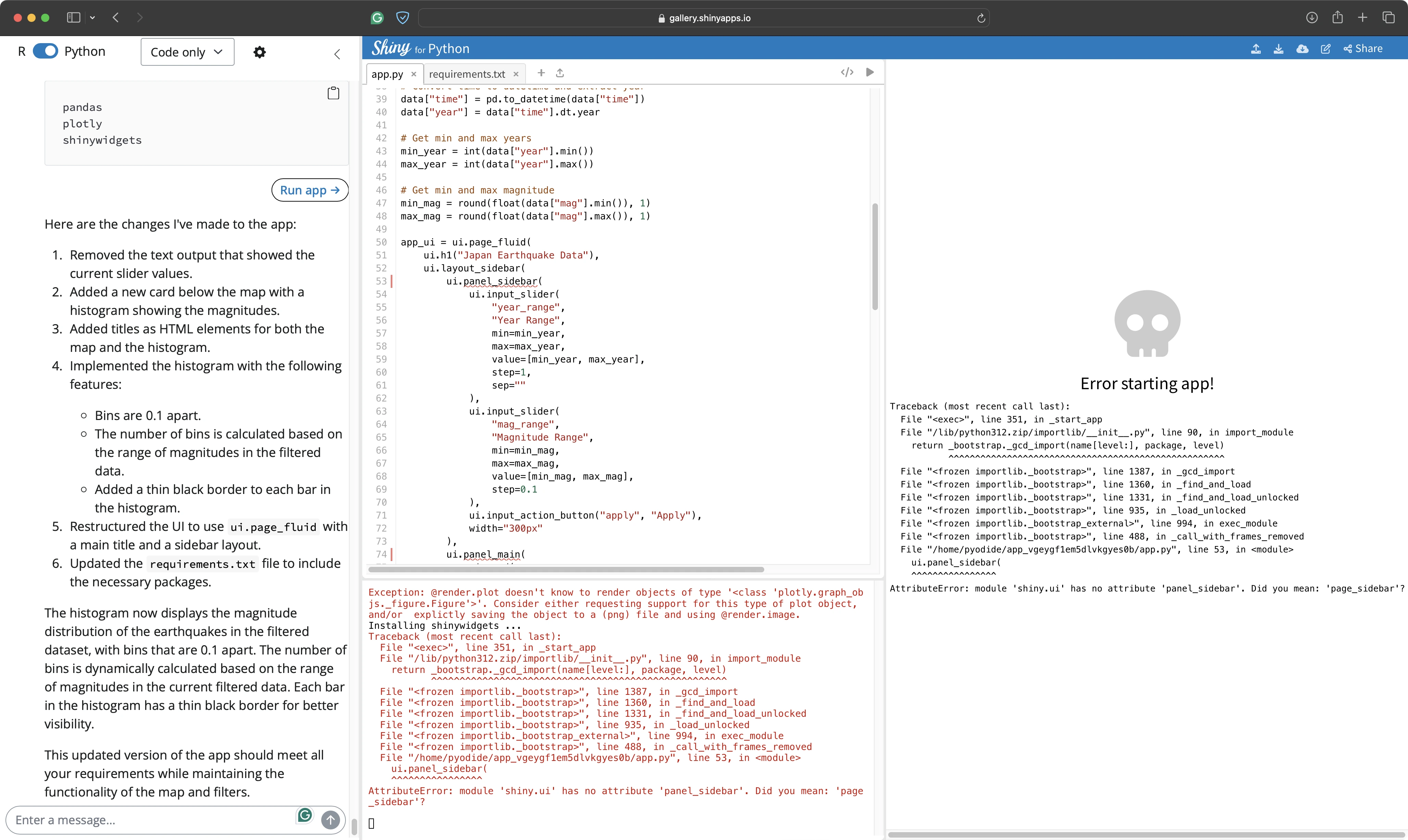
However, Shiny Assistant made a UI mistake that’s easy to fix, but shouldn’t have happened in the first place. It altered the code that was working and broke the app.
Prompt #11 - Shiny Layout Bug Fix
In short, Shiny Assistant once again referenced a function that doesn’t exist - `panel_sidebar`. The function did exist in earlier releases of Shiny for Python, so we can understand (and forgive) the confusion.
The Assistant also decided to use Plotly Express to plot a histogram.
Both issues were addressed with the following prompt:
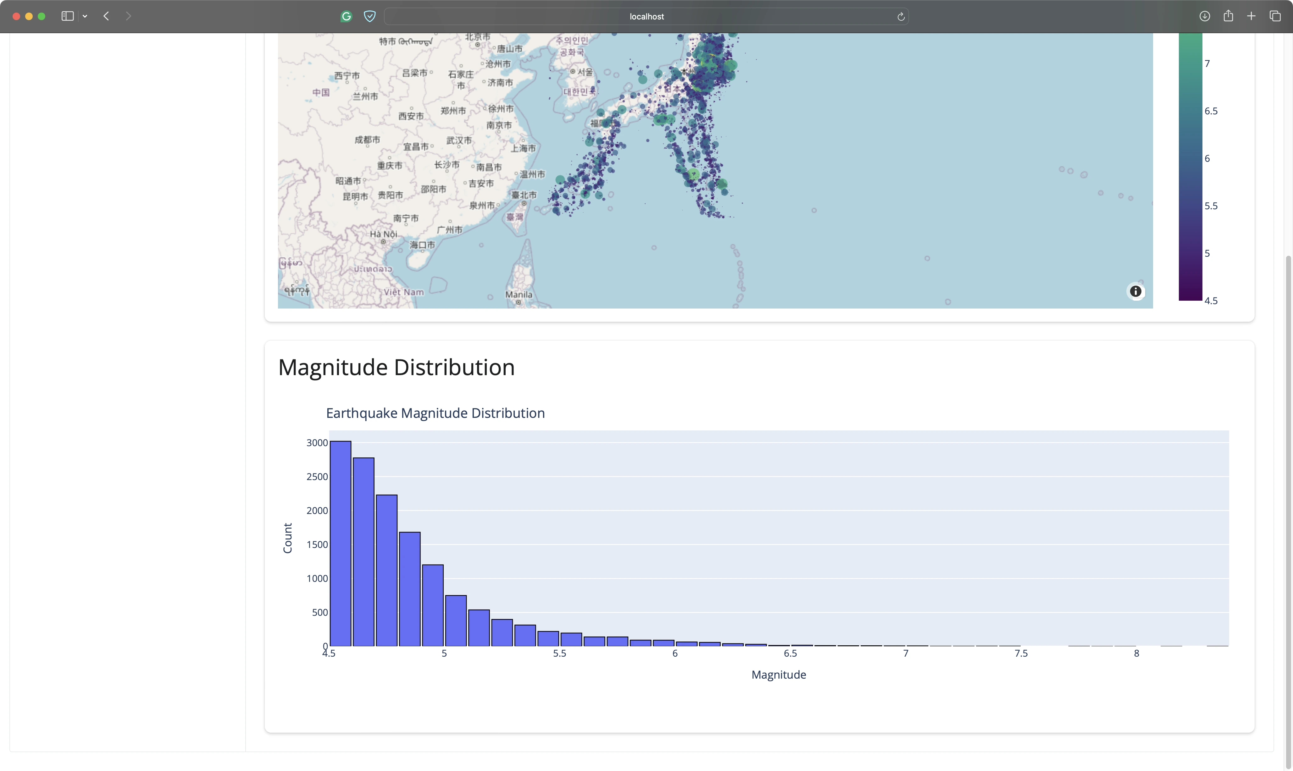
The app works again!
You can see the histogram below the map, and it updates correctly as the filter values are changed:
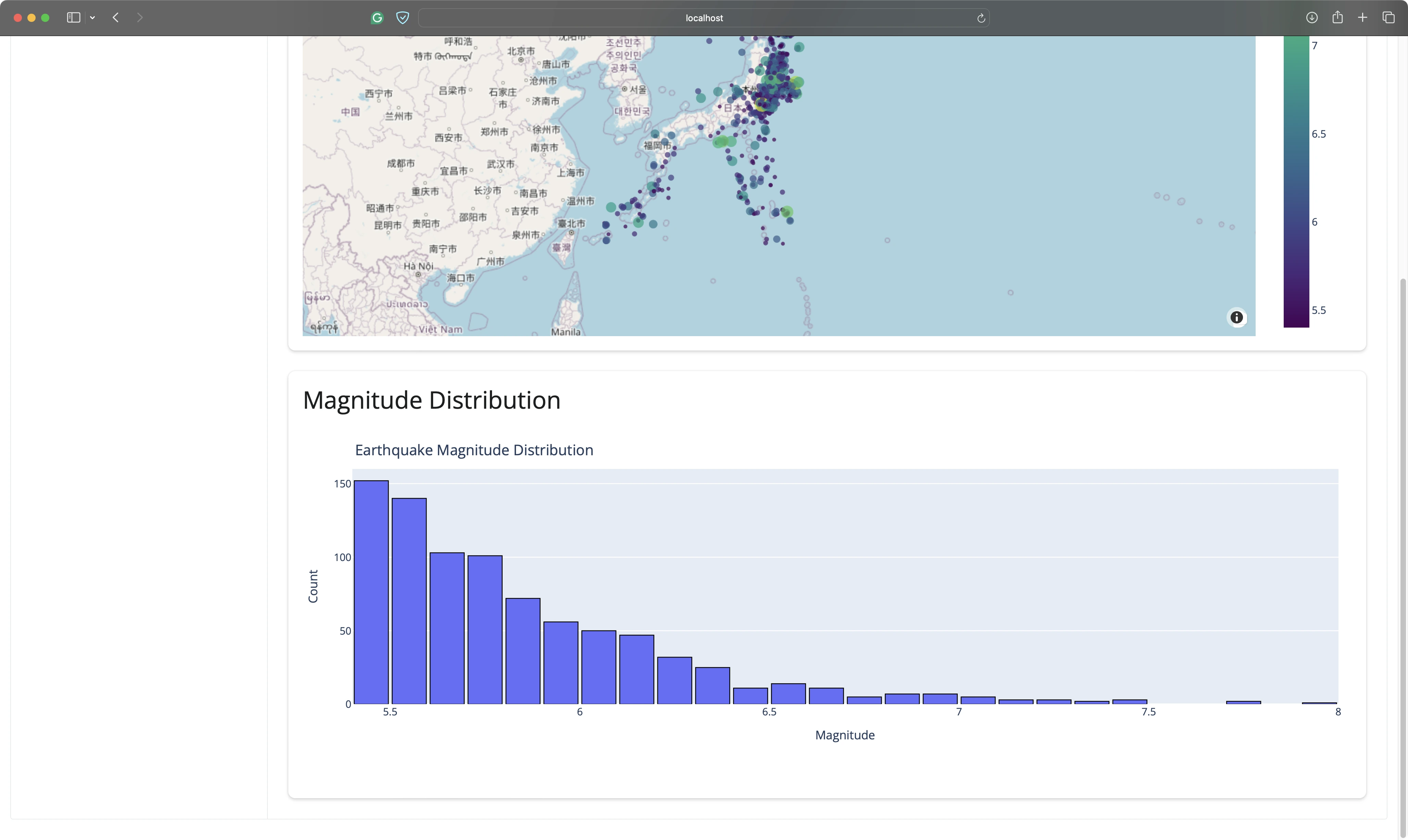
But we have two new issues:
- The histogram has two titles (and looks terrible).
- The filters are not visible as you scroll through the app.
Both should be relatively easy to fix.
Prompt #12 - Magnitude Histogram Style Tweaks
The following prompt instructed the Assistant to remove the title and toolbar from the histogram, and also to change the color and theme - that’s all easy to do manually.
The tricky part comes from the toolbar not having a fixed position - we don’t have specific instructions on how to solve it.
Let’s write the requirements into a prompt and hope for the best:
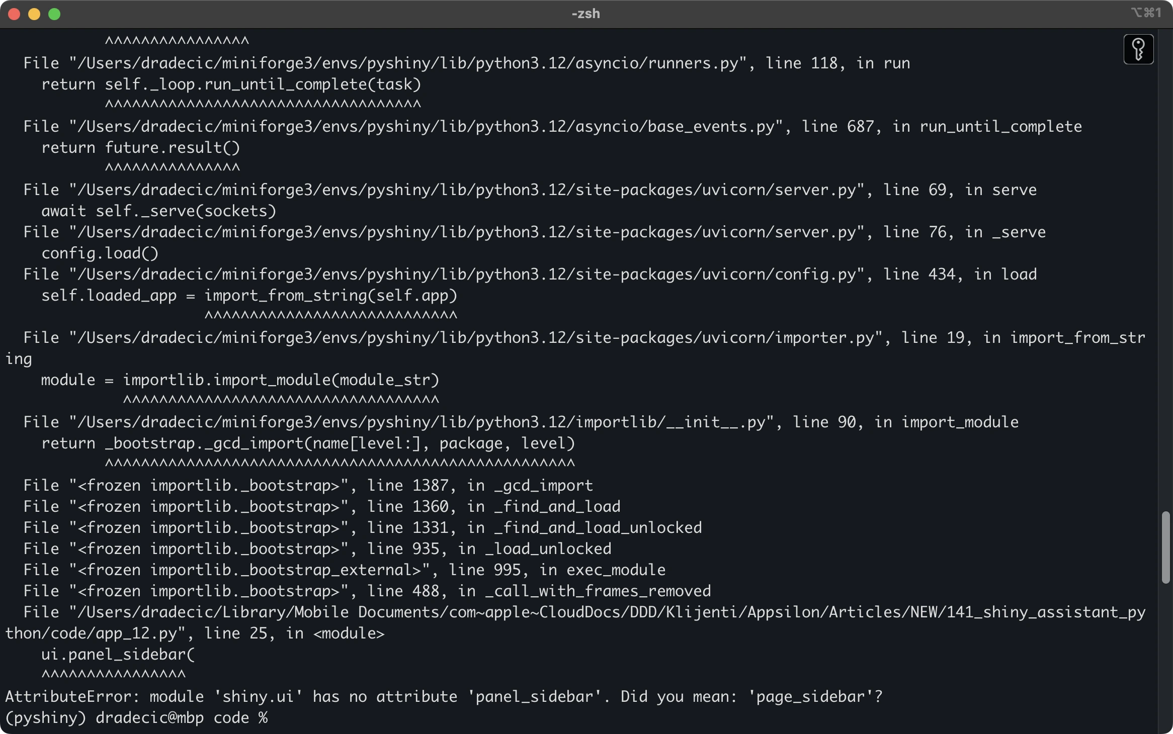
And we’re back to the well-known `panel_sidebar` error.
Prompt #13 - Shiny Layout Bug Fix (2)
It should be an easy fix, right?
After all, this wasn’t the first time we’ve seen this error message. This is the prompt we entered into the chat, hoping for the best:
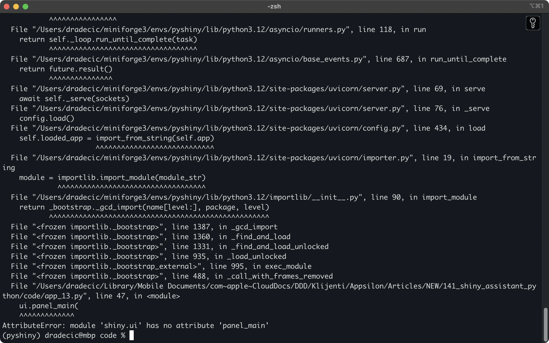
The `panel_sidebar` error is gone, but we have another one that’s similar - `panel_main`.
Prompt #14 - Shiny Layout Bug Fix (3)
Long story short, Shiny Assistant wrapped the main app contents into a function `panel_main()`. That function doesn’t exist, and is not necessary, as all of the main app components should be written one after the other, right below the sidebar function.
We ran this prompt to instruct Shiny Assistant to remove the function entirely:
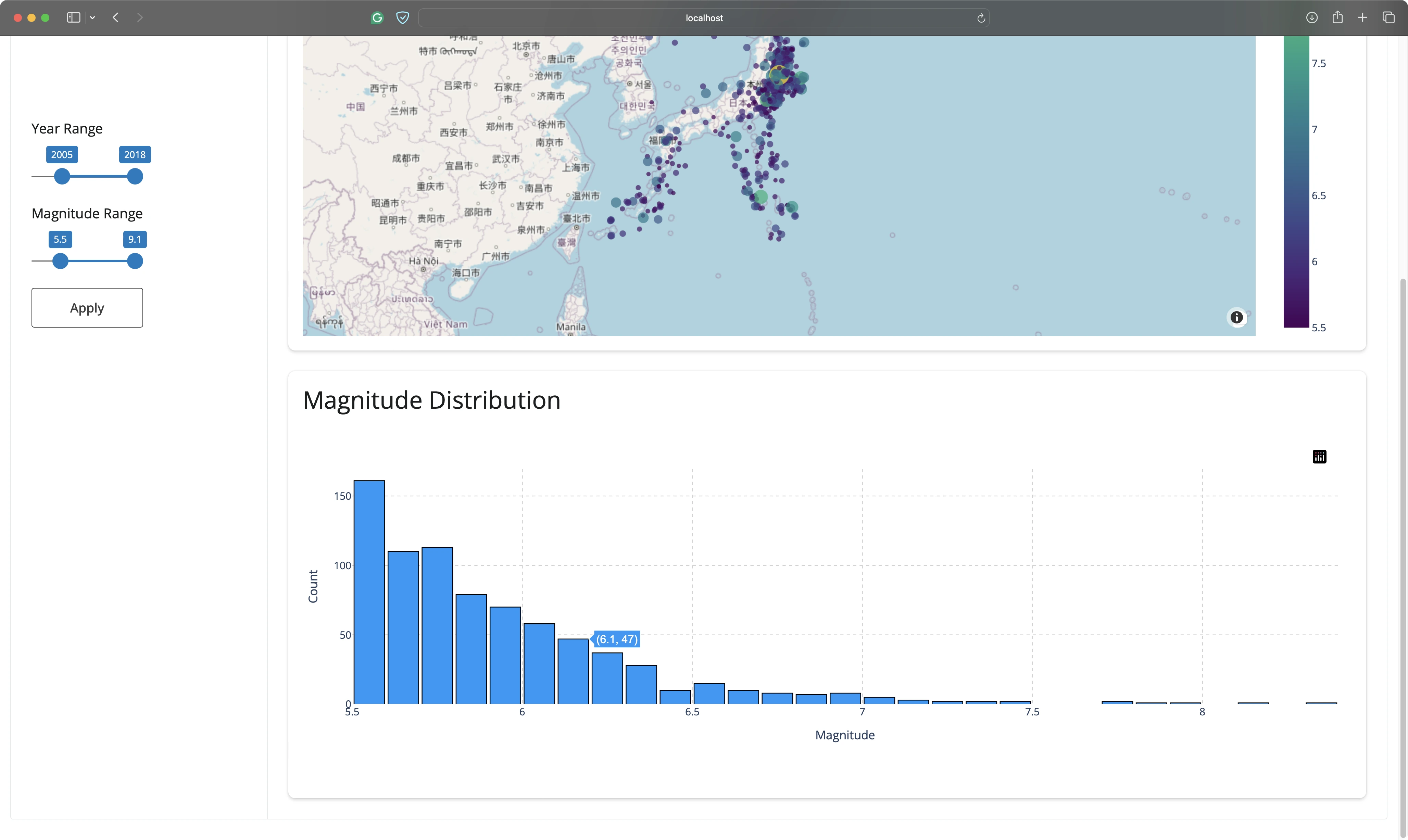
The app is working again!
The sidebar is now visible at all times, but its width was reduced by half for some reason.
Prompt #15 - Sidebar Position Fix
Shiny Assistant added the `position: fixed` property to the sidebar component. It’s the only thing that changed, and yet it somehow broke the aesthetics.
The fix wasn’t immediately visible to us, so we instructed it to look for a workaround, as the current solution decreased the width of the components:
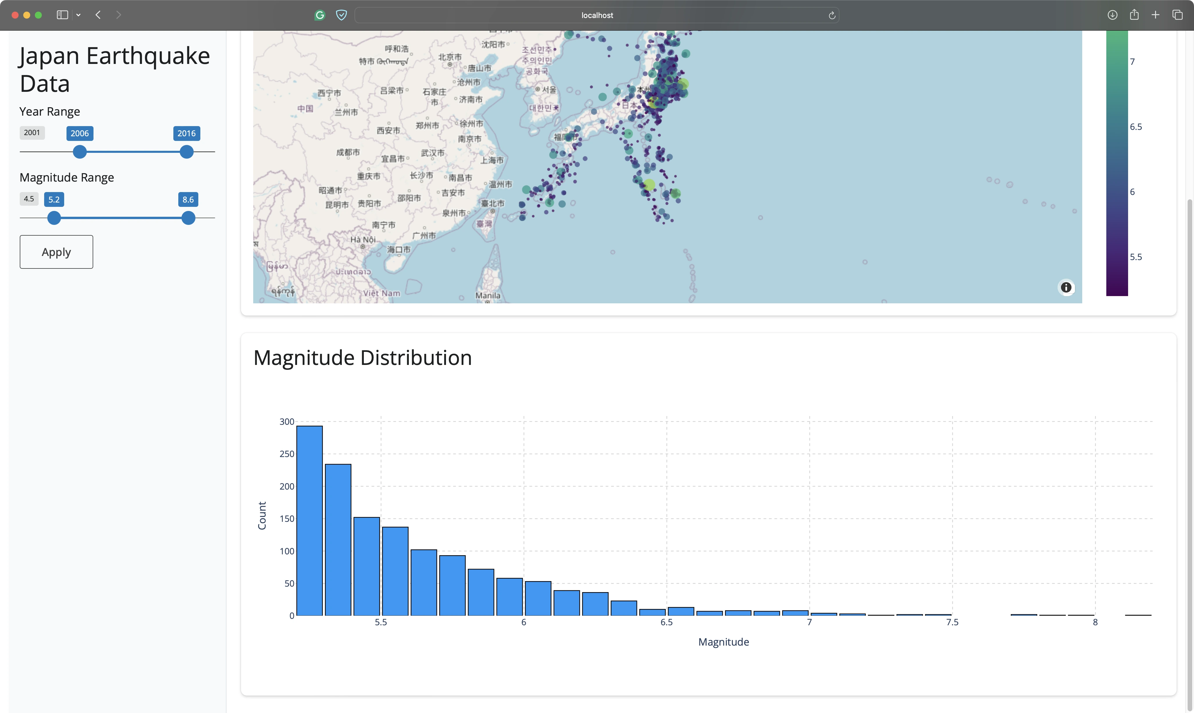
It found a solution by including CSS code in the Python script.
That was a good way to solve the problem, but we’d prefer for all the styles to be in a separate file.
Prompt #16 - External CSS File
For that reason, we decided to ask the Assistant to create an external CSS file with a custom font and a responsive layout.
Hopefully, it will also move the sidebar styles to this file:
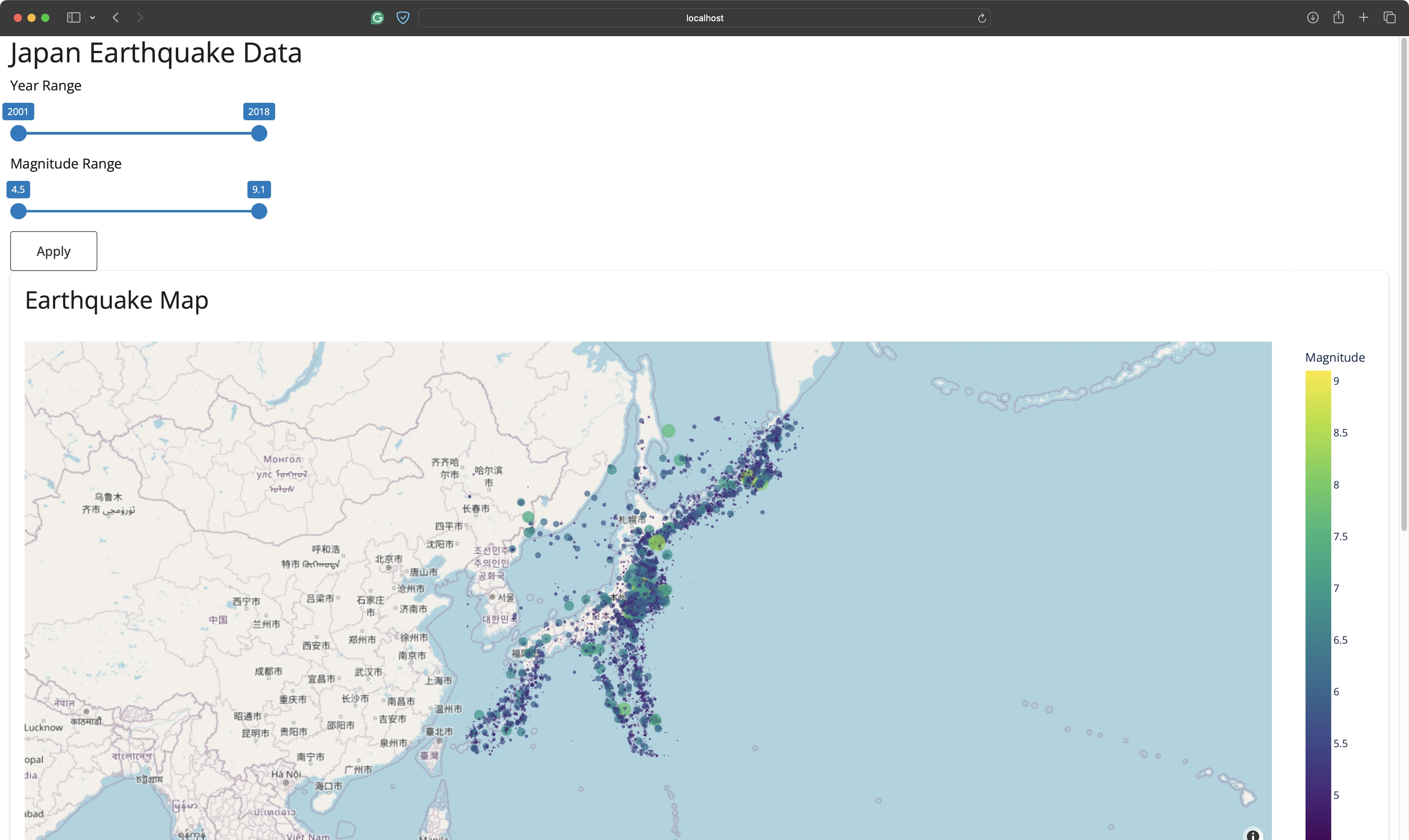
The assistant successfully did what was asked of it, but it broke the layout on larger screens. In other words, the app was now configured to always be in a “mobile” layout.
Prompt #17 - Responsive Design for Mobile Devices
Unfortunately, further instructions on how to tweak the layout for different screen sizes didn’t work.
This is the prompt we used:

The layout was still the same, so it was time to try something different.
Prompt #18 - Switching to Bootstrap
And that something is a CSS framework. Bootstrap was the first one that came to mind:
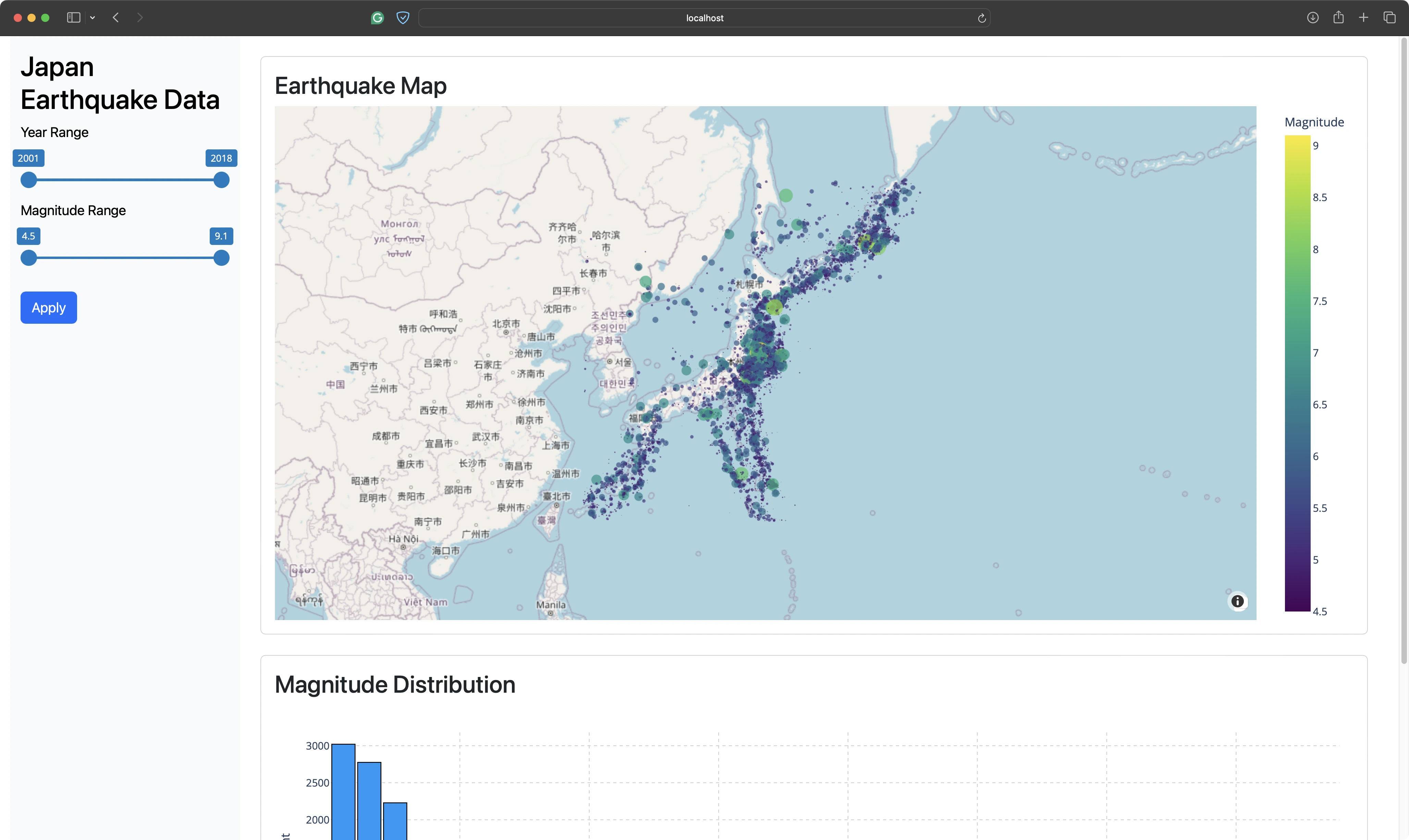
The look of the app changed only slightly, but it was fully working in the desktop mode.
When resized to mobile, the app correctly rendered components one below the other:
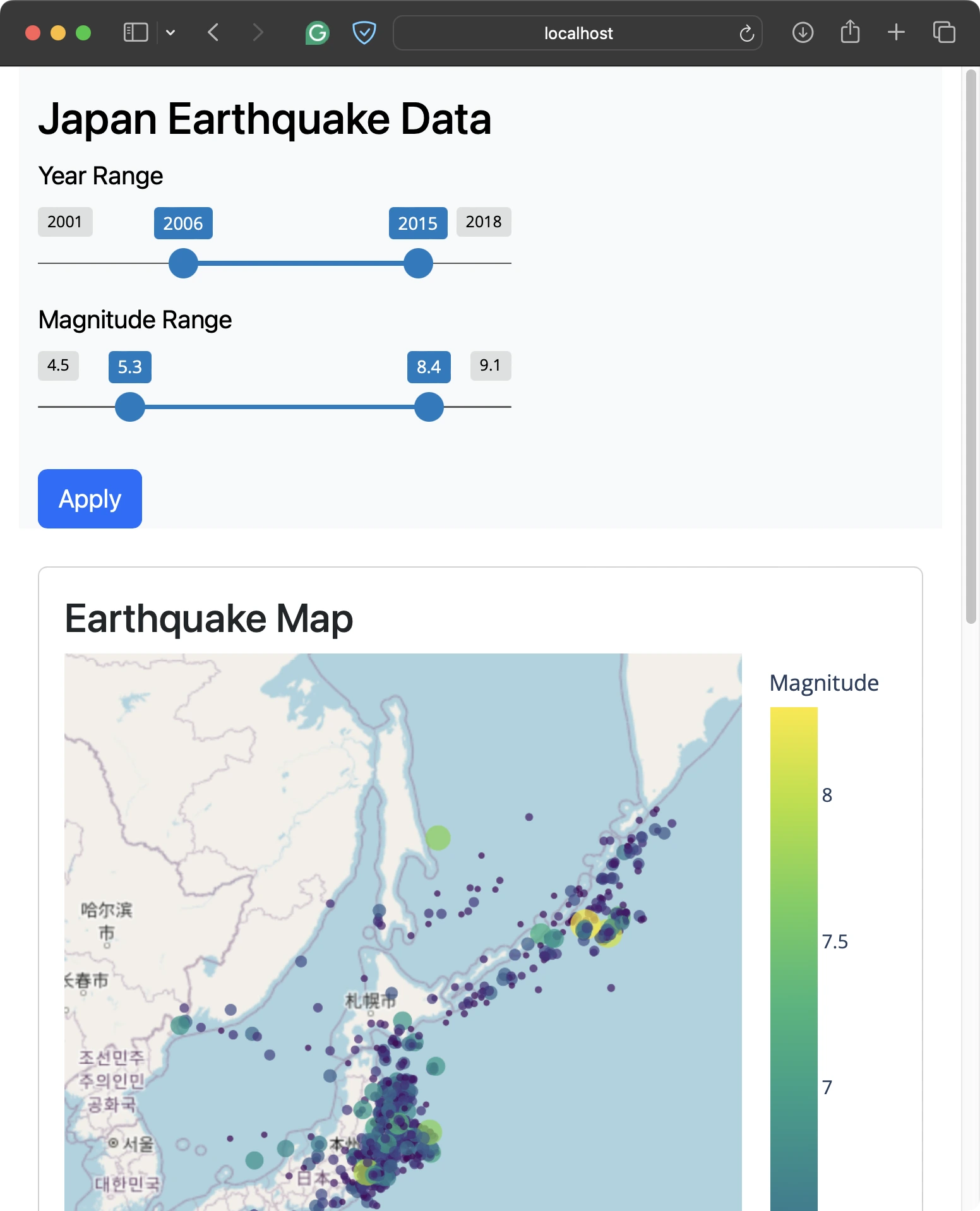
You could spend more time playing around with the styles, and we encourage you to do so.
Prompt #19 - Better Project Structure
The `app.py` got long through the previous 18 prompts, with close to 200 lines of code.
Any additional features wouldn’t be easy to maintain in the long run. For this reason, we decided to ask the Assistant to extract the chart and data preprocessing logic into separate files:
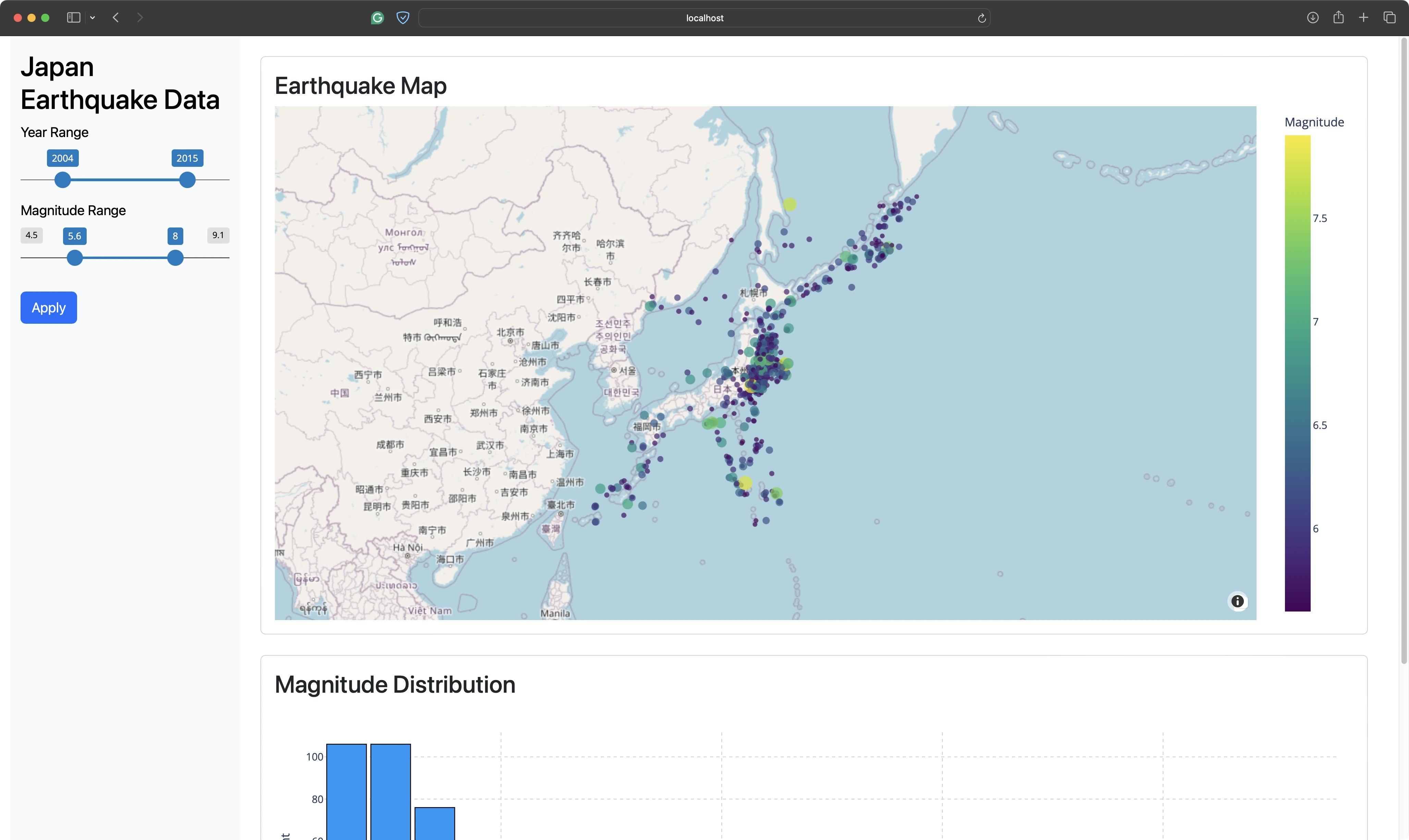
It worked like a charm and didn’t break any functionality. `app.py` was reduced to 87 lines of code.
These additional files were created in the project directory:
This is where we’ll call it a day.
You can always optimize further and introduce new features, but we feel like we have enough information to give you our thoughts on Shiny Assistant for Python.
Shiny for Python Application Source Code
You can find the source code for the application in the subsections that follow. The dataset is available here.
data_processing.py
chart_logic.py
styles.css
app.py
Shiny Assistant for Python Pros and Cons
What’s the verdict, should you try out the beta version of Shiny Assistant for Python?
You already know our thoughts on the negative sides of using Generative AI for R and R Shiny - It shortens your attention span; It’s just a matter of time before you hit a wall; It doesn’t save you that much time; You shouldn’t share sensitive data. All of these still apply.
The rest of the section will walk you through the pros and cons specific to Shiny Assistant for Python.
Shiny Assistant Pros
Here are the things we loved about Shiny Assistant for Python:
- It’s great for getting you started - If you don’t have a lot of experience with Shiny, the Assistant can write starter code for you. Just list your requirements and it'll get it right most of the time. Keep in mind that starter code doesn’t equal production-ready code, so manage your expectations.
- It works surprisingly well, given the circumstances - Shiny for Python is about 15 months old at the time of writing. After trying both flavors of the Assistant, we can tell that the difference exists, but it’s not as significant as we initially thought. It will take some time for it to catch up with R Shiny, but it’s far from unusable.
- It’s aware of a wider Python ecosystem - You’ve seen today that we’ve worked with Pandas and Plotly. Python is a general-purpose programming language, which means you can ask the assistant to do more generic Python things. For example, if you need to implement a pipeline for downloading and processing the dataset before showing it in a Shiny app.
- It’s free - As of now, Shiny Assistant won’t cost you a dime. There is an option to add your Anthropic API key which will charge you on a per-request basis, but the Assistant itself is free.
- It’s a great tool to start learning - If you just want to get started with Shiny for Python and learn it faster through data and examples relevant to you, look no further than Shiny Assistant. It has everything you need, and it can fix the most common bugs you’ll encounter as a beginner.
Shiny Assistant Cons
The Assistant is currently in closed beta (October 2024), so we expect some pain points from this list resolved in the future:
- Assistant modes don’t work - Just like in the R version, the switch from “Code only”, “Concise”, and “Verbose” assistant modes doesn’t make any difference. We wanted to use “Code only” to reduce the response time, but this mode still generated a lot of explainer text. It looks like a prompting error, so it shouldn’t take the Posit’s team too much time to get it working.
- The live preview is buggy and doesn’t reflect the app - If you tell the Assistant your data is in a CSV file and provide a sample, it’ll try to read it in the code, resulting in a crash. Other times, we found the app preview not updating after fixing a bug, even if the same code works when running the app locally. Technically, this has little to do with the Shiny Assistant, but it’s worth pointing out since it’s part of the UI.
- It can be slow at times - Shiny Assistant always generates the code from scratch. If you have a larger application split between multiple files, this can be a huge time waste. We’d love to see the option to generate only the code that has to be updated, but this could introduce additional errors if you like to just copy/paste. Still, a toggle or an additional assistant mode would be a nice-to-have feature.
- It works on a very limited set of data - In the grand scheme of things, Shiny isn’t the most used application framework out there. Adding the fact that Shiny for Python was released in 2023, it’s easy to see that there’s not so much data running in the background. Of course, this will change as time goes on.
- It’s not available as an IDE plugin - In the future, we’d love to see Shiny Assistant as an integral part of Python-specific IDEs, or as a downloadable plugin (like Copilot in VSCode).
Summing up Shiny Assistant for Python
Shiny Assistant is a good place to start writing and prototyping your apps in 2025 and beyond.
It works great with R and Python. The latter is surprising since Shiny for Python is more than a decade younger than its R equivalent. You can use the tool to learn Shiny in a context that’s relevant to you, as an idea generator to explore new features, and as a tool for creating apps from scratch. Just keep in mind that some manual intervention will be required.
What we’d love to see in the future are refinements in the Assistant UI, particularly regarding the code generation speed and output formats. Sometimes you don’t need a couple of paragraphs of explainer text - you’re just there for the code. Other times, you need more detailed step-by-step instructions. We’d also love to see it running in Positron or VSCode.
These are all issues that are likely to be resolved before the first public release. Stay tuned to the Appsilon blog and subscribe to Shiny Weekly to never miss a thing.
If you haven’t tried Shiny Assistant yet, join the waitlist.
We’d love to hear your thoughts on Shiny Assistant for Python. Join our Slack community and share your experiences so far.
Looking to share your Shiny for Python apps? Try Tapyr - Appsilon’s Rhino equivalent for Python.

.png)

.png)


