Race Charts in R: How to Visualize and Compare Change Over Time with gganimate

So, you’ve mastered the basics of ggplot2 animation and are now looking for a real-world challenge? You’re in the right place. After reading this one, you’ll know how to download and visualize stock data change through something known as race charts.
You can think of race charts as dynamic visualizations (typically bar charts) that display a ranking of different items over time. In our case, we’ll build a stock price comparison animation that shows the average monthly stock price for 7 tickers for the last 10 years.
Let’s start by gathering data. The best part - you can do it straight from R!
Want to use R to process huge volumes of data? Read our detailed comparison of tools and packages for efficiently handling 1 billion rows.
Table of contents:
- Data Gathering: How to Download and Organize Stock Data in R
- Step 1: Build and Style a Bar Chart for a Single Time Period
- Step 2: Chart Animation with R gganimate
- Summing up Race Charts in R
Data Gathering: How to Download and Organize Stock Data in R
The process of gathering data typically involves downloading CSV/Excel files from the web or connecting to a database of some sort. That couldn’t be further from the truth when it comes to financial data.
You can download data for any ticker and any time period straight from R! Just make sure you have the `quantmod` package installed. And speaking of packages, these are the ones you’ll need today:
If you don’t have them installed, simply run `install.packages(“<package-name>”)` from the R console.
Moving on, we’ll declare a vector of 7 tickers for which we want to download daily stock prices: Amazon, Apple, Google, Microsoft, Meta, Tesla, and Nvidia. For each, we’ll grab the last 10 years’ worth of data, indicated with `start_date` and `end_date`.
To demonstrate how this approach works, we’ll call the `quantmod::getSymbols()` function to display the first 10 rows of a returned dataframe for the Nvidia stock. It will make adequate API calls to Yahoo Finance for you:
This is the output you’ll see:
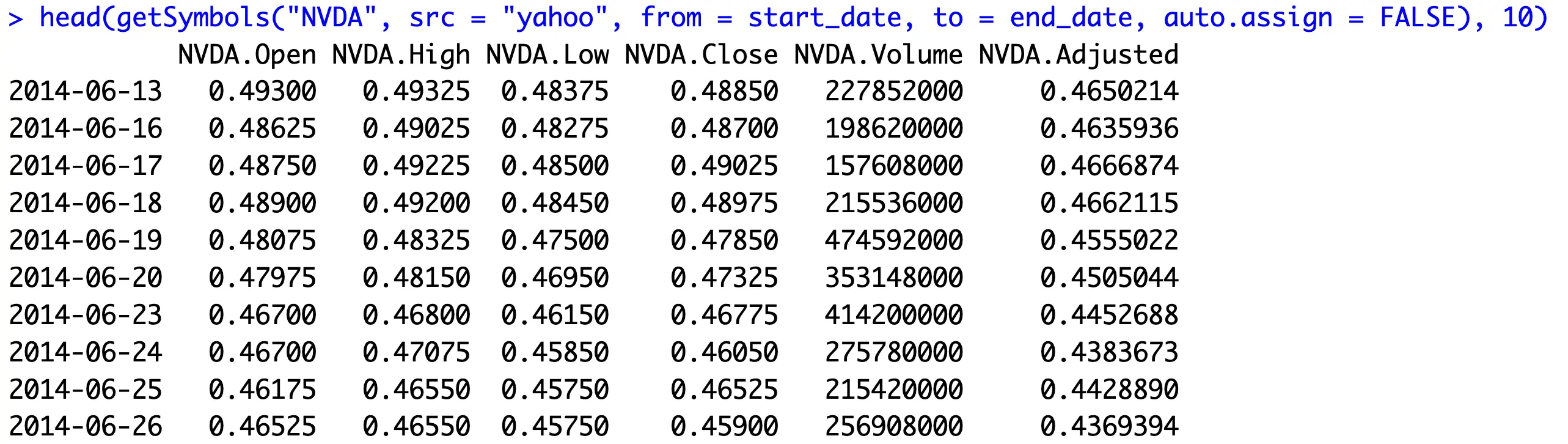
We only care about the Adjusted price and the date, which is represented by the dataframe index. Let’s see how to get the data for all tickers next.
How to Get Historical Data for All Tickers
The `get_monthly_averages()` is a custom function that will download stock data for a provided ticker. It will then rename the dataframe columns so that the ticker name is removed from them (needed for the aggregation later).
As mentioned earlier, only the Adjusted price column is relevant, so we’ll construct a new dataframe with its value and the index (time period). We’ll then remove the day information from the date since we only care for monthly averages.
Finally, the mean value for each time period is calculated and returned:
With the function to get single stock data out of the way, you can now use the `lapply()` magic to apply the function to each of our 7 tickers. Here, we’ll also arrange the data by the time period (ascending) and the average stock value (descending):
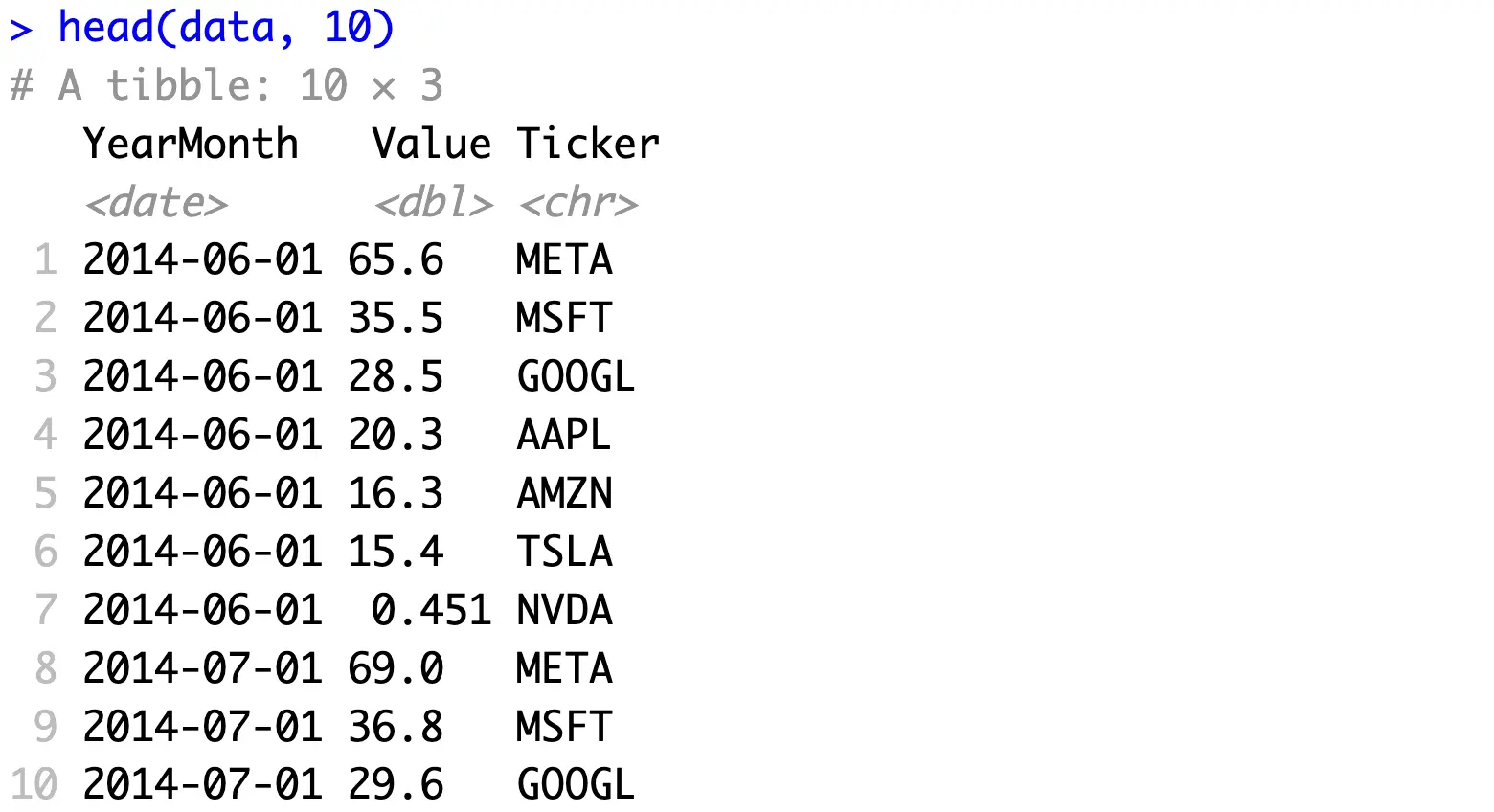
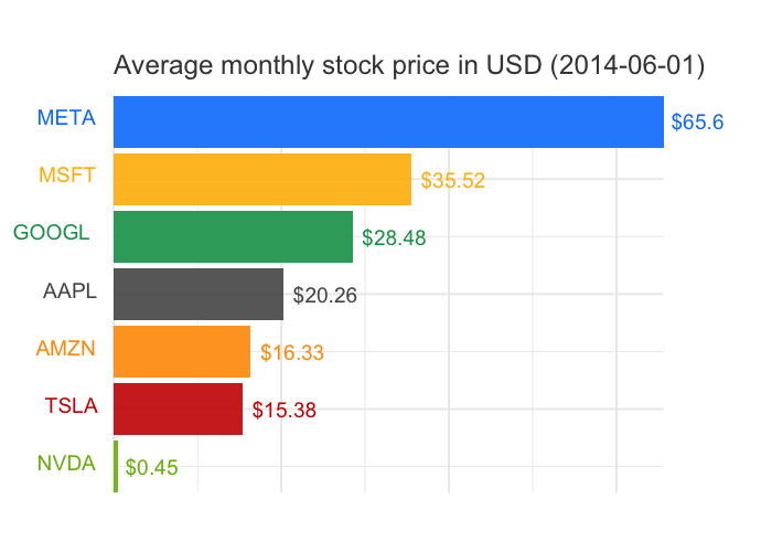
You could say the following to interpret this data: Microsoft’s average stock price for the month June of the year 2014 was USD 35.5.
You now have the data, so the only thing left to do is to build some cool visualizations!
Step 1: Build and Style a Bar Chart for a Single Time Period
Rendering an animated chart takes time, so a good piece of advice is to start small by building a visualization for a single time period. This way, you’ll know everything looks exactly the way you want to.
Race charts need one thing to work properly, and that is the rank. In our case, rank represents the position of the ticker’s value when compared to other tickers. In other words, it determines the position the column will have in a bar chart.
While here, we’ll also add a label column (you’ll see why in a bit):
Here’s what your dataframe should look like now:
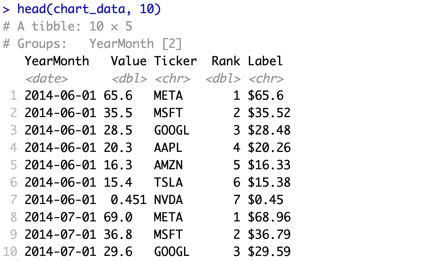
Meta had the highest stock price in June 2014, so it’s ranked number 1. The exact opposite is true for Nvidia.
The last thing we want to do before visualizing this data is to declare a custom color palette. We’ve grabbed the official brand color codes so the chart looks more representative:
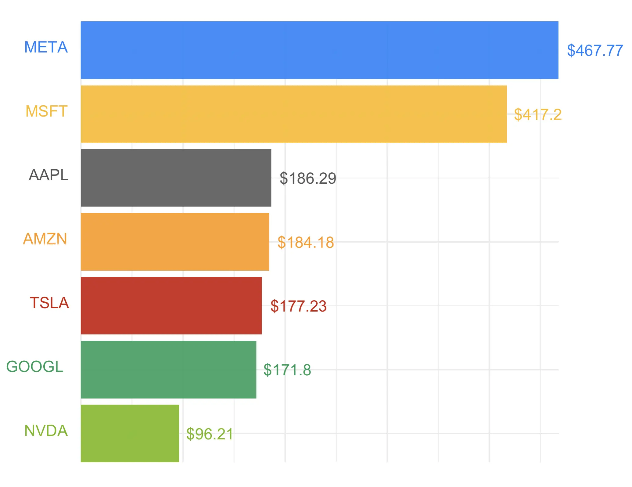
And now, onto the visualization. As mentioned, we’ll create it for a single time period first, and discuss animation in the following section.
We’re creating a horizontal bar chart with the help of the `geom_tile()` function that’s typically used to build heatmaps. The two `geom_text()` calls are used to add ticker names and stock prices, both from their respective side of the chart. The rest of the code is related to styling, changing the theme, and playing around with the overall aesthetics:
In the end, this is the chart you should end up with:
Now let‘s see how to animate it!
Step 2: Chart Animation with R gganimate
Good news - nothing much changes in the charting code. You only have to remove the data filtering so all time periods are captured, and also store the entire plot into a variable:
Now to build the animation, we’ll append the `transition_states()` function to our chart to indicate we want the chart to change between different states. Then, the `view_follow()` function allows the chart window to follow the data dynamically, but only on the Y-axis.
The `labs()` function allows us to modify the title through the `{closest_state}` property. In simple terms, this updates the time period in the chart title:
Finally, the `animate()` function will render a 1024x768 GIF with 600 frames in total (more info about different rendering options here):
Once the rendering finishes, you’ll see the following chart saved to your disk:
And that’s the basics of race charts for you. Let’s wrap things up next.
Summing up Race Charts in R
Data visualization is a powerful tool. Given the option, almost no one would choose to stare at spreadsheets instead of charts. Animating these charts brings the whole thing to a different dimension.
You now know how to breathe life into static and somewhat boring ggplot2 visualizations, which is an amazing skill to have. Animated charts make it easy to capture trends and shifts over time, ensuring your data stories are more engaging and easier to understand. They are especially useful in presentations and reports where you need to highlight key changes and patterns dynamically, rather than relying on a series of static images.
What are your thoughts on chart animation in R? Do you use gganimate or some other package? Let us know in our Slack community.
Are you hitting the wall with Excel? Here are 5 ways R can help you improve your business workflows.