Data visualization is the key to understanding relationships in your data. Yet, effectively zero datasets come with so few features that you can display the whole thing on a single chart.
Newcomers tend to visualize one or two features at a time, but more seasoned data professionals opt for different dimensionality reduction techniques to see through the noise.
Today you’ll learn all about one such technique. It’s called t-SNE (t-distributed Stochastic Neighbor Embedding) and is typically used to organize your data into lower-dimensional clusters, and then plot them as a 2-dimensional or 3-dimensional scatter plot.
Let’s begin by covering t-SNE in more depth, and then we’ll dive into the code.
Is Positron a viable replacement for RStudio? We tested this new IDE for a typical R/Python workload - here are the results.
Table of contents:
- t-distributed Stochastic Neighbor Embedding - A High-Level Overview
- Exploring the High-Dimensional Digits Dataset in R
- t-SNE in Action - How to Plot a 784-Dimensional Feature Space in R
- Summing up R t-SNE
t-distributed Stochastic Neighbor Embedding - A High-Level Overview
The t-SNE algorithm, short for t-distributed Stochastic Neighbor Embedding, has a simple goal of taking a high-dimensional dataset and reducing it to a low-dimensional graph (2D or 3D) that retains most of the original information.
Unlike PCA, t-SNE is a non-linear dimensionality reduction technique, meaning that it allows you to separate data that cannot be separated by a straight line.
The rest of this section will teach you the basic concepts behind the algorithm, discuss the most important parameters, and answer the age-old question of how t-SNE differs from PCA.
t-SNE Explained Step by Step
The following four bullet points are a brutal oversimplification of how the t-SNE algorithm works. If you want to dive deeper, especially into mathematics, we recommend reading the official paper by L. Maaten, and G. Hinton.
- Pairwise similarity computation in high-dimensional space: The t-SNE algorithm first finds the similarity measure between pairs of data points in high-dimensional space. Similarities are modeled as probabilities, so you end up with a probability distribution (gaussian) over pairs of high-dimensional data points.
- Similarity definition in low-dimensional space: The algorithm then places the points in a lower-dimensional space (2D or 3D) and defines a new set of similarities using a different probability distribution (Student’s t-distribution with one degree of freedom). This heavy-tailed distribution is used to help t-SNE handle so-called “crowding problems”, where too many data points would otherwise be forced together in a small area.
- Divergence minimization between distributions: The next step is adjusting data point positions in the lower-dimensional space by minimizing the difference (KL divergence) between high-dimensional and low-dimensional similarity distributions.
- Iterative position optimization: t-SNE then uses gradient descent to refine the positions in the lower-dimensional space. The optimization process runs for a defined number of steps, continuously reducing the divergence until the positions stabilize.
Important t-SNE Parameters You Must Know
In R, there are about a dozen parameters you can tweak when running t-SNE. We won’t cover all of them, as we found these three to be the most important to memorize:
- Perplexity
- A parameter that controls the balance between local and global aspects of the data when t-SNE is creating the low-dimensional map. You can think of it as a measure that controls the effective number of neighbors for each point.
- Value typically ranges between 5 and 50 (30 is the default in R). Lower values put more emphasis on local structures, while higher values focus more on broader patterns. If your dataset has many points, you might want to increase the perplexity.
- It’s often a good idea to test a couple of different values since different perplexities can result in significantly different t-SNE plots
- Number of iterations
- Controls how many times the optimization process is repeated, similar to the number of epochs you specify when training a neural network model.
- R sets the default value to 1000, but tweaking it can often yield better results. Increasing the value increases the computation time
- If set too low, you’ll end up with data points in suboptimal positions
- Initial dimensions
- Before running t-SNE, the data can be reduced to a lower number of dimensions using PCA. This is usually done to reduce complexity and remove noise.
- The default value in R is 50, but this can (and should) be adjusted to match your data. If you have a very high-dimensional dataset, reducing the number of initial dimensions too much might lead to a loss of important information, while keeping it too high might introduce too much noise.
How t-SNE Differs from PCA
Both PCA and t-SNE are dimensionality reduction algorithms, but the way they work behind the surface is significantly different. Here are a couple of points you should keep in mind:
- PCA captures directions (principal components) that maximize the variance in the data. On the other hand, t-SNE is designed for visualizing high-dimensional data by focusing on preserving local relationships (similarities between nearby points).
- PCA is a linear technique, while t-SNE is non-linear. The latter is oftentimes used when the underlying data can’t be separated by a straight line (flat multi-dimensional object).
- PCA focuses on preserving global structures in the data, the overall variance, and relationships between the entire dataset. On the other hand, t-SNE maintains small pairwise distances, making it ideal for identifying clusters or patterns in complex datasets.
Exploring the High-Dimensional Digits Dataset in R
As mentioned earlier, t-SNE is an excellent choice for reducing the dimensionality of a dataset. Let’s prove that by examining the MNIST digits dataset, presented in tabular format. Download the training subset if you’re following along, or keep reading if you’re only here for the visuals.
You’ll need a couple of packages - install any that are missing with the `install.packages(“<package-name>”)` command. Once done, read the dataset and rename the columns:
We’re working with 60000 rows, each having 785 columns. The first column is the target variable (digit), while the other columns represent the 784 pixel values (28x28 images).
You can verify this by printing the first row as a matrix:
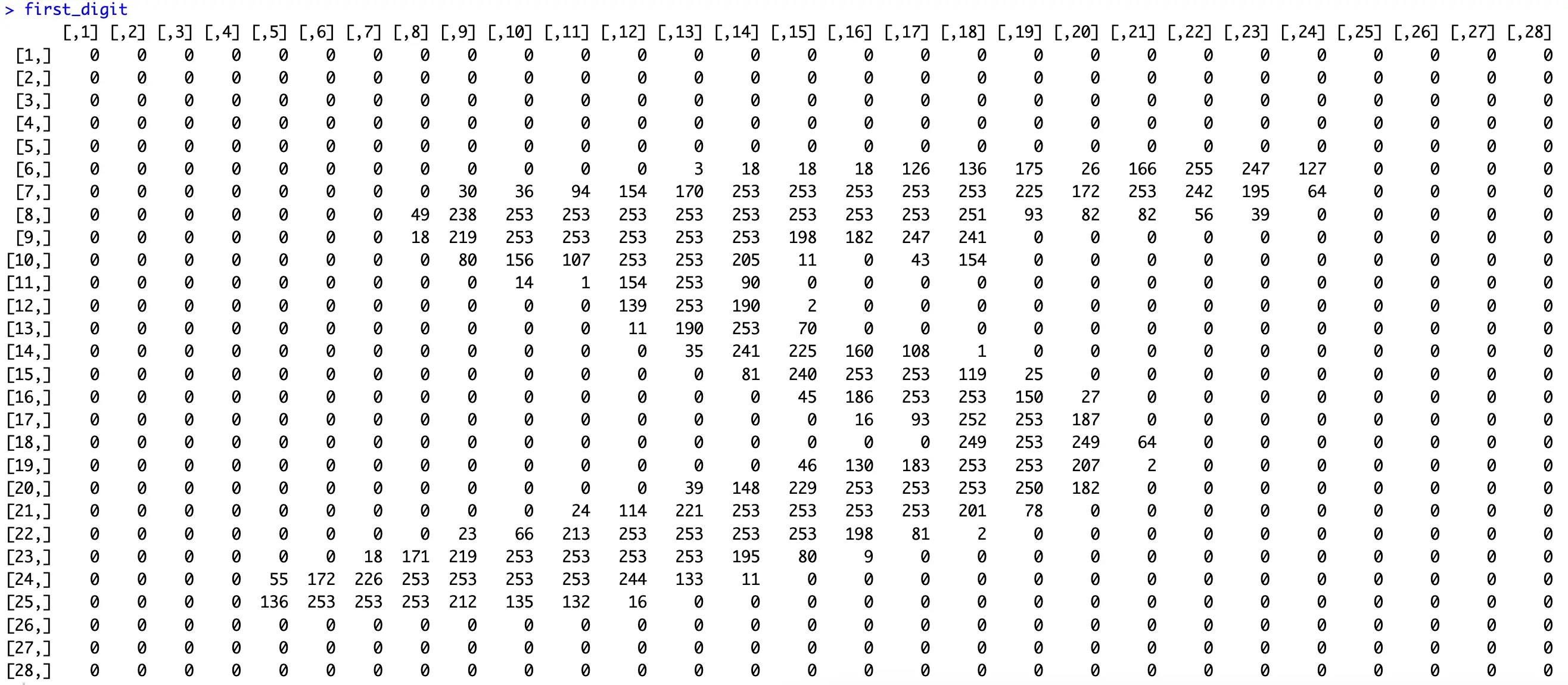
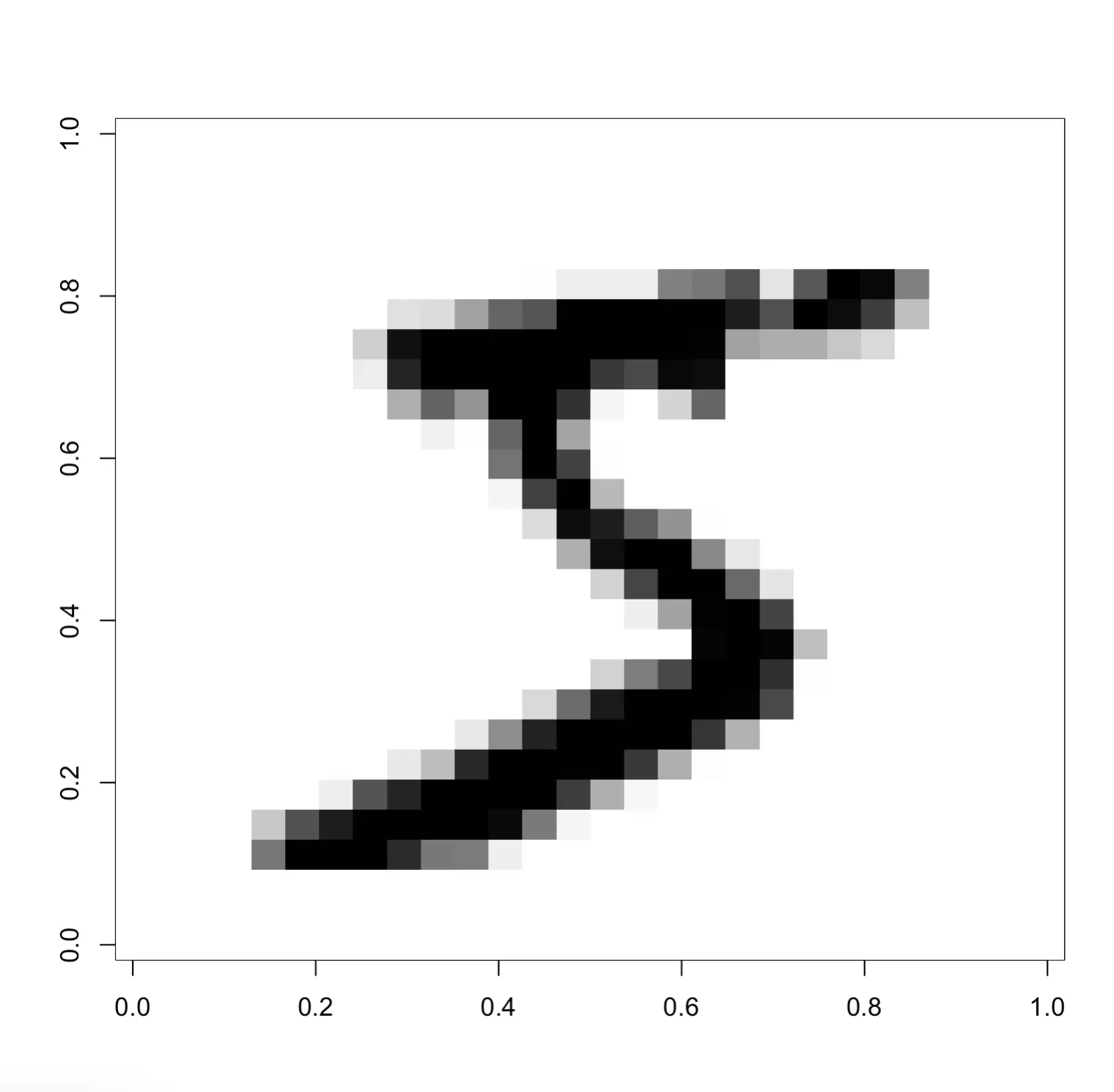
The digit “5” is clearly visible. The values in the matrix range from 0 to 255, as you would expect from a grayscale image.
You can further explore this matrix by visualizing it:
Or, if you want to get a glimpse into a larger portion of the dataset, run the following snippet:
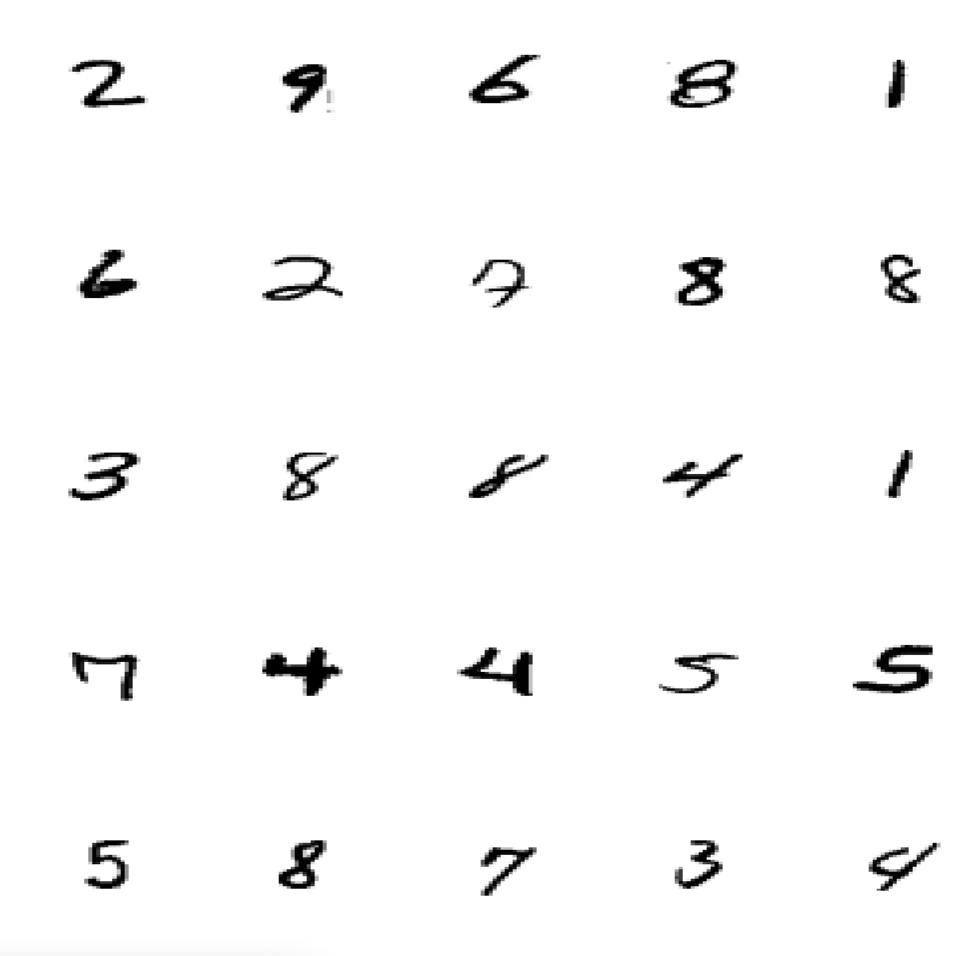
All in all, you have access to 60000 images with uniformly distributed target variable. It’s more than enough records for what you need today.
t-SNE in Action - How to Plot a 784-Dimensional Feature Space in R
This section will show you how to plot the results of the t-SNE dimensionality reduction algorithm in 2 and 3 dimensions. But first, we’ll reduce the number of records slightly, since plotting 60000 points sounds like a disaster waiting to happen.
Data Organization
Images in the dataset are fairly uniformly distributed - around 6000 samples for each digit:
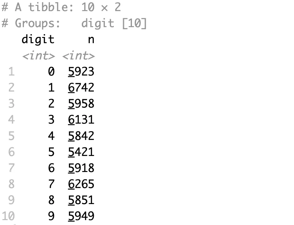
That’s too much to include in a single chart, so we’ll reduce the per-class sample size to 100:
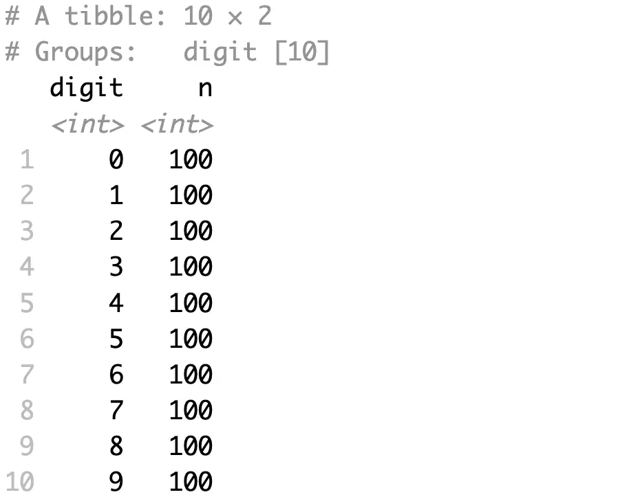
Feel free to experiment with the sample size.
While here, let’s also make a feature/target split:
You’ll apply t-SNE only to the features, and you’ll use the target for visual distinction in visualizations.
Plotting t-SNE Results in 2 Dimensions
The `Rtsne` package has an identically-named function that’s packed with familiar parameters (that is if you’ve read the theory section).
The following example shows you how to go down to two dimensions through 1500 iterations:
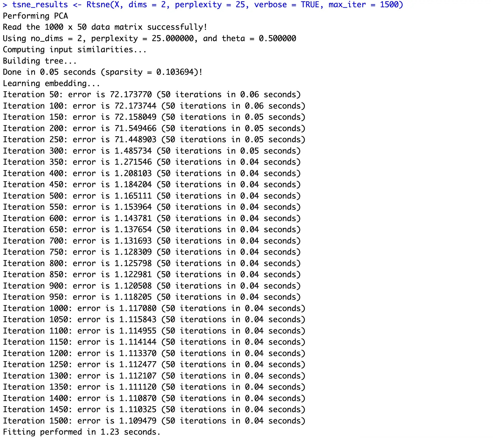
You can clearly see how an iterative approach of gradient descent reduces the error quickly and then plateaus around 1.1.
From here, it’s just a matter of organizing things into a dataframe and displaying a scatter plot:
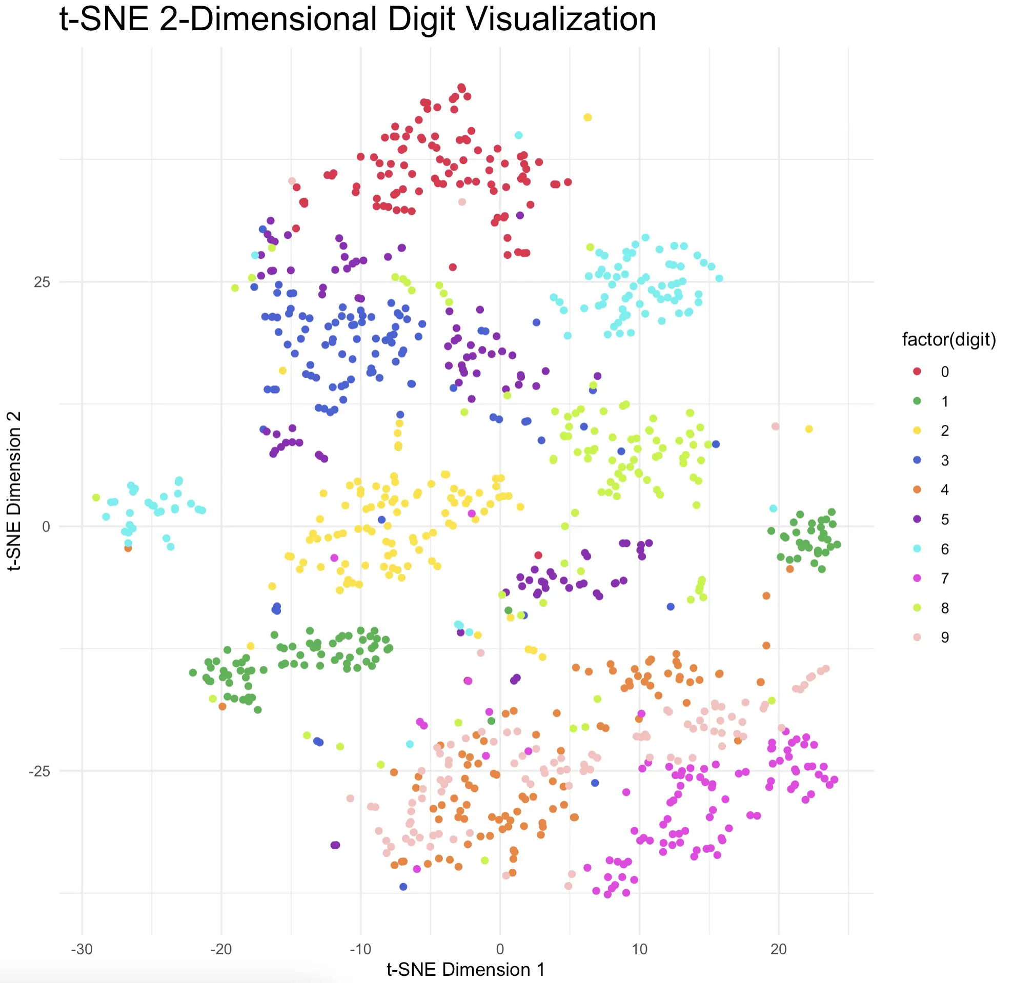
Most digits show almost ideal clustering behavior and are clearly separated from the rest of the pack. That’s just what you want to see, so it’s safe to conclude that t-SNE did a terrific job.
New to scatter plots in R? Read our comprehensive guide to data visualization with ggplot2.
Plotting t-SNE Results in 3 Dimensions
Things are almost identical when going from 2 to 3 dimensions, at least for obtaining the values. Most of the code is the same, except you now want to account for an extra dimension:
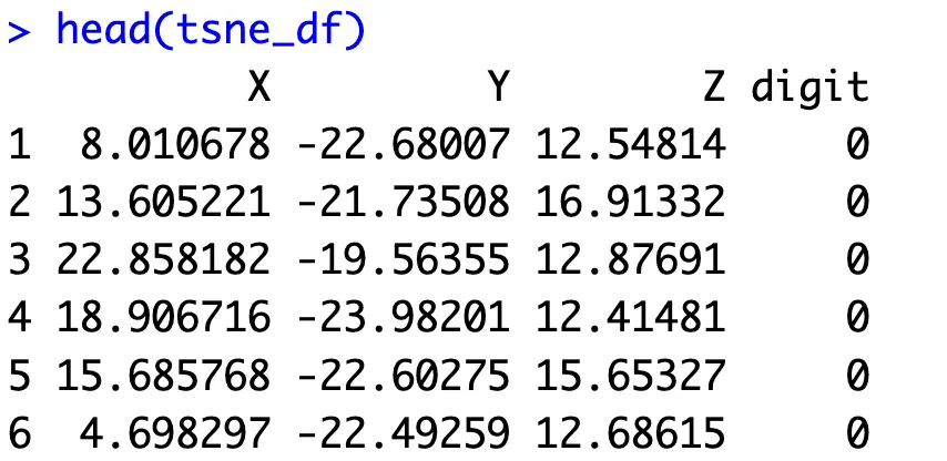
As for the visualization, we’ll move from ggplot2 to Plotly. This will allow you to move the chart however you see fit, and examine the data points from any angle imaginable:
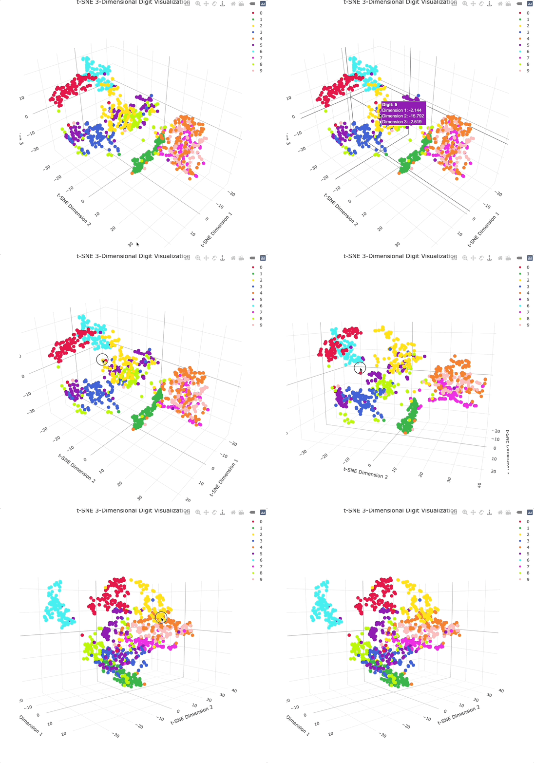
Adding an extra dimension shows even more separation between clusters, especially because you can physically rotate the chart to get the best angle.
[Optional] Perplexity Tuning
Unlike PCA, the results of t-SNE will often vary (sometimes significantly) because of the tweakable parameters and the nature of gradient descent.
This section demonstrates how to tweak the most important parameter - perplexity - and shows you just how different the results are. The values for this parameter typically range from 5 to 50, so we’ll go over this entire range with the step size of 5.
Most of the code below is not new, just organized in a different way:
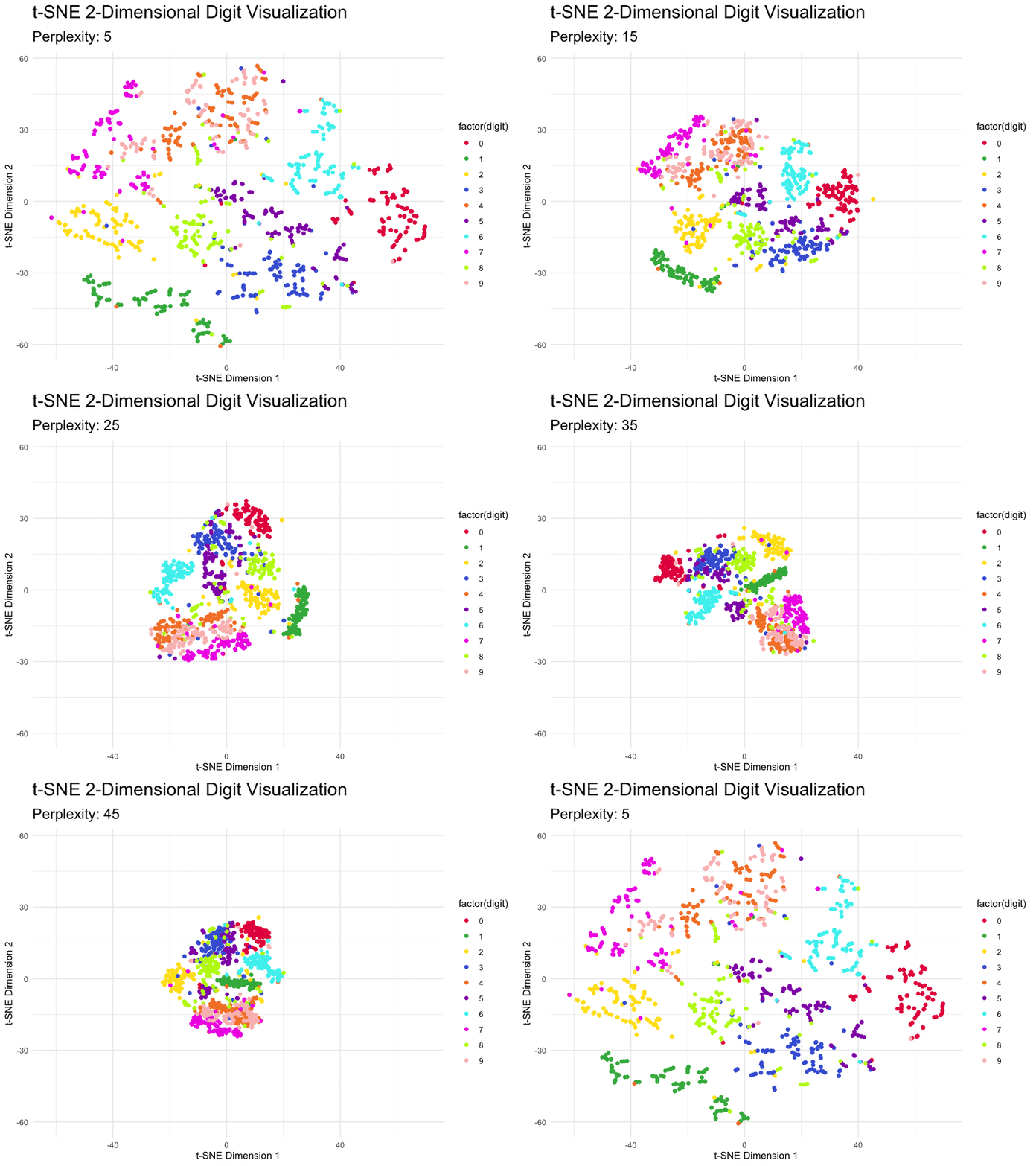
You can see how the magnitudes reduce as you increase the value of perplexity, but the overall clusters don’t break.
How does animation with ggplot work? Our detailed guide to gganimate has you covered.
You can do the same experiment with other parameters, such as the number of iterations and the number of initial dimensions. You can even test all possible combinations and perform a grid search of some sort.
We’ll leave that up to you.
Summing up R t-SNE
If you have a dataset for which PCA fails to provide meaningful visuals, maybe the relationships between variables aren’t linear. You should try t-SNE as it works well with linearly inseparable data.
Just keep in mind that the algorithm works iteratively and has a couple of adjustable knobs, so you aren’t likely to get the same results every time.
That being said, t-SNE is an amazing tool for visualizing highly-dimensional data. We’ve demonstrated that today by going from 784 to 2 and 3 dimensions.
What are your thoughts on t-SNE? What are the scenarios in which you prefer it over PCA? Join our Slack community and let us know!
What’s the best way to visualize time series data in R and R Shiny? Try R Dygraphs, especially if you care about interactivity.
