Time Series Forecasting in R: From Moving Averages to Seasonal ARIMA


When it comes to time series forecasting in R, one thing you don’t lack is options. There are dozens of algorithms and their variations you can choose from, and doing so is usually overwhelming to newcomers.
That’s where this article chimes in. In the next 15 minutes, you’ll go through dataset preprocessing and simple forecasting methods to seasonal ARIMA models. You’ll also learn how to evaluate and compare time series models through evaluation metrics specific to this type of algorithms.
Buckle in, it’s gonna be a long one.
Don’t know the first thing about Time Series Analysis in R? Make sure to read our latest prequel in this series.
Table of contents:
- Data Preprocessing for Time Series Forecasting in R
- Time Series Forecasting in R - The Complete Guide
- How to Evaluate Time Series Forecasting Models in R
- Summing up Time Series Forecasting in R
Data Preprocessing for Time Series Forecasting in R
Just like in the previous article, you’ll use the Airline passengers dataset. It’s not the most exciting one, but requires almost no preprocessing. That’s exactly what you want when first starting out.
You’ll need the following R packages to follow along. If one or more aren’t available on your system, simply install them by running `install.packages(“<package-name>”)` from the R console:
Alright, assuming you have the dataset downloaded and the packages installed, you’re good to proceed!
Dataset Loading and Data Type Conversion
The biggest “issue” with the dataset is that it displays the date information in `YYYY-MM` format. It’s an issue because R won’t be able to infer it by default, so you’ll have to assist.
The `zoo` package has an `as.yearmon()` function that allows you to pass in a year-month string. It will be converted to an appropriate date format automatically:
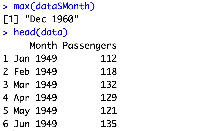
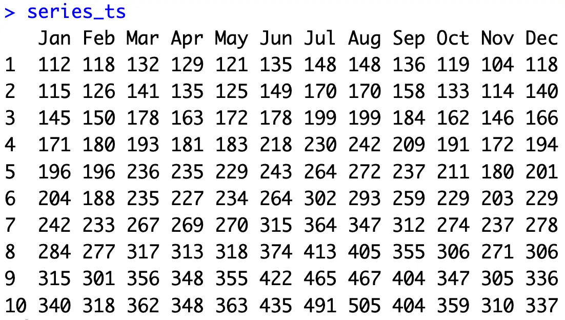
As you can see, there are only two columns - time period and the number of passengers in thousands. The data spans from January 1949 to December 1960, so we have a decent chunk of data to work with.
Train/Test Split
The next step you want to do when forecasting time series data in R is to split the original dataset into training and testing subsets. The idea is to build your model(s) only on training data and then compare its predictions to the test set (actual data).
But with time series, you don’t want to split the data randomly. Time is a crucial component here, and you always want to predict the future in a sequential matter.
The following snippet shows you how to extract the last two years for testing purposes:
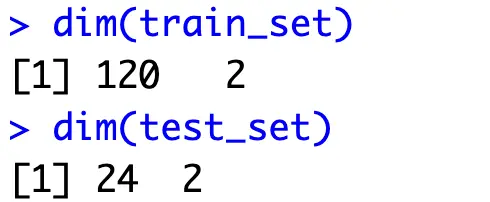
There are 12 months in a year (no missing records), so you now have 10 years of data for training and 2 years for evaluation.
To further drive this point home, let’s visualize both series:
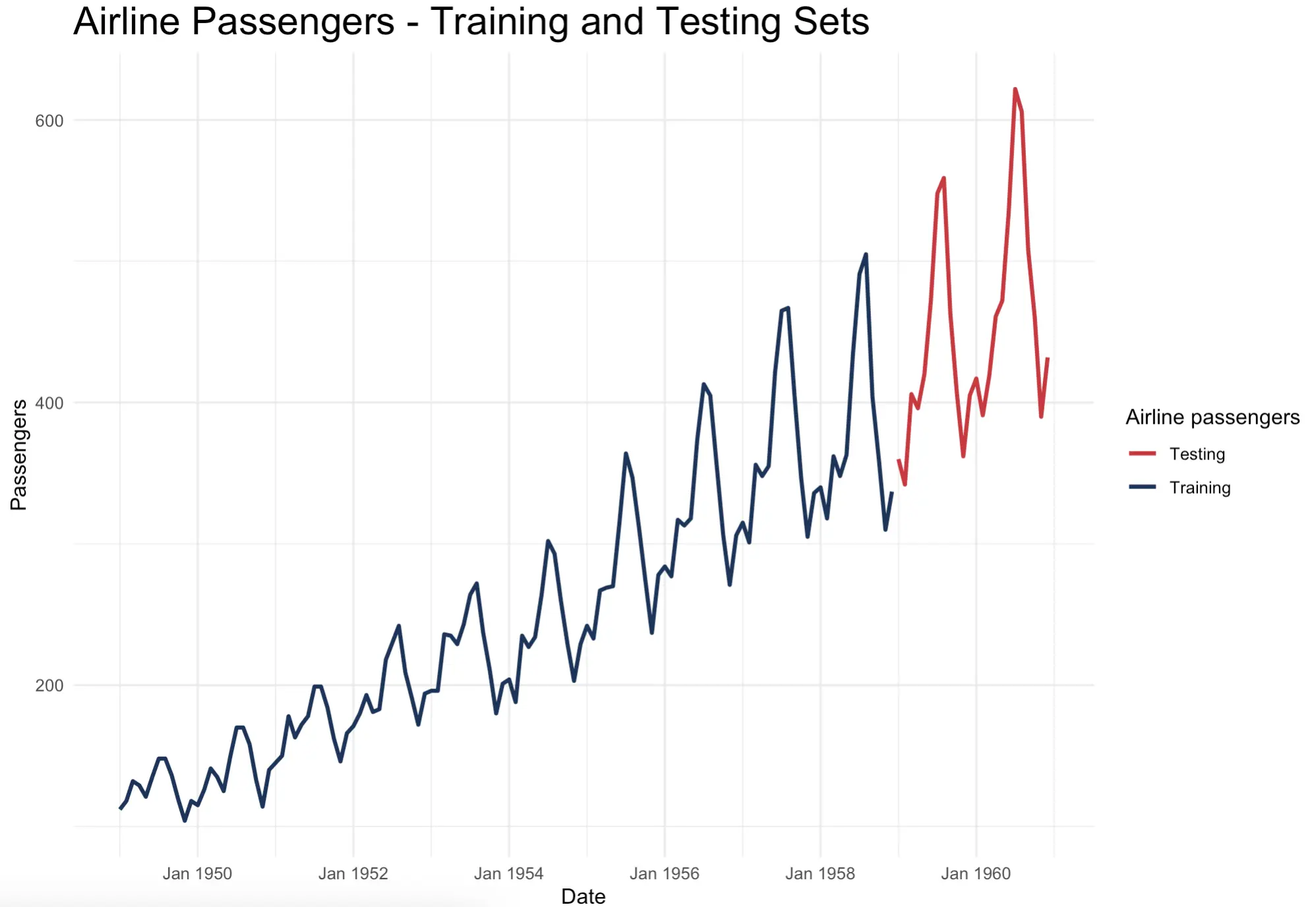
You can now clearly see how the testing set continues where the training set left off. Splitting the data randomly as you would do for traditional machine learning datasets wouldn’t make sense.
The increasing trend and seasonal components are clearly visible. Most people travel by plane during the summer months, and the peaks only get higher with time. It will be interesting to see if time series algorithms can capture that.
Note: We’ll use the above code snippet for visualization purposes throughout the article. The code snippet will always be slightly modified to accommodate a different number of lines shown. To keep the code portions minimal, we won’t share the visualization code.
Time Series Forecasting in R - The Complete Guide
This section will walk you through different time series forecasting algorithms ranging in complexity. Let’s start simple by using no forecasting algorithm whatsoever.
Simple and Naive Forecasting
Predicting future values as a flat line of training set average is typically used to make a baseline in time series forecasting. The premise is simple - you don’t need a sophisticated algorithm if a simple average does the job.
That might be the case for time series data that shows no trend or seasonality, but will be far from an optimal solution in our case.
To calculate this average flat line, simply get the mean value of a training set and repeat it N times, where N is the length of the test set:
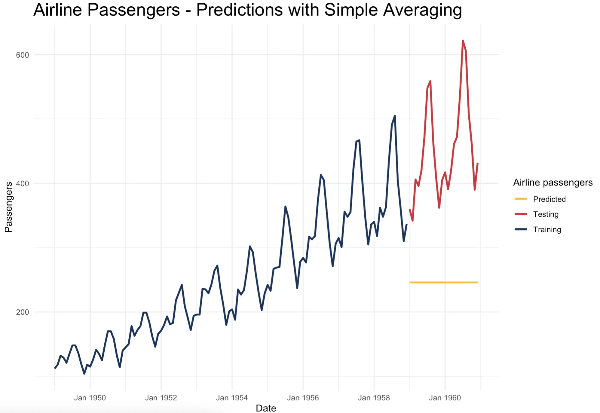
Not impressive at all and the error looks huge, but let’s not worry about metrics just yet. Just from the looks of it, it doesn’t seem to follow the test set well.
Moving Averages
For the rest of the article, you’ll want to convert the `Passengers` numeric vector to a specific time series object. The `forecast::ts()` function is here for you. Since the data captures the fluctuations within a year, you can specify `freqency = 12`:
You now have a specific time series object to work with. It’s also much easier to inspect:
Now, onto moving averages. You can think of these as a specific technique used to smooth out fluctuations and highlight long-term trends within the data. You select a window size (the number of data points used to calculate the average), calculate the average of a window, and then move the window over the series.
There are many flavors of moving averages, but we’ll stick with a simple one here. The others may put more weight on different data points in the window.
Moving averages are useful for smoothing out the noise due to averaging and identifying general trends. They fall behind when there are sudden changes and anomalies in the data. It’s also worth noting that a window size can significantly impact the results you get, so it’s worth playing around with this parameter.
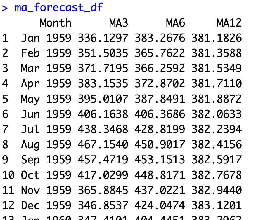
We’ll do just that - create the model and forecasts for moving averages of window sizes 3, 6, and 12:
You now have a dataframe with actual values and predictions:
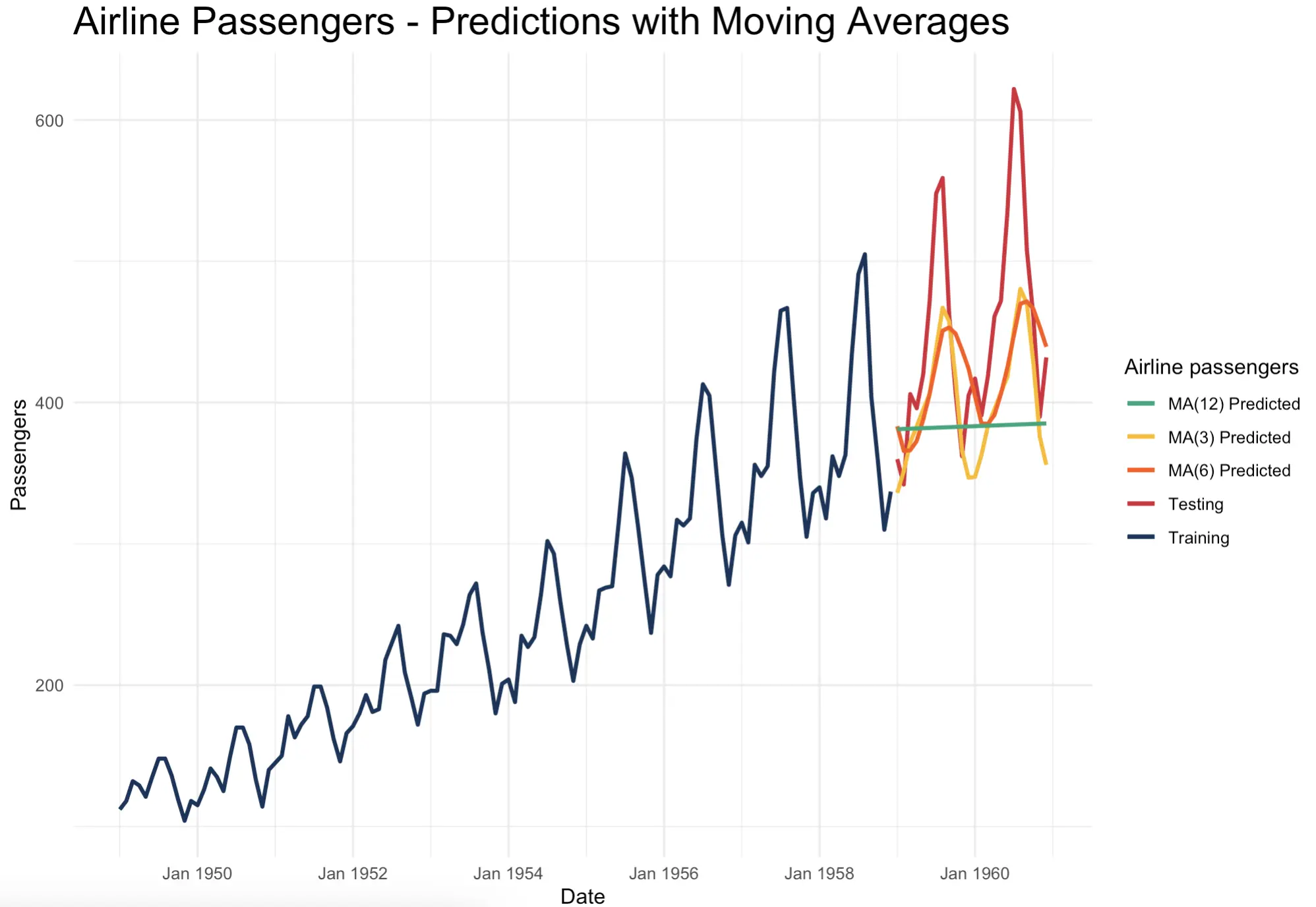
When visualized, it’s easy to see how moving averages work. The larger the window size you choose, the fewer “peaks” and “valleys” you’ll capture. You’re essentially smoothing out the series with the aim of keeping the trend and somewhat removing the seasonal effects:
That’s moving averages for you. Up next, let’s dive into exponential smoothing.
Exponential Smoothing
Unlike moving averages, exponential smoothing algorithms will assign exponentially decreasing weights to historical data. In plain English, this means that more recent data points are more important for forecasting. This fact makes exponential smoothing algorithms adaptable and useful in dynamic environments, as more weight is placed on recent observations.
In practice, you’ll encounter three types of exponential smoothing algorithms:
- Simple Exponential Smoothing (SES) - A method that assigns exponentially decreasing weights to past observations. It’s typically used when data shows no trend or seasonality.
- Double Exponential Smoothing (DES) - Also known as Holt’s method, it extends SES by capturing trends in the data. It’s useful for forecasting time series data that has a clear trend but no seasonality.
- Triple Exponential Smoothing (TES) - Also known as the Holt-Winters method, it extends DES by capturing seasonality. It’s typically used when time series data shows both trend and seasonality, which most time series datasets do.
By knowing this, it seems like TES would be a perfect candidate for forecasting on the Airplane passengers dataset!
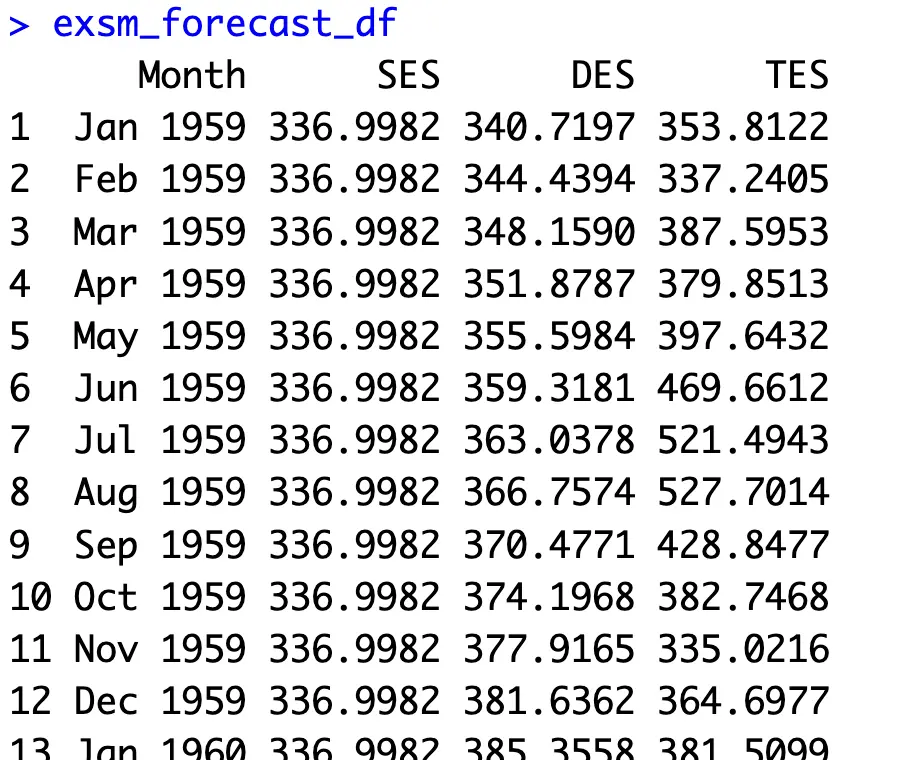
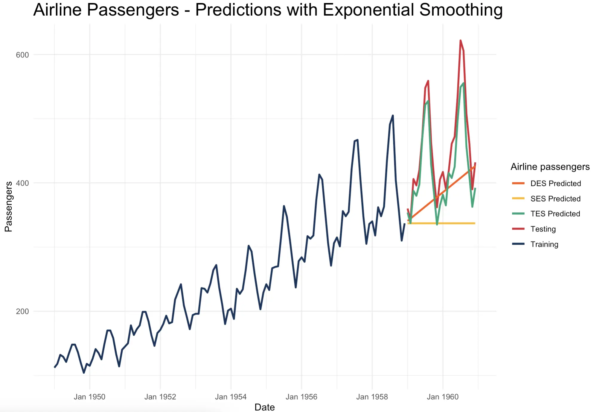
But let’s test all three. The `HoltWinters()` method runs triple exponential smoothing by default, but you can turn off `beta` and `gamma` parameters to build SES and DES models:
Once again, you have a dataframe with actual data and predictions for every algorithm:
The theory makes sense as soon as the predictions are visualized. SES is essentially a flat line that doesn’t capture either trend or seasonality. DES captures the trend correctly, but TES looks almost identical to the actual data from the test set:
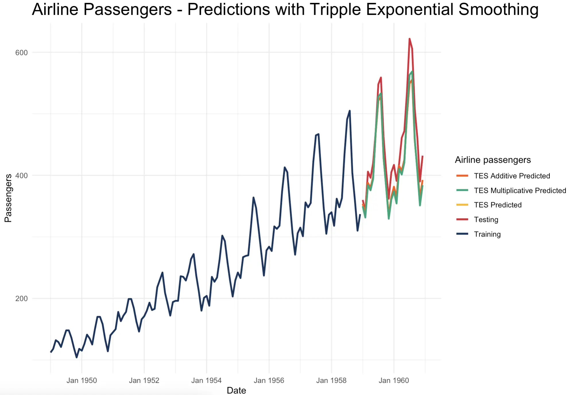
The `HoltWinters()` function also allows you to change how the seasonal component is combined with the modeling formula. You can either add it (additive) or multiply (multiplicative) it with the rest.
Let’s create a model for both to see how they differ:
It seems like `HoltWinters()` uses an additive seasonality option by default. Switching it to multiplicative better captures the peaks in the series, but is slightly worse on the valleys:
As said earlier, let’s not worry about the actual correctness just yet. There’ll be a dedicated section later in the article.
But first, let’s go over a slightly more complex family of time series forecasting models - ARIMA.
ARIMA Models
Covering all there is to ARIMA models would require a couple of articles at least, so we’ll go only the basics for now.
ARIMA stands for Auto Regressive Integrated Moving Average and is a popular family of algorithms to capture a wide range of patterns in the data. The I (Integrated) part is an interesting one - it assumes your data isn’t stationary and stands for the order of differencing required to make it stationary.
The Auto Regressive (AR) part says that the value of a variable at a given time point is modeled as a linear function of its previous variables, or lags. You already know what the Moving Average (MA) is.
The `Arima()` function in R allows you to create a full ARIMA model, or only to use it partially. For example, you can tweak the parameters to build only AR, MA, and ARMA models. The parameters you’ll typically see when it comes to ARIMA are named `(p, d, q)`.
To make matters even more complicated, ARIMA can also capture seasonal patterns. This algorithm variation is called SARIMA. It has a somewhat more complex parameter structure - `(p, d, q)(P, D, Q)m`. You already know what the first set of parameters covers. The uppercased parameters are here to add the seasonal components with a seasonal period of `m`. In the case of Airline passengers, that would be 12.
The good thing about R is that you don’t have to worry about manual parameter configuration. The `auto.arima()` function automates the entire process for you, as it automatically chooses the best-resulting values for both seasonal and non-seasonal models.
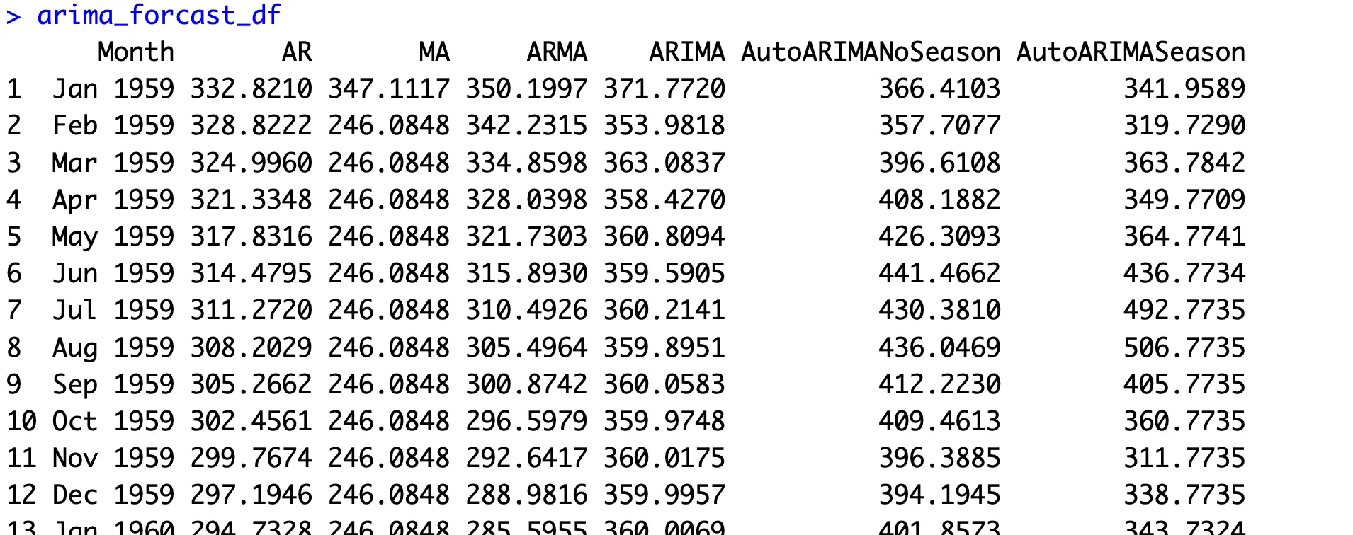
The following code snippet builds 6 models - AR, MA, ARMA, manual ARIMA, auto ARIMA without seasonality, and auto ARIMA with seasonality:
These are the results you’ll get:
When inspected visually, it’s easy to see that seasonal ARIMA, or SARIMA performs the best:
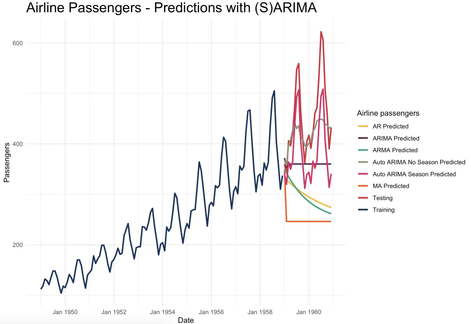
Looking at the above chart reveals one fact that’s often overlooked in data science - Just because a model is more complex, it doesn’t mean it’s better. SARIMA looks like a top performer here, but the predicted line still looks worse than the one yielded by exponential smoothing models.
Let’s verify if that’s the case by going through an evaluation process.
How to Evaluate Time Series Forecasting Models in R
By now, you’ve only looked at the results visually and tried to eyeball which prediction line is the closest to the actual data. It’s not the worst approach, but we’d rather look at the concrete numbers.
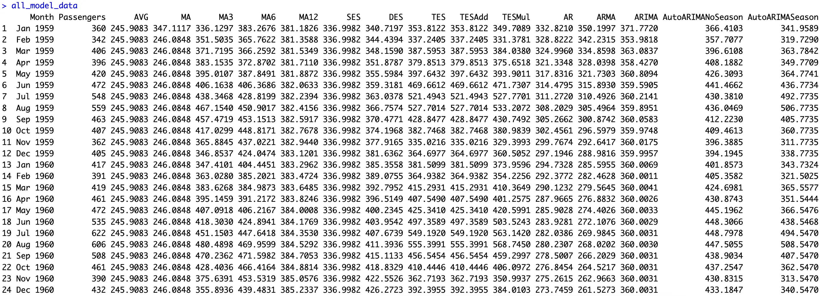
First things first, you should collect all of your model predictions into a single dataframe object, alongside the ground truth data:
We’ve built a lot of models today, that’s for sure:
Onto the evaluation now.
With time series, you typically want to use metrics like Mean Absolute Error (MAE), Mean Absolute Percentage Error (MAPE), and Root Mean Squared Error (RMSE). MAE will show you how far off the model is in terms of thousands of passengers on average. MAPE will show the same but expressed as a percentage. RMSE will be similar to MAE, but will penalize larger errors more due to squaring.
Overall, you can easily loop over the columns and use the `Metrics` package to calculate these 3 values for all algorithms:
Here are the results we got:
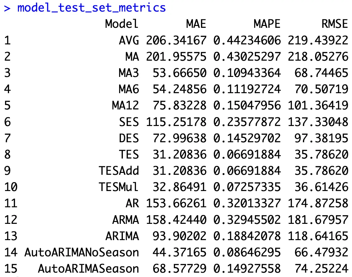
Our baseline (predictions as a flat line of train set averages) is by far the worst model in all three metrics - that’s good, as it means it makes sense to invest time into building time series models.
ARIMA model without seasonality seems to be performing better than SARIMA, even though SARIMA looks better on the chart. That’s because of the overexaggerated valleys.
But the stars of the show are your simple exponential smoothing models. Triple exponential smoothing (Holt-Winters) seems to do best for this dataset, being wrong for about 35.8K passengers on average, or 6.7%. That’s impressive!
Summing up Time Series Forecasting in R
Overall, there’s a lot that goes into time series forecasting in general, but R hides 99% of math and abstractions from you. It’s a good thing if you’re a practitioner, as the only thing you need to build highly accurate models is a couple of lines of code and a curious mind. If you want to dive deeper into the math, the functions shown today allow you to tweak all the possible formula parameters.
Evaluating the performance of your time series models is also a breeze. Just make sure you choose a metric that’s relevant for time series data.
You now know how to build basic time series models in R. But what about machine learning? Can you apply regression or boosting algorithms to time series data? Make sure to stay tuned to the Appsilon blog, and we’ll make sure to let you know.
Looking to make your time series charts animated and interactive? Be sure to check out our guide on R Highcharts visualization package.


.png)


