R tidymodels: A tidyverse Like Ecosystem for Efficient Machine Learning in R

Have you ever thought R’s approach to machine learning is outdated?
Like, data analysis and visualization tools are superb. Everything feels intuitive and every following step of your workflow integrates seamlessly. That’s by design. Or, the design of the tidyverse collection of packages.
R tidymodels aims to do the same but for machine learning. It presents itself as a one-stop shop for everything ML-related, from processing data to training and evaluation models. It’s an ecosystem of its own and currently combines 9 R packages to cover a wide array of machine learning applications.
Today you’ll learn how to use R tidymodels by training and evaluating a classification model.
Are you a pharmaceutical expert with a passion for machine learning? See how the two intersect.
Table of contents:
- Wine Quality Dataset Exploration
- R tidymodels in Action - Model Training, Recipes, and Workflows
- R tidymodels Model Evaluation - From Numbers to Charts
- Summing Up R tidymodels
Wine Quality Dataset Exploration
Let’s get down to business.
We’re using the Red Wine Quality dataset for this article. You can download the CSV file, or load the file straight from the internet. The code snippet below shows how to do the latter.
The dataset has a header row and uses a semicolon for a delimiter, so keep that in mind when reading it.
If any of the below packages raise an import error, install them by running `install.packages(“<package-name>”)` from the R console.
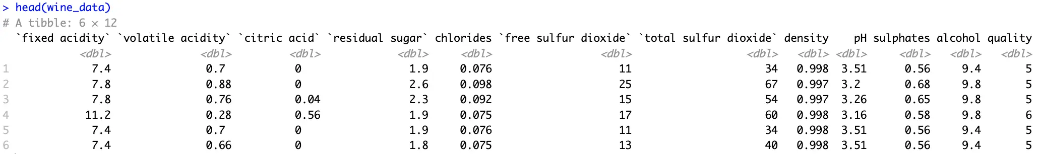
We’ve selected this dataset because it doesn’t require much in terms of preprocessing. All features are numeric and there are no missing values. Scaling is an issue, sure, but we’ll cross that bridge when we get there.
Another issue is the distribution of the target variable:
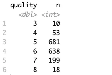
Two major issues:
- Variable type - We’ll build a classification dataset, and it needs a factor variable. Conversion is fairly straightforward.
- Too many distinct values - That is, if you consider how few data points are available for the least represented classes.
To mitigate, you’ll want to group the data further, let’s say into three categories (bad, good, and great), and convert this new attribute into a factor:
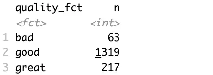
Better, but the data still suffers from a class imbalance problem.
Since it’s not the focal point of today’s article, let’s consider this dataset adequate and shift the focus to machine learning.
R tidymodels in Action - Model Training, Recipes, and Workflows
This section will walk you through the entire machine learning pipeline, without evaluation. That’s what the following section is for.
Train/Test Split
The tidymodels ecosystem uses the `rsample` package to perform a train/test split. To be more precise, the `initial_split()` function is what you’re looking for.
It allows you to specify the portion of the data that’ll belong to the training set, but more importantly, it allows you to control stratification. In plain English, you want to use stratified sampling when classes in your target variable aren’t balanced. This way, the split will preserve the proportion of each class in the resulting training and testing set:
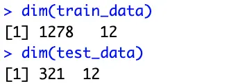
These subsets will be used for training and evaluation later on.
R tidymodels Recipes
The `recipes` package is part of the tidymodels framework. It provides a modern and consistent approach to data preprocessing, which is an essential step before predictive modeling.
There are dozens of functions you can choose from, and the one(s) you go with will depend on your data. Our wine quality dataset is clean, free of missing values, and contains only numerical features. The only problem is the scale.
That’s where `step_normalize()` function comes in. Its task is to normalize numeric data to have a mean of 0 and a standard deviation of 1.
But before normalizing numerical features, you have to specify how the data will be modeled with a model equation. The left part contains the target variable, and the right part contains the features (the dot indicates you want to use all features). You also have to provide a dataset, but just for fetching info on column names and types, not for training:
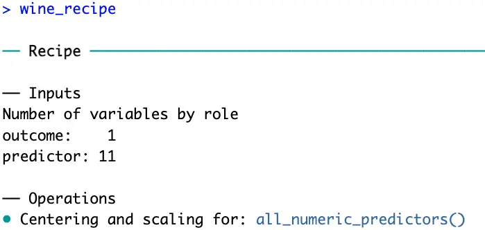
R recipes now knows you have 11 predictor variables which should be scaled before proceeding.
Workflows and Model Definition
Workflows in R tidymodels are used to bundle together preprocessing steps and modeling steps. So, before declaring a workflow, you’ll have to declare the model.
A decision tree sounds like a good option since you’re dealing with a multi-class classification dataset. Just remember to set the model in classification mode:
And now finally, you can chain these two into a workflow:
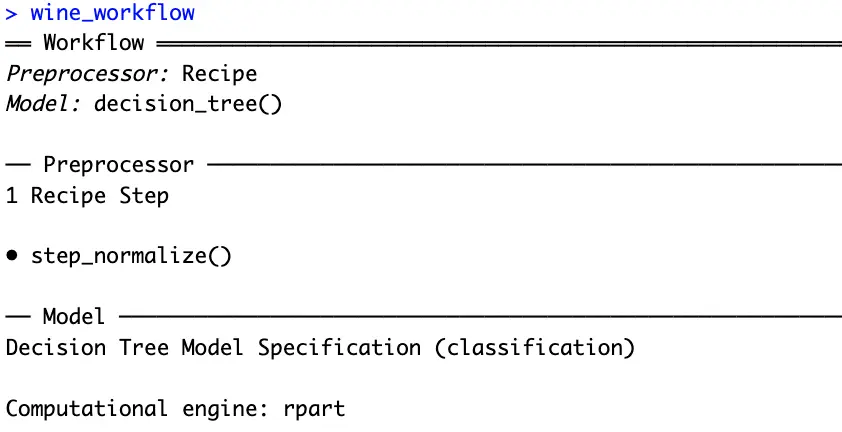
That’s everything you need to train a machine learning model. The tidymodel package knows you want to create a decision tree classifier, and also knows how the data should be processed before training.
Model Fitting
The only thing left to do is to chain a `fit()` function to the workflow. Remember to fit the model only on the training dataset:
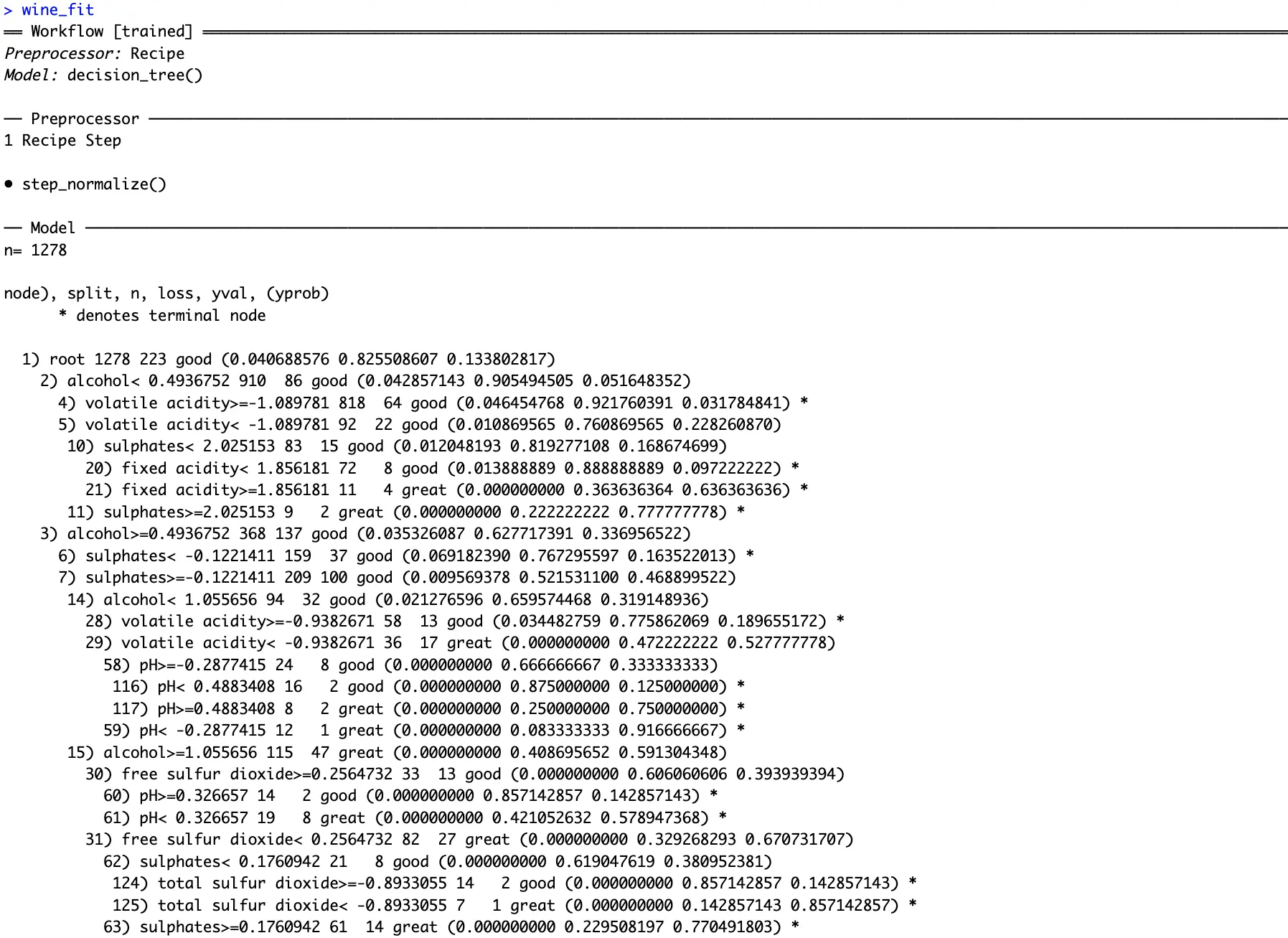
You can see how the fitted decision tree classifier decided to shape the decision pathways. Conditions might be tough to spot from text, so in the next section, we’ll dive deep into visualization.
R tidymodels Model Evaluation - From Numbers to Charts
This section will show how good your model is. You’ll first see how the model makes decisions and which features it considers to be most important. Then, we’ll dive into different classification metrics.
Model Visualization
Remember the decision tree displayed as text from the previous section?
It takes two lines of code to represent it as a chart instead of text. By doing this, you’ll get deeper insights into the inner workings of your model. Also, if you’re a domain expert, you’ll have an easier time seeing if the model makes decisions in a similar way you would:
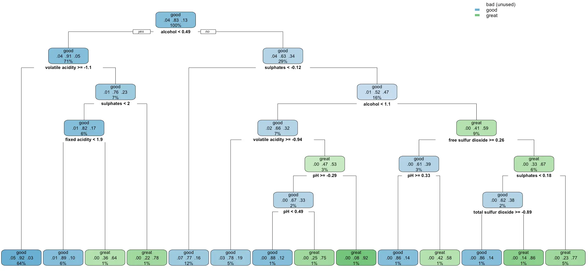
It looks like the model completely disregards the `bad` category of wines, probability because it was the most unrepresented one. It’s something worth looking into if you have the time.
Similarly, you can extract and plot feature importances of a decision tree classifier:
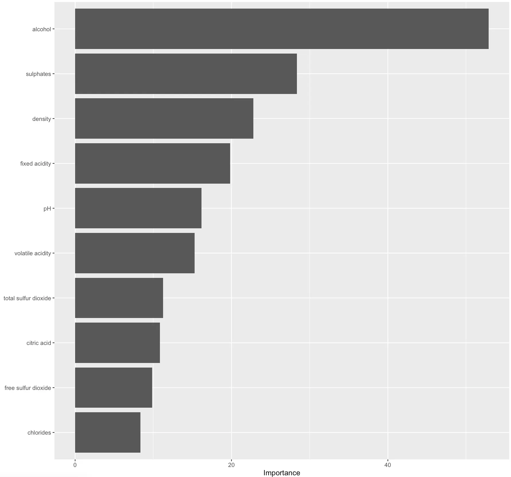
The higher the value, the more predictive power the feature carries.
In practice, you could disregard the least significant ones to get a simpler model. Out of the scope for today, but I would be interesting to see what impact would this have on prediction quality.
Prediction Evaluation
Speaking of prediction quality, the best way to understand it is by calculating predictions on the test set (previously unseen data) and evaluating it against true values.
R tidymodels uses the `yardstick` package to implement evaluation metrics.
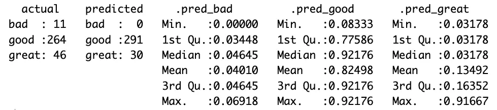
The following code snippet will get the predicted classes and prediction probabilities per class for you. It will also rename a couple of columns, so they’re easier to interpret:
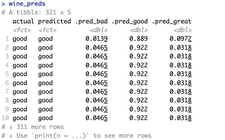
Actual and predicted classes all match in the above image and probabilities are high where they should be.
It looks like the model does a good job. But does it? Evaluation metrics for the classification dataset will answer that question. We won’t explain what each of them does, as we have an in-depth article on the subject.
The following snippet prints the values for accuracy, precision, and recall:
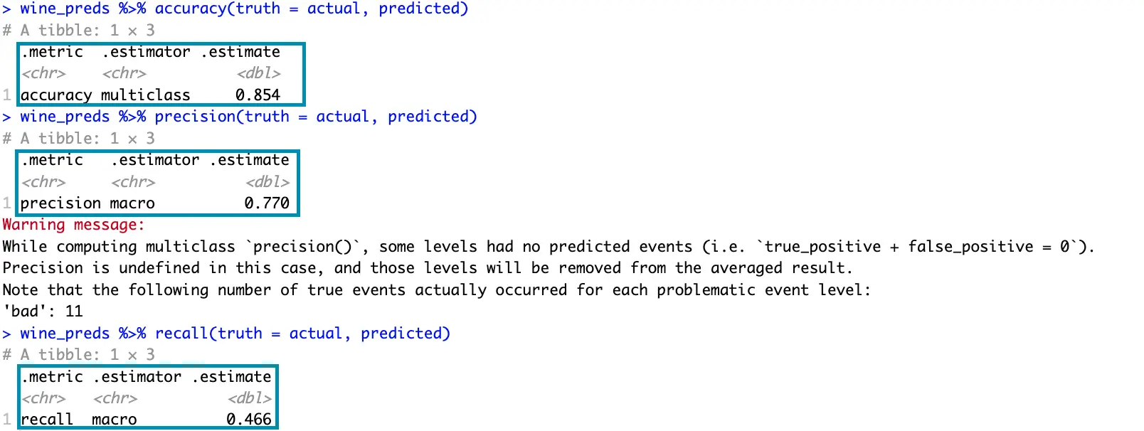
You already know that the decision tree model completely disregards the `bad` quality wines, so that’s why you get a warning message.
That’s also clearly visible if you print the confusion matrix:
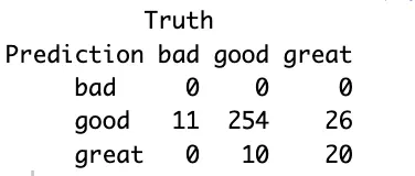
The model misclassified 11 bad wines as good, which is potentially a concerning factor. Further data analysis would be required to drive any meaningful conclusions.
If you find the confusion matrix to be vague, then the model summary will show many more statistics per target variable class:
You now get a more detailed overview of the values in the confusion matrix, along with various statistical summaries for each class.
R tidymodels (yardstick in particular) come with a couple of visualizations you can show to get a better understanding of your model’s performance.
One of these is an ROC (Reciever Operating Characteristics) curve. In short:
- It plots the true positive rate on the x-axis and the false positive rate on the y-axis
- Each point on the graph corresponds to a different classification threshold
- The dotted diagonal line represents a random classifier
- The curve should rise from this diagonal line, indicating that predictive modeling makes sense
- The area under this curve measures the overall performance of the classifier
ROC curve has to be plotted for each class of the target variable individually, and doing so is quite straightforward with tidymodels:
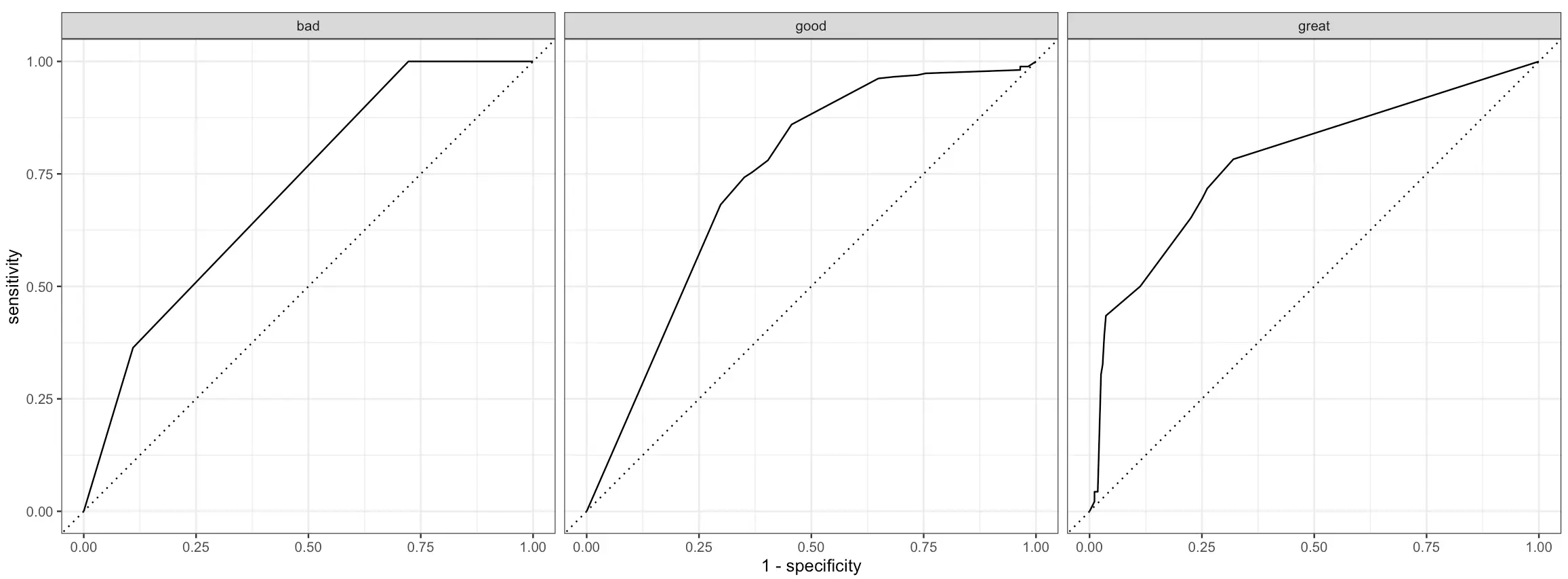
Better than random, but leaves a lot to be desired.
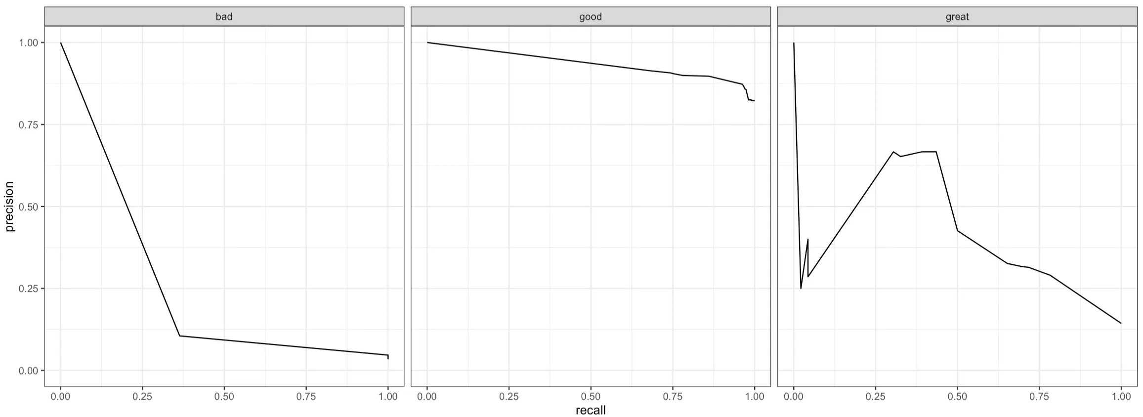
Another curve you can plot is the PR (Precision-Recall) curve. In short:
- It plots precision (y-axis) against recall (x-axis) for different classification thresholds to show you the trade-offs between these two metrics
- A curve that’s close to the top-right corner indicates the model performs well (high precision and recall)
- A curve that’s L-shaped suggests that a model has a good balance of precision and recall for a subset of thresholds, but performs poorly outside this range
- A flat curve represents a model that’s not sensitive to different threshold values, as precision and recall values are consistent
Just like with ROC curves, PR curves work only on binary classification problems, meaning you’ll have to plot them for every class in the target variable:
And that’s all we want to show for today. There are more evaluation metrics available, but these are the essential ones you’ll use in all classification projects.
Summing Up R tidymodels
To conclude, R tidymodels provides a whole suite of packages that work in unison.
The entire pipeline achieves the same results as the one that uses a traditional set of R’s functions, but you can’t negate the benefit of improved code flow, increased readability, and similarity with other packages you’re using daily. That is, if you’ve worked with tidyverse before. And you probably did.
Building and evaluating machine learning models with tidymodels is a pleasant developer experience, and we’ve only scratched the surface. There are many more models to explore, evaluation metrics to use, and data processing functions to call. We’ll leave that up to you.
What are your thoughts on R tidymodels? Has this suite of packages replaced R’s default functions for machine learning? Join our Slack community and let us know.
If you’re looking to make your machine learning data pipelines scalable and reproducible, R {targets} is worth checking out.