R Principal Component Analysis: Apply and Understand R PCA in Minutes

Did you ever have to deal with a highly-dimensional dataset? Think hundreds of columns. If so, were all the features (dimensions) relevant for analysis and modeling? Of course, they weren’t, that’s rarely the case.
The good news: Data Science has a set of algorithms that enable you to see what matters and what doesn’t. One such tool is Principal Component Analysis (PCA). It’s an unsupervised algorithm used to reduce dimensionality by calculating principal components - new features that capture the essence of your data, hopefully in fewer dimensions.
This article will teach you the basics of Principal Component Analysis in R focusing on application, drawing insights, and visualization. We’ll use the well-known Iris dataset for simplicity, but the methods described are applicable to any tabular dataset out there.
Let’s dig in!
Coding a classification machine learning algorithm? Use these 10 metrics to evaluate the performance of your model.
Table of Contents:
- Introduction to Principal Component Analysis
- Principal Component Analysis in R Prerequisites - Get Your Data in Order
- R PCA in Action
- Visualizing Principal Component Analysis in R
- Summing up R PCA
Introduction to Principal Component Analysis
PCA is a mathematical technique used for dimensionality reduction. The ultimate goal is to reduce the number of features your dataset has while preserving most of the original information.
After applying PCA to your dataset, you’ll end up with seemingly uninterpretable principal components instead of your original features. Each of these components captures one-directional variance of the entire dataset.
This comes in handy because you can typically use 2-3 components to capture some decent percentage of variance in the original dataset, and then visualize them to see how the data is spread out. Of course, you won’t get a full picture since you need N principal components to perfectly describe N dataset features. Still, you’ll gain a visual understanding of your data that’s impossible to get from the raw features.
The entire algorithm can be boiled down to a three-step process:
- Data Scaling - Essentially, you don’t want some features to be voted as “more relevant” due to scale differences. In other words, 1 meter is the same as 1000 millimeters, but machine learning algorithms tend to favor features with greater magnitude. You want all your features centered around 0 with a standard deviation of 1.
- Covariance Matrix Calculation - The measure of variance reports variation of a single random variable. Covariance does the same thing but for two random variables. The covariance matrix will be a symmetrical square matrix with variances on the diagonal and covariances on other elements.
- Eigendecomposition - This long word from linear algebra represents the process of decomposing a square matrix into eigenvectors (unit vectors) and eigenvalues (magnitudes of unit vectors). Calculating these basically computes principal components. Eigenvectors of symmetrical matrices are orthogonal, meaning the first principal component will explain most of the dataset’s variance, the second will explain most of the remaining variance in the orthogonal direction, and so on.
The resulting principal components will be sorted by percentage of explained variance. From there on, you’re the boss! You decide how many components should you keep. For example, if you’re starting out with 100 features, but the first 3 principal components explain 95% of the variance, it makes sense to keep only these three for visualization and model training. You’ll end up with a much simpler model as a result.
Luckily for you, we won’t implement the PCA algorithm from scratch. It makes no sense to do so since R comes with a convenient `prcomp()` function that does the job. Before exploring it, let’s make sure our data is adequate.
Principal Component Analysis in R Prerequisites - Get Your Data in Order
As mentioned earlier, we’ll use the Iris dataset for the sake of simplicity. All principles will work the same on larger, real-world datasets.
The following snippet shows all the R packages needed to follow along. If you don’t have any of these installed, run the `install.packages(“<package-name>”)` command from the R console. The snippet also loads the Iris dataset and prints the first couple of records:

Missing Values
The first order of business is dealing with missing values. The Iris dataset doesn’t contain any, but for the sake of argument let’s say we don’t know that.
The following code snippet will print missing value column sums - the number of missing values present in the dataset per column:

If your dataset contains some, you should either impute or remove them before proceeding.
New to missing values in machine learning? Read our guide to learn the top 3 ways to impute missing values in R.
Removing the Target Variable
Principal Component Analysis obviously works only on numerical data. Our dataset has a `Species` column that is textual and represents the target variable. We’ll create two new variables - `X` and `y`. The prior represents the numerical features while the latter holds the target variable values:
Data Standardization
As mentioned in the theoretical section, all of your features should be on an identical scale. You’ll want to use Z-scaling, also known as Standard scaling, implemented in R’s `scale()` function.
This will compute Z-scores - values that are the result of subtracting the average value from individual values in the column, and then dividing it by the standard deviation of the column:
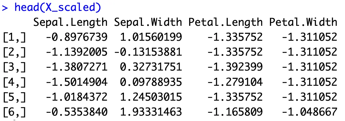
In case you have a dataset where a column has a constant value, its standard deviation will be 0. Since division with 0 is not possible, you’ll want to exclude columns as these from data scaling, and then glue them back in the correct order.
Anyhow, you can test if data scaling was successful by calculating the average mean and average standard deviation of all columns:
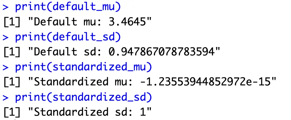
Every column now has an average value of 0 with a standard deviation of 1 - just the format you need to calculate principal components.
R PCA in Action
PCA in R boils down to calling the `prcomp()` function and passing in a dataframe of scaled numerical features:

What you should be looking at is the proportion of variance and cumulative proportion values. The prior tells you how much variance each principal component captures from the entire dataset, while the latter shows how many components you need to capture some percentage of total variance. For example, if you decide 95% of the variance is enough, the first two principal components are all you need.
For the sake of easier analysis and visualization later on, we’ll create a helper dataframe that basically rearranges the values of `summary(pca_result)`:

Now let’s dive into the interesting stuff - visualization.
Visualizing Principal Component Analysis in R
The original Iris dataset is difficult to visualize in its entirety. There are 4 numerical features and one target variable. We humans still haven’t figured out a way to see past the third dimension. Principal components can help since you’re visualizing the information from the original data but in a space humans can interpret.
Scree Plot
A scree plot is a helpful visualization used to determine the number of principal components you should keep. Data scientists typically use the “elbow” rule to determine where the amount of additional explained variance drops sharply, hence finding the optimal number of principal components to retain.
There are many built-in visualizations for scree plots, but none of them (that we could find) show both the explained variance and cumulative explained variance. That’s why we’ll visualize it from scratch:
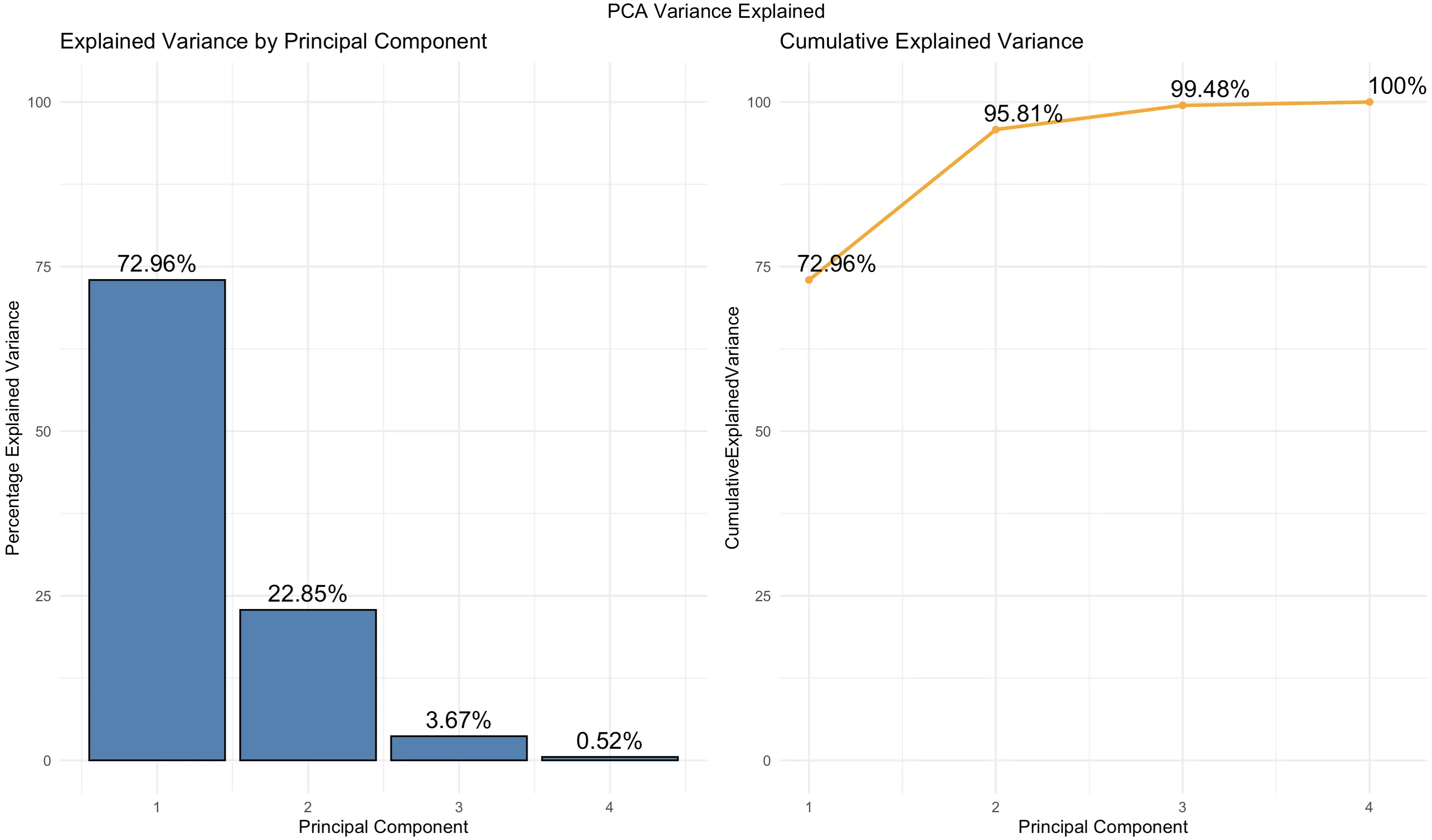
You can see that the charts are just another way of showcasing the values you already know from a tabular format.
But, keep an eye on the cumulative percentage of explained variance - 2 components explain ~ 96%, and 3 components explain ~ 99.5%. This means you can visualize them to see the true essence of the Iris dataset in a lower-dimensional space.
Let’s do that next.
2-Dimensional PC Scatter Plot
Up first, the two-dimensional charts. Almost all the dataset variance can be explained by the first two principal components. We’ll make a scatter plot and change the individual marker color and shape to match the `Species` target variable:
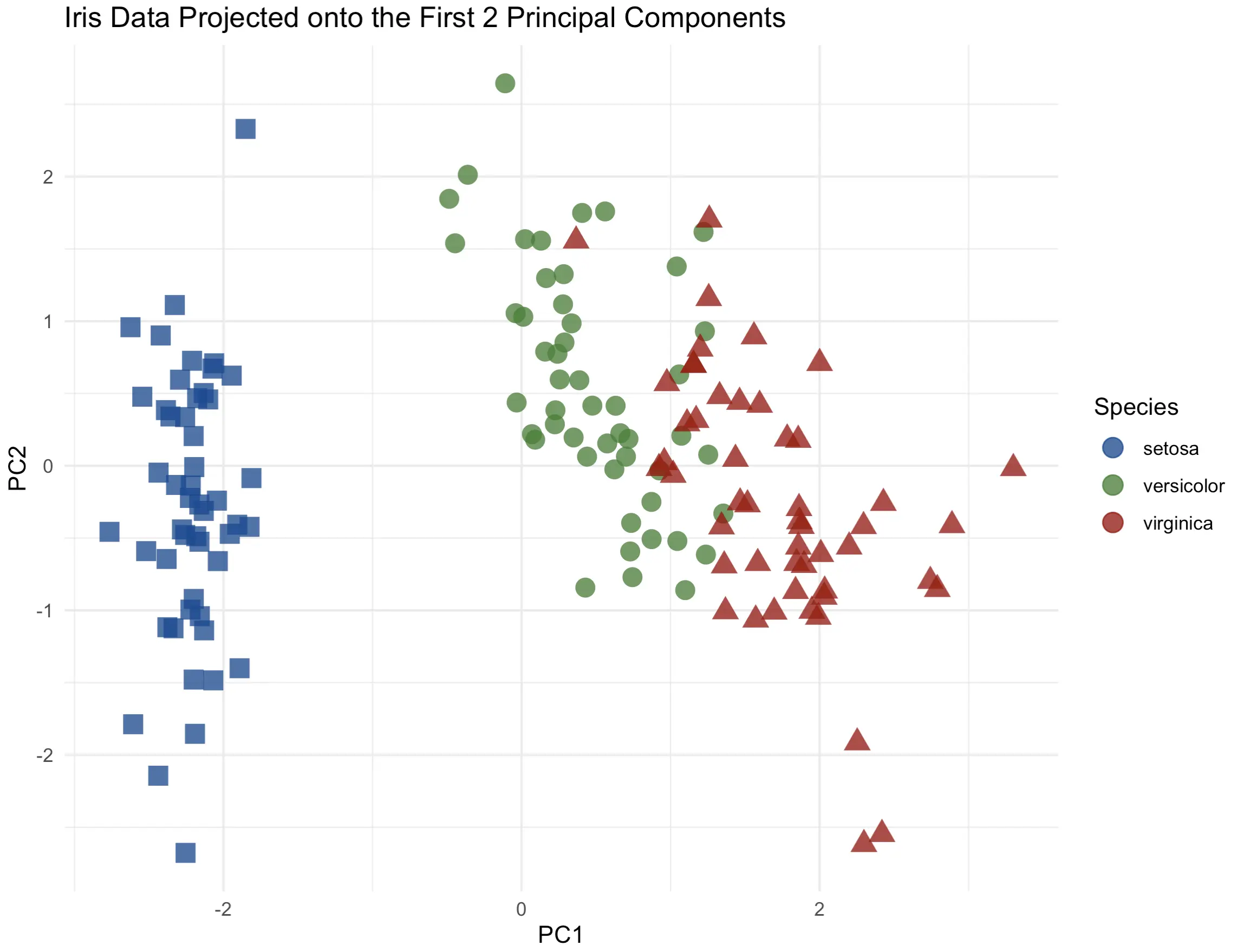
There’s a clear distinction between the flower species, especially from setosa to the others. Up next, let’s see if adding a third dimension can increase the information quality.
3-Dimensional PC Scatter Plot
We’ll use the Plotly package to create a 3-dimensional scatter plot. We’ll also modify a couple of things while here - marker symbol, color, and the text displayed when hovering over an individual data point:
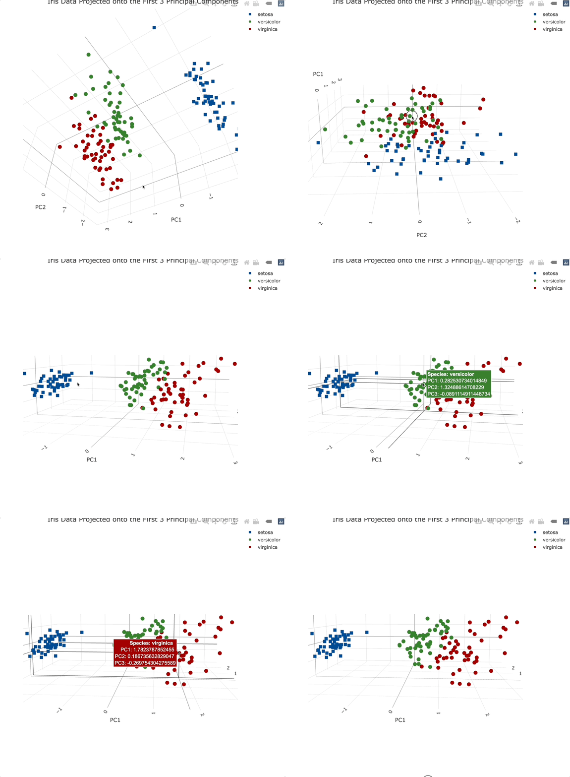
Plotly charts are interactive by default, meaning you can zoom in, and out, rotate them, and generally manipulate them however you see fit. It’s a must-have for 3-dimensional data visualization.
Adding a third principal component into the mix didn’t add that much information. That’s expected since it only accounts for an additional ~3.5% of variance.
Attribute Biplot
Let’s now get into a highly specific visualization type - biplot. In plain English, it shows the relationship between principal components and original variables. It provides a way to interpret PCA results and understand how the original variables contribute to the principal components.
Biplot shows the first two principal components on the X and Y axes. Vectors (arrows) represent the original variables. Their direction and length indicate how strongly each variable influences principal components (longer = more). The angle between vectors shows the correlation between variables - the closer they are together, the more correlated they are.
In R, you can call the `factoextra::fviz_pca_var()` function to visualize a biplot:
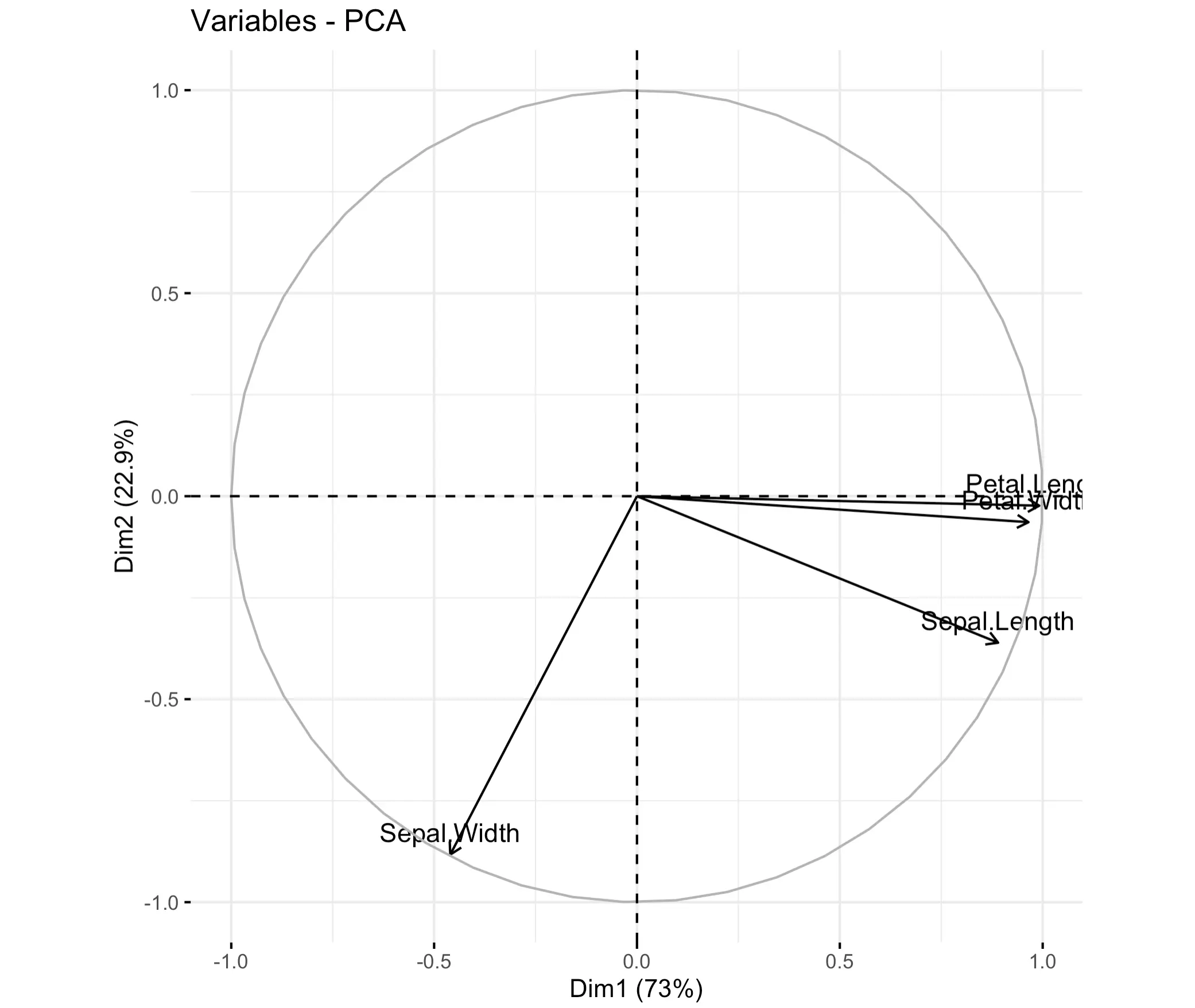
As you can see, petal length and width are highly correlated. Sepal length is also quite there, but sepal width is highly individual.
Loading Score Plot
And finally, let’s take a look at loading scores. You can think of these as coefficients that show how much each original variable contributes to each principal component. Some use it as a way to find the most relevant features in the dataset. After all, if the first principal components account for ~ 70% of the variance, it makes sense to see which features contribute the most to this high percentage.
Loading scores range from -1 to +1. Most of the time you won’t be interested if the value is positive or negative - you’re just looking for the highest absolute value.
The following bar chart shows a 2x2 grid of loading scores for every principal component:
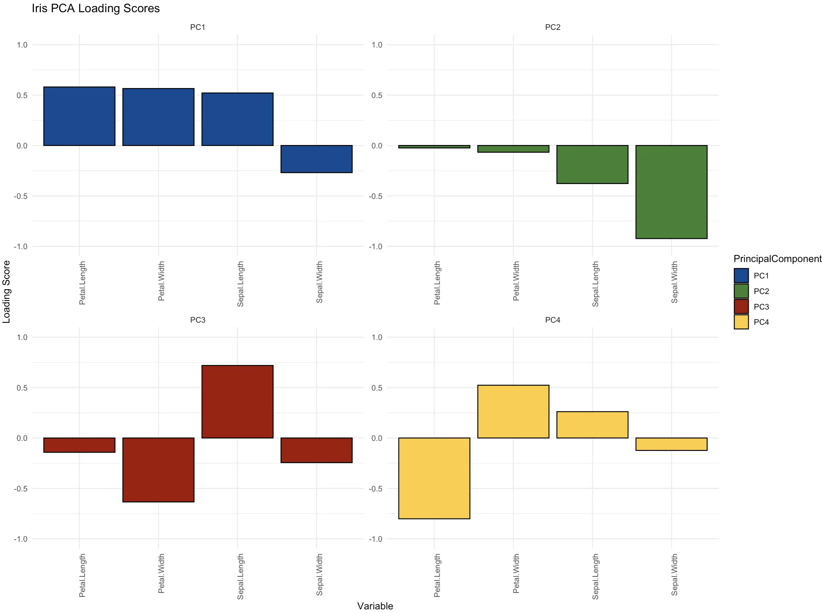
The features petal length, petal width, and sepal length are the most important ones in the first principal component that in itself captures over 70% of the dataset’s variance. The roles are reversed in the second component - there, the sepal width is the key contributor.
Summing up R PCA
And there you have it - Principal Component Analysis explained in plain English. The basic idea behind the algorithm is simple - reduce the dimensionality of the data by calculating the principal components - one-directional variances of the entire dataset. Combine a couple of them, and you have a low-dimensional representation that accounts for most of the original data.
You can dive deeper into the mathematics on your own if you like, and we strongly encourage you to do so. R does a fantastic job of hiding all the calculations for you. All you need to do is provide a numerical dataset that has all features centered around 0 with a standard deviation of 1, and has no missing values.
How do you use the results of Principal Component Analysis in R? Is there a visualization type we haven’t covered? Join our Slack community and let us know!
Looking for a practical example of Data Science in Finance? Watch our video on successful machine learning projects in Fintech.


