R Microbenchmark: How to Measure and Compare the Execution of R Expressions

Are you still conducting runtime benchmarks in R through manual calls to `Sys.time()`? We don’t judge, but there’s a way more powerful and automated way to do the same - and more - with fewer lines of code.
Meet R Microbenchmark - a package that compares the execution of your R expressions by running them several times. You’ll typically want to use it to compare algorithms or functions that have the same goal, but different methodology of getting to it. Today you’ll learn all about this package through a couple of real-world examples. Let’s dive in!
Is R slow for processing huge volumes of data? We did the test on 1 billion rows.
Table of contents:
- R Microbench: How to Get Started
- R Microbenchmark: Testing on Real-World Data
- Summing up R Microbenchmark
R Microbenchmark: How to Get Started
The Microbenchmark package is available on CRAN, meaning you can install it easily through the R console:
Speaking of installation, here are all the packages you’ll need today. Install any that are missing:
We’ll keep things simple in this section, mainly just to showcase how R Microbenchmark works without worrying about the tasks at hand.
R has a `median()` function built in that computes the middle value of a vector. What we’ll do here is implement the function from scratch. This goes without saying, but you should never do this on your own - it’s just for demonstration purposes.
Then, we’ll create a vector of random integers and calculate the median with our custom function and the built-in function:

The values are identical, so let’s proceed.
The `microbench()` function allows you to declare multiple expressions. Basically, you’re assigning an expression result to a string name, so you can easily compare the results. The function will run the test for each expression 100 times by default (you’ll see how to change this later).
Here’s everything you need to do in code:

On average, the built-in function is about 30 microseconds faster when compared to our custom implementation. Not an impressive difference, but surely lays the groundwork for more complex comparisons.
The R Microbenchmark package also allows you to display a violin plot of the benchmark results:
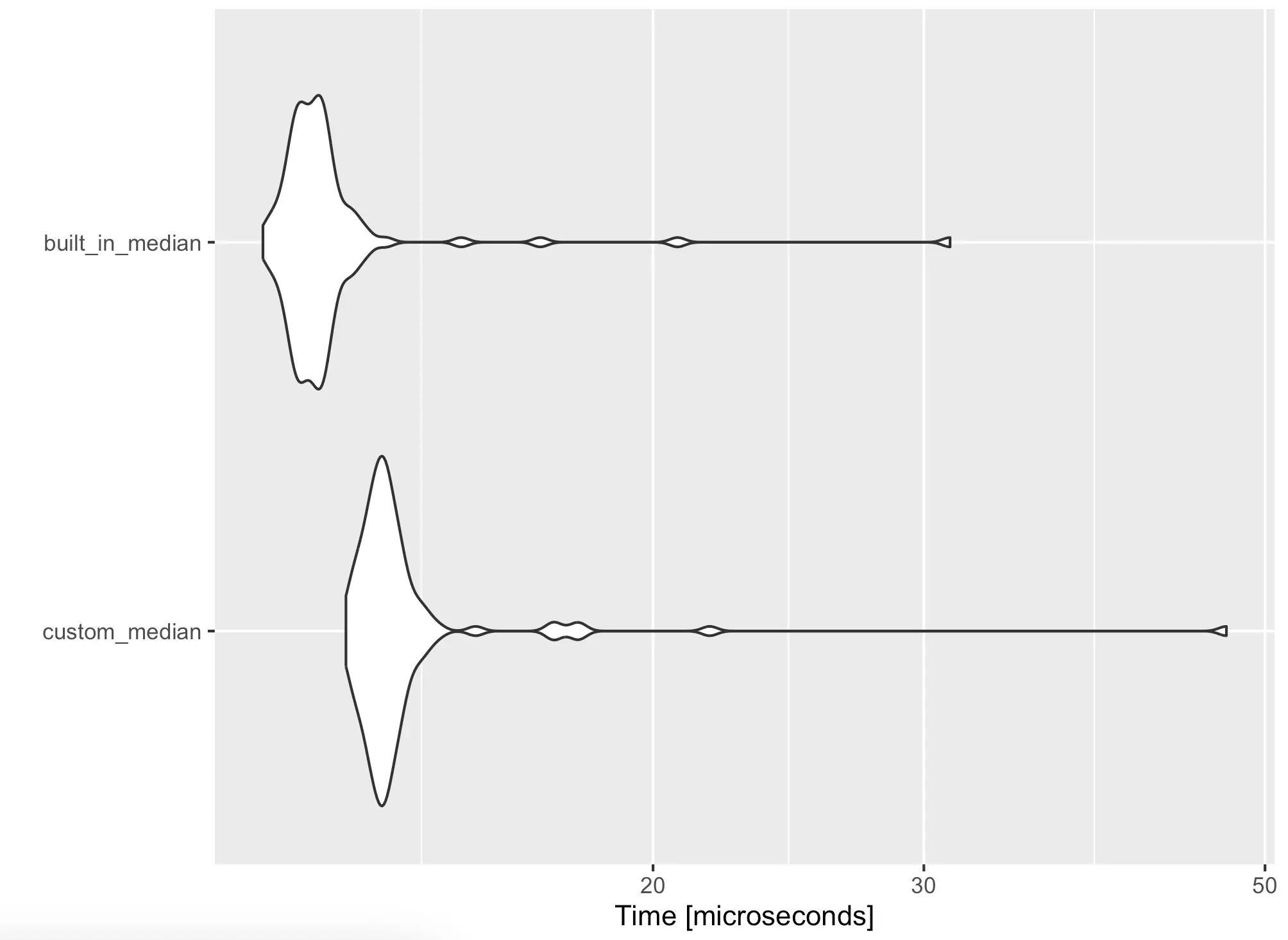
The X-axis scale is tiny, but you can clearly see that the built-in function is faster. Let’s transfer this to a couple of real-world examples next.
R Microbenchmark: Testing on Real-World Data
You now know how R Microbenchmark works, so next, we’ll explore how it can help you in the real world. To follow along, download the NYC Yellow Taxi dataset for December 2023 (or any other month). The December dataset has almost 3.4 million records! Parquet files are fast to work with, so we’ve manually converted it to CSV.
The following two sections will compare two R options for working with CSV files - dplyr and data.table.
Reading Data
The first order of business is getting data from disk into R. The built-in `read.csv()` function will do the groundwork for dplyr, and `fread()` for datatable. It turns out dplyr isn’t really efficient when reading local CSV files, so we’ll reduce the number of time benchmark runs from 100 to 500:

Yes, you’re reading that right. Datatable is more than 10 times faster than dplyr on average when it comes to reading local CSV files.
A chart will paint that picture even better:
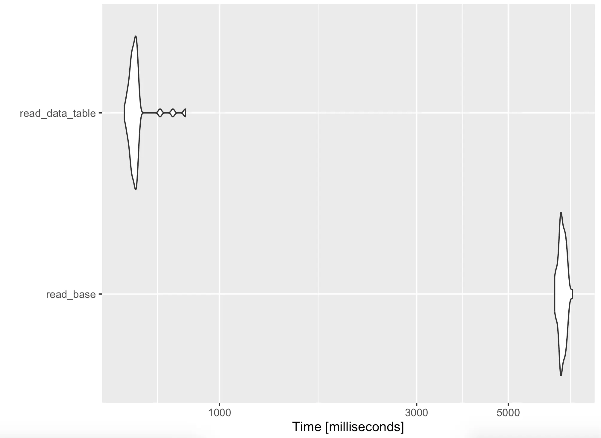
If your data pipelines are running slow, check your data reading methodology. It might be a serious bottleneck.
Aggregating Data
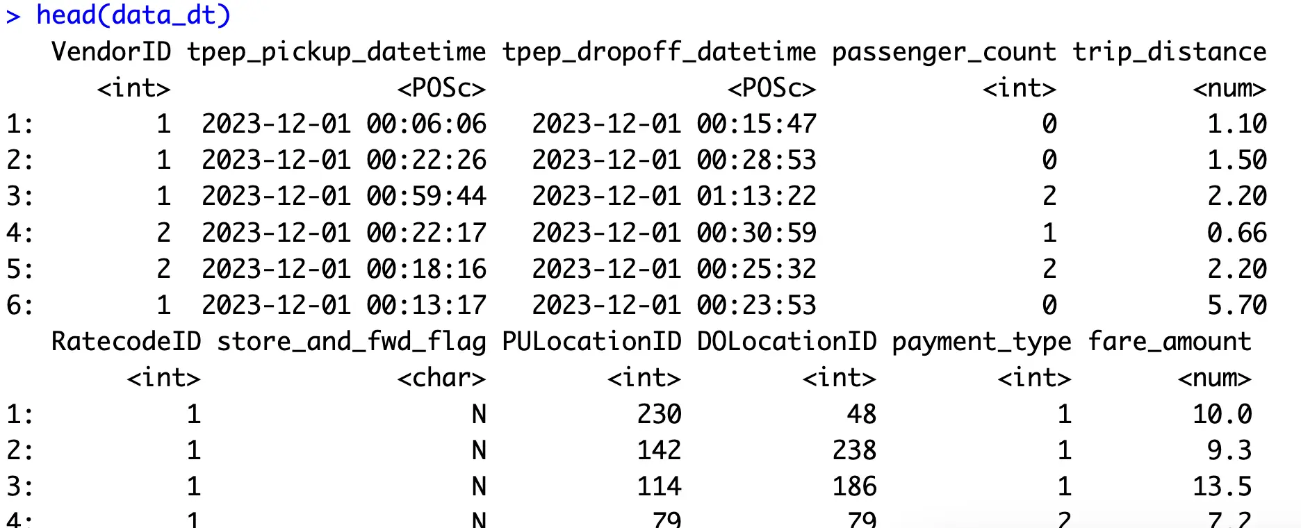
Next, let’s discuss data aggregation. For demonstration purposes, let’s agree that the data is loaded into R through the following commands:
Onto the aggregation now. The goal is to calculate the number of, minimum, average, and maximum trip distances for a given month. The aggregation snippet includes calculating derived columns, filtering out records that don’t belong to the given month, grouping data, and calculating summary statistics.
Here are snippets for both dplyr and datatable aggregations:

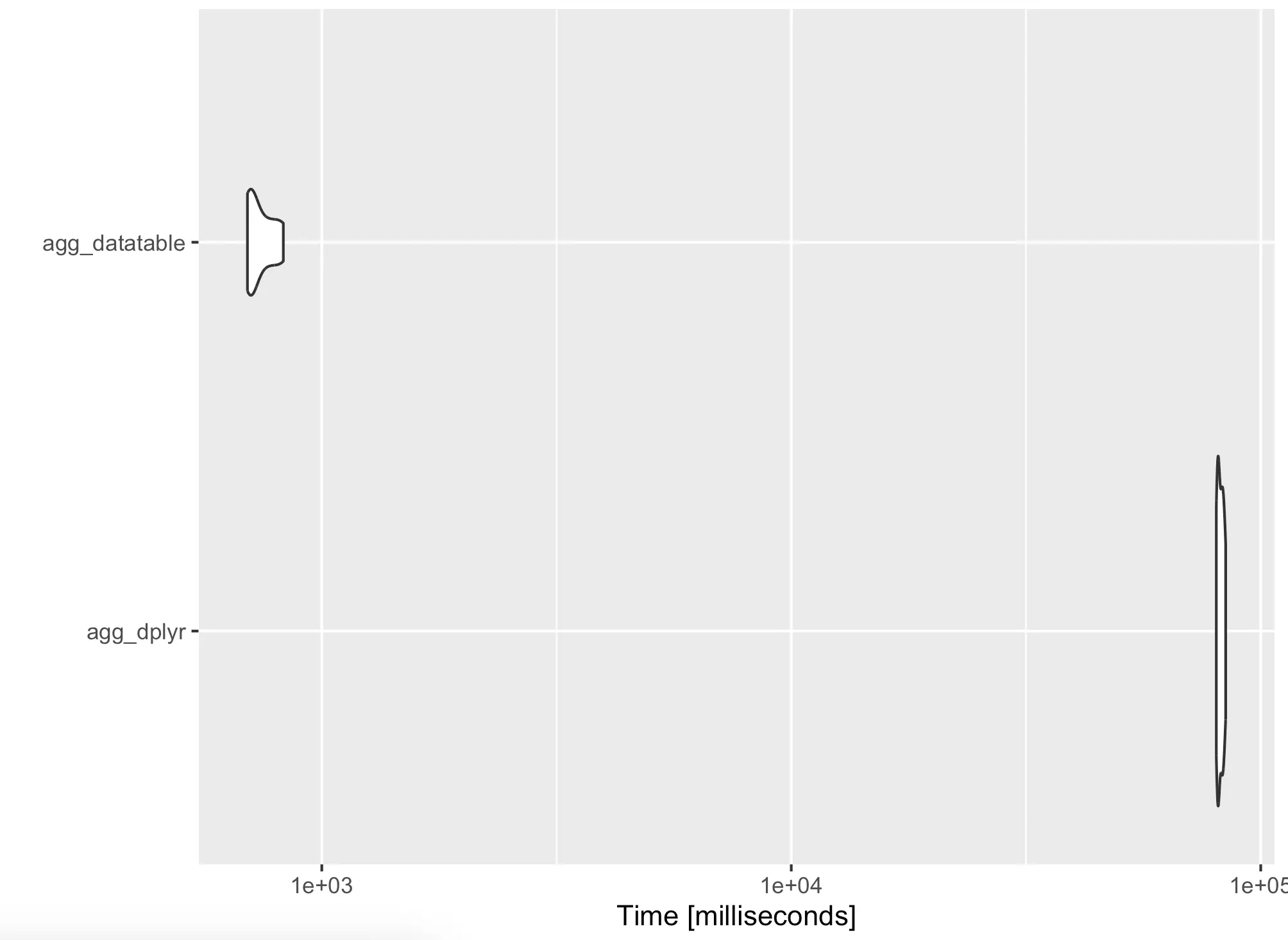
The dplyr code took forever to run, so we’ve reduced the number of iterations to 10. The results are clear - datatable is several orders of magnitude faster than dplyr in this case.
As before, you’re free to inspect the results visually:
Speaking of visualization, the default styles may not be too appealing to some, so next, we’ll show what you can do about it.
Bonus: Autoplot Styling
Plot styling isn’t the main focus of this article, but we still wanted to briefly show how to tweak a couple of small things that will make a huge aesthetical difference in the end.
The result of the `autoplot()` function is a ggplot2 plot object, which means you can add layers to it just like you normally would.
The following snippet shows how to add a title, change its style, and how to change the overall theme:
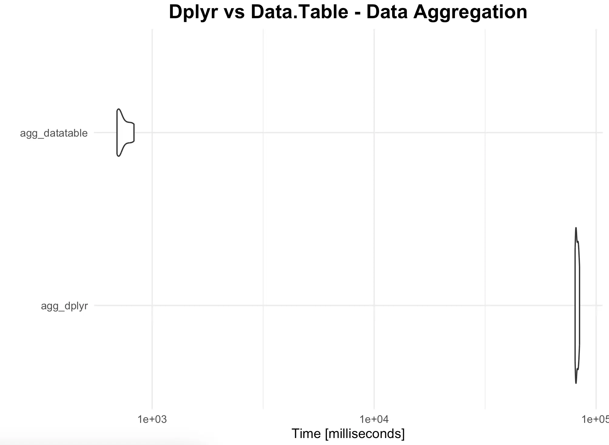
Nothing fancy, but you get the idea - you can threat the results of `autoplot()` just like any other ggplot2 visualization.
Summing up R Microbenchmark
And that does it for today’s article. It was somewhat shorter than other pieces you’re accustomed to reading on the Appsilon Blog, but there isn’t much more to say about R Microbenchmark. It’s a simple package that does one thing and does it really well.
We see ease of use and simplicity as the main benefits of this package. You no longer need to call `Sys.time()` at appropriate places, nor do you need to run your experiments in loops. Nothing wrong with that approach either, but Microbench offers more for fewer lines of code. Win-win!
What are your thoughts on R Microbench? What’s your procedure for comparing runtimes in R? Let us know in our community.
Did you know ggplot2 can make animated charts? Read our guide on Race Charts with gganimate!

.png)


.png)