R Highcharts: How to Make Animated and Interactive Data Visualizations in R
.png)
If you're looking to take your R data visualization skills to the next level, interactivity is the name of the game. There aren't too many packages that offer it out of the box, but you don't need quantity if you have quality. Highcharts is among the most popular JavaScript packages for interactive data visualization, and it has a superb R port - Highcharter.
It's the package you'll want to use to explore R Highcharts capabilities for basic data visualizations, maps, drill-down charts, and even R Shiny. We'll focus on the first one today, but stay tuned to the Appsilon blog to learn more advanced concepts.
You can now visually prototype R Shiny applications - Learn more about {ShinyUiEditor}.
Table of contents:
- What is Highcharts and Why Should You Use It in R?
- R Highcharts: Dialing In the Fundamentals
- Exploring Different Chart Types in Highcharts
- Advanced R Highcharts: Tweaking the Tooltip with JavaScript
- Summing Up R Highcharts
What is Highcharts and Why Should You Use It in R?
Highcharts library originates in JavaScript - a programming language loved by many in the web development circles. The library serves as a simple way to make interactive and animated charts for websites and applications.
It's a JavaScript library, so why should R developers care?
As it turns out, Highcharts is available for you to use in R and R Shiny through the Highcharter package. It provides everything you need to produce engaging data visualizations, maps, and even drill-down charts (more on that in a follow-up article). Highcharts is also available for Python, .NET, and iOS - so it has a lot of bases covered.
What sets R Highcharts stand out from the competition is the following:
- Ease of use: You can make visually appealing data visualizations in minutes. The code is simple to understand, even if you aren't the most tech-savvy person out there.
- Superb customizability: Tweak anything from colors, fonts, themes, titles, labels, legends, tooltips, and much more. If you can see it, you can tweak it.
- Out-of-the-box interactivity: You can hover over data points to see more info, zoom in and out, and even click on chart elements to drill down. Also, all charts have a neat appearance animation.
- Cross-platform support: Highcharts originated in JavaScript, but is now supported in R, Python, iOS, .NET, PHP, Java, and many other platforms.
- Highcharts Dashboards: For premium users only, but allows you to build dashboards with almost zero heavy lifting.
In a nutshell, it's the library to use if you want your visualizations to stand out, and are able to distribute them in a way that benefits from interactivity.
Up next, let's cover the fundamentals in code!
R Highcharts: Dialing In the Fundamentals
We'll be using three R packages today - dplyr for data manipulation, gapminder for data sources, and highcharter for visualization. You can install all of them by running the following command in the R console:
install.packages(c("dplyr", "gapminder", "highcharter"))Next, create a new R script and stick the following imports on top:
library(dplyr)
library(highcharter)
library(gapminder)
That's it - you're ready to build your first data visualization with R Highcharts!
Your First R Highcharts Plot
We'll begin by plotting the simplest column chart you can imagine. The gapminder dataset isn't in the optimal format for visualization out of the box, but we can get it there with a touch of dplyr magic. The following code snippet will calculate the average life expectancy per continent and arrange it in descending order:
avg_le_continent <- gapminder %>%
  group_by(continent) %>%
  summarise(AvgLifeExp = round(mean(lifeExp), 1)) %>%
  arrange(desc(AvgLifeExp))
avg_le_continent
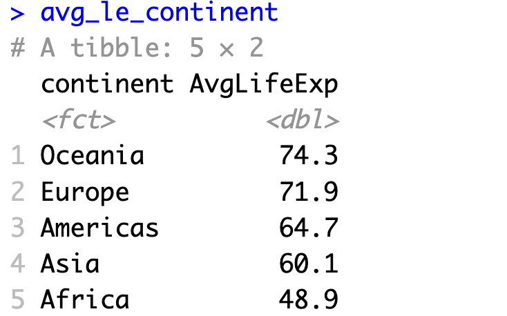
Now that looks like something we can easily visualize. R Highcharts wants you to use the hchart() function to pass in the data frame, chart type, and chart aesthetics. These are minimum requirements for any chart, but you can add much, much more.
For example, we can construct a column chart with the continent shown on X-axis, and average life expectancy on Y-axis:
hchart(
  avg_le_continent,
  "column",
  hcaes(x = continent, y = AvgLifeExp)
)
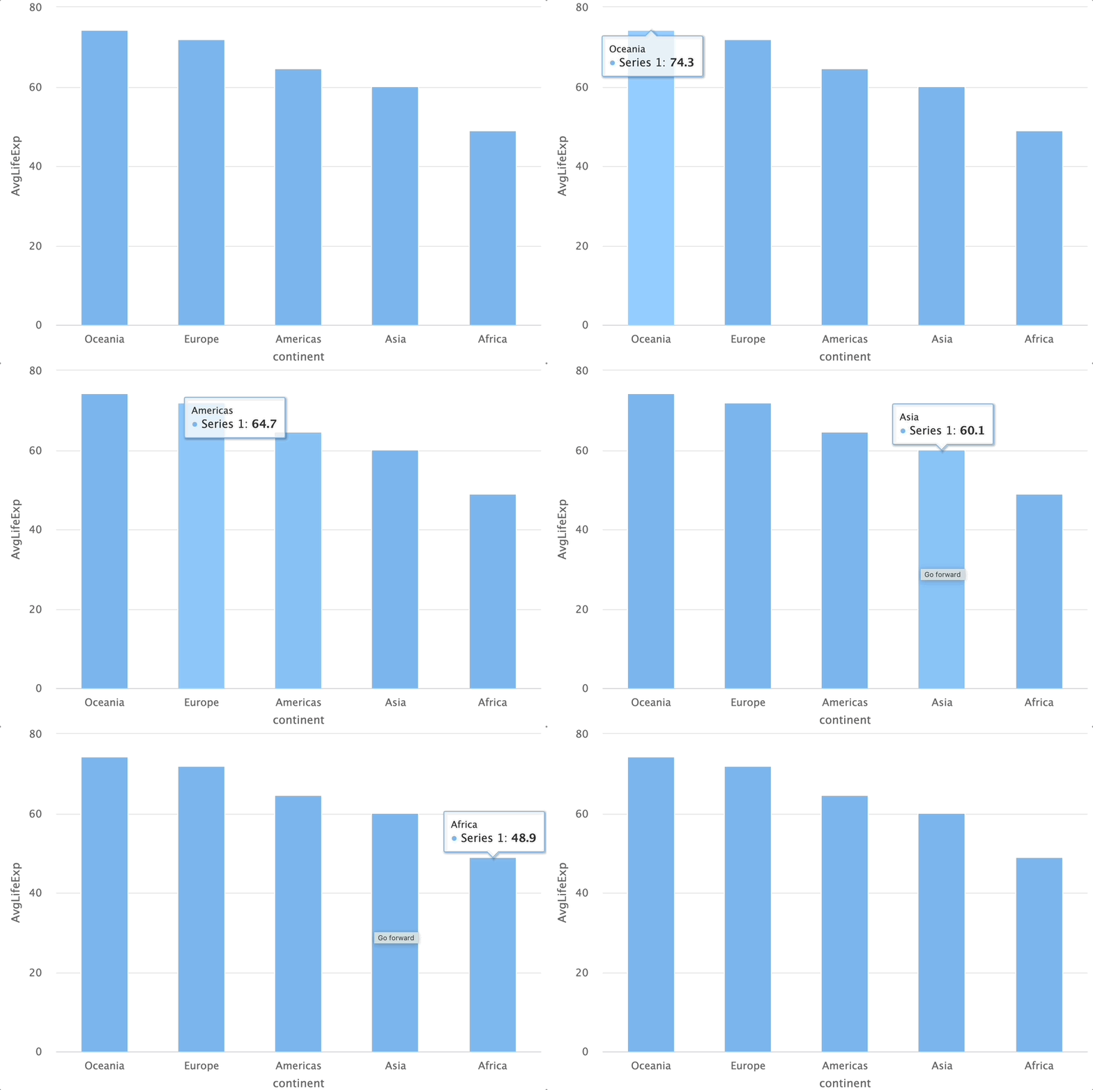
One line of R code (if you don't mind condensing the code), and you already have a decent-looking interactive visualization. Let's make it better.
Basic Styling
There are two things we'll address here. First, the default bar color looks fine, but we want to add more personality to the chart, so we'll change it to Appsilon blue. Second, you might have noticed that hovering over individual columns shows the name as "Series 1". That's easy to fix.
The following code snippet plots the same chart, but with changed color and corrected series name:
hchart(
  avg_le_continent,
  "column",
  hcaes(x = continent, y = AvgLifeExp),
  color = "#0198f9",
  name = "Average life expectancy"
)
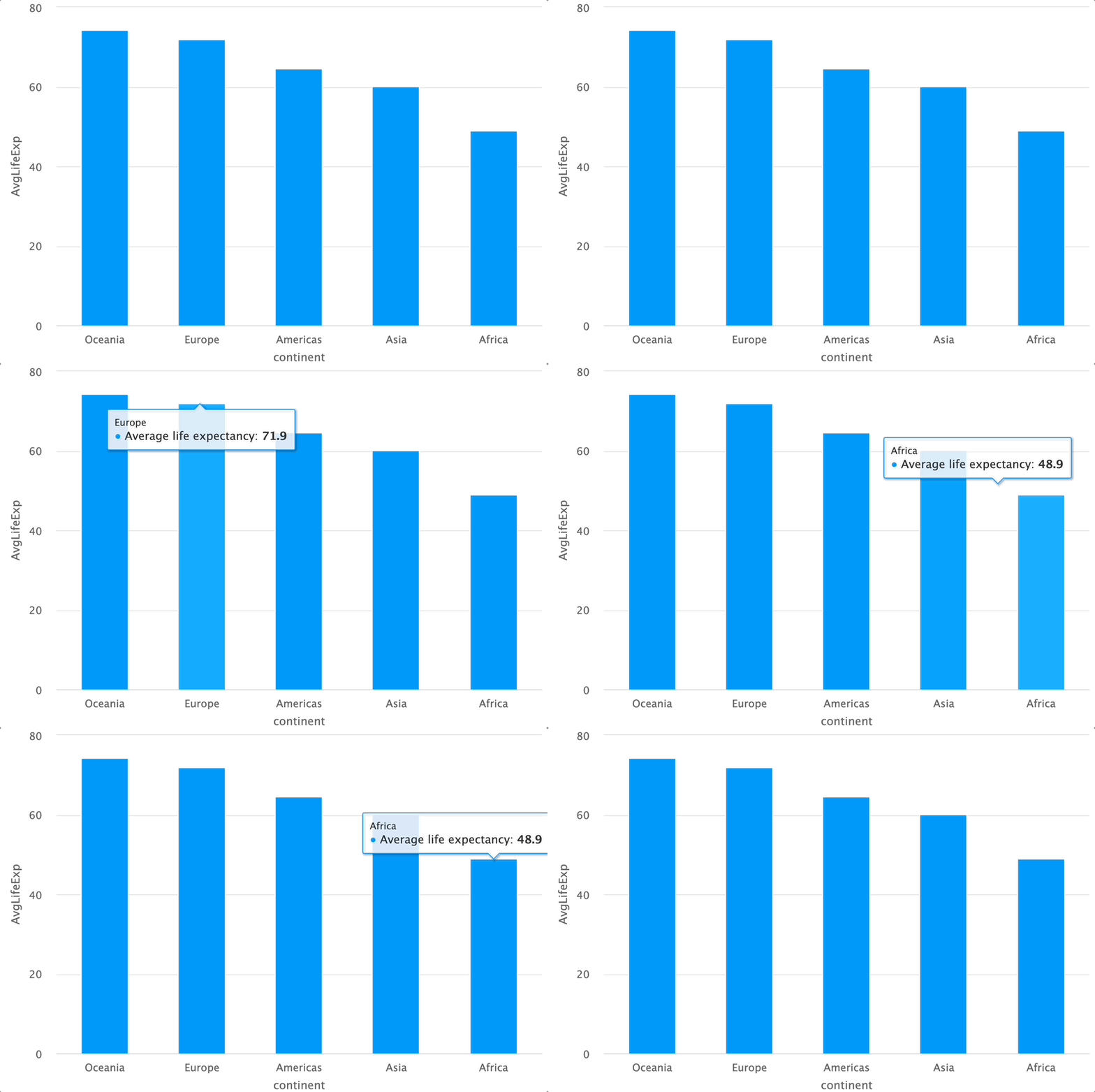
That does it for the fundamentals, but what about other common plot attributes, such as title and axis labels? Let's go over these next.
Adding Chart Elements
R Highcharter uses a special syntax for chaining multiple function calls - |>. You might be used to %>% if you've been working with dplyr and ggplot2 a lot, so this difference is worth pointing out.
As for function chaining, you want to do it to take maximum control over your visualization. For example, it allows you to add title, subtitle, credits, axis labels, and change the overall theme.
Take a look for yourself:
hchart(avg_le_continent, "column", hcaes(x = continent, y = AvgLifeExp), color = "#0198f9", name = "Average life expectancy") |>
  hc_title(text = "Average life expectancy per continent") |>
  hc_subtitle(text = "Source: Gapminder dataset") |>
  hc_credits(text = "appsilon.com", enabled = TRUE) |>
  hc_xAxis(title = list(text = "Continent")) |>
  hc_yAxis(title = list(text = "Average life expectancy")) |>
  hc_add_theme(hc_theme_smpl())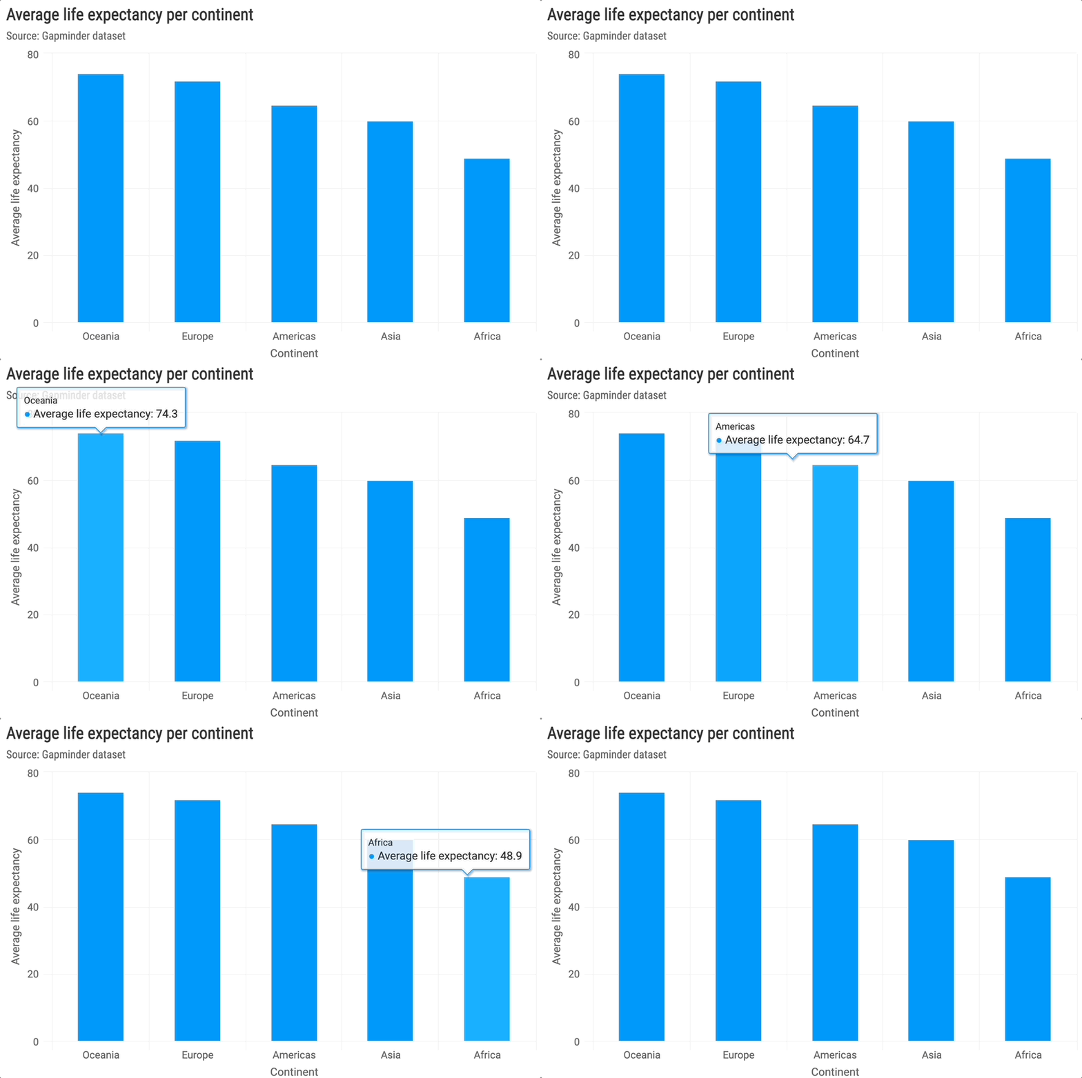
The chart now looks much more production-ready. It contains all the information needed so that everyone can take a quick look at your chart and immediately know what it's about.
If you're interested, you can find more theme options on the Highcharter official documentation page.
We've only explored column charts so far, and Highcharts has a lot more to offer. Let's explore some alternative visualization types next.
Exploring Different Chart Types in Highcharts
This section will walk you through creating the most common data visualization types - scatter plots, line charts, histograms, and pie charts. Alongside column charts you're already familiar with, these combined will allow you to make 90% of the applications and dashboards you're using.
We'll first show you both how to make single and multiple scatter plots. The logic of including multiple series into a single chart is transferable, so you'll easily be able to produce multiple line plots, stacked bar charts, and similar.
Scatter Plots
The subset we've worked with so far won't make the cut here. We need fewer data points.
The avg_le_europe data frame will display average life expectancy in Europe grouped by year:
avg_le_europe <- gapminder %>%
  filter(continent == "Europe") %>%
  group_by(year) %>%
  summarise(AvgLifeExp = round(mean(lifeExp), 1))
avg_le_europe
This should be easy enough to visualize. You can copy the code from the column chart and change the second argument to "point". Highchart still uses X and Y axis values to construct the chart, so the rest of the code should look familiar.
We've tweaked the bubble color just to make things a bit different:
hchart(avg_le_europe, "point", hcaes(x = year, y = AvgLifeExp), color = "#800000") |>
  hc_title(text = "Average life expectancy in Europe") |>
  hc_xAxis(title = list(text = "Year")) |>
  hc_yAxis(title = list(text = "Average life expectancy"))
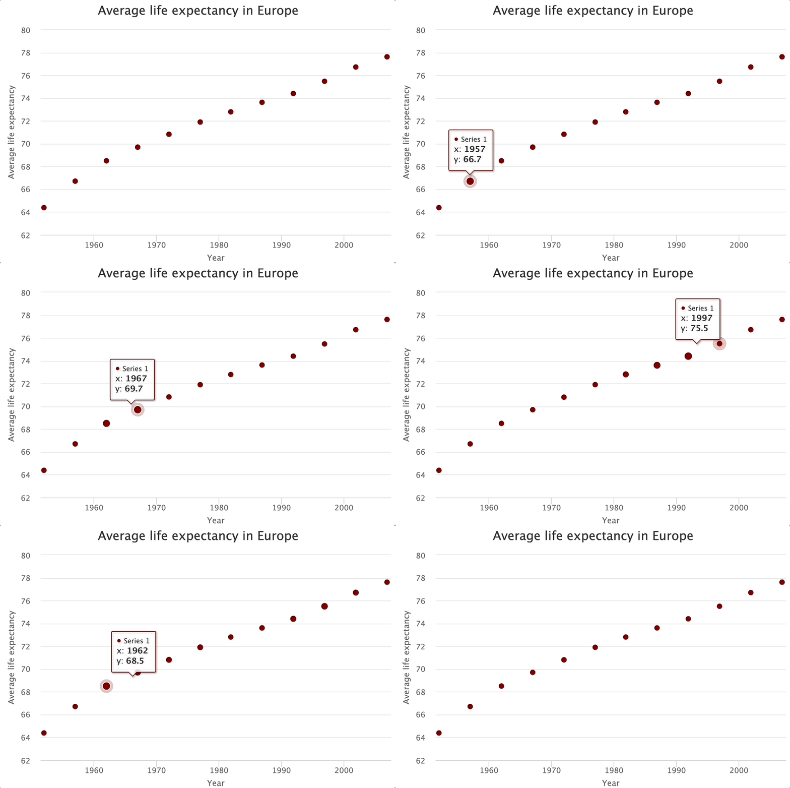
And now you have a scatter plot! But what if your dataset includes multiple categories for the same variable? That's where multiple scatter plots shine.
Multiple Scatter Plot
In plain English, a multiple scatter plot allows you to plot multiple categories of the same variable. You'll see what this means in practice, but first, we need a bigger dataset. Let's also include Asia into the mix:
avg_le_europe_asia <- gapminder %>%
  filter(continent %in% c("Europe", "Asia")) %>%
  group_by(continent, year) %>%
  summarise(AvgLifeExp = mean(lifeExp))
avg_le_europe_asia
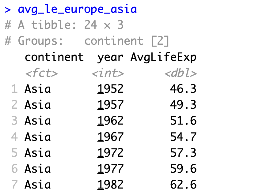
Now we have two continents, each with exactly the same number of data points for our Y variable.
In R Highcharter, you can specify the additional group argument in hcaes() to declare which dataset variable will contain the groups. Here, we're also using hc_colors() to manually control bubble color for every group:
hchart(avg_le_europe_asia, "point", hcaes(x = year, y = AvgLifeExp, group = continent)) |>
  hc_title(text = "Average life expectancy in Europe and Asia") |>
  hc_xAxis(title = list(text = "Year")) |>
  hc_yAxis(title = list(text = "Average life expectancy")) |>
  hc_colors(c("#0198f9", "#800000"))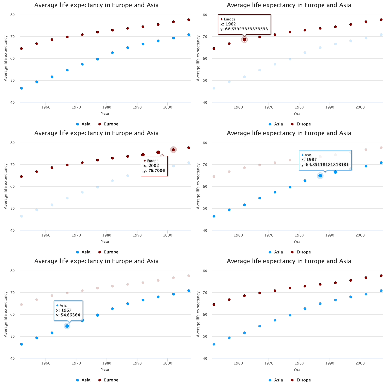
You now know how to make a scatter plot. Up next, you'll see how simple it is to turn it into a line chart.
Line Charts
In essence, a line chart conveys the same information as a scatter plot, but individual data points aren't separated - they're connected by a line instead.
That simplicity is carried to Highcharts' syntax, as you can simply swap "point" for "line" to transform a scatter plot into a line chart. Let's see it in action:
hchart(avg_le_europe_asia, "line", hcaes(x = year, y = AvgLifeExp, group = continent)) |>
  hc_title(text = "Average life expectancy in Europe and Asia") |>
  hc_xAxis(title = list(text = "Year")) |>
  hc_yAxis(title = list(text = "Average life expectancy")) |>
  hc_colors(c("#0198f9", "#800000"))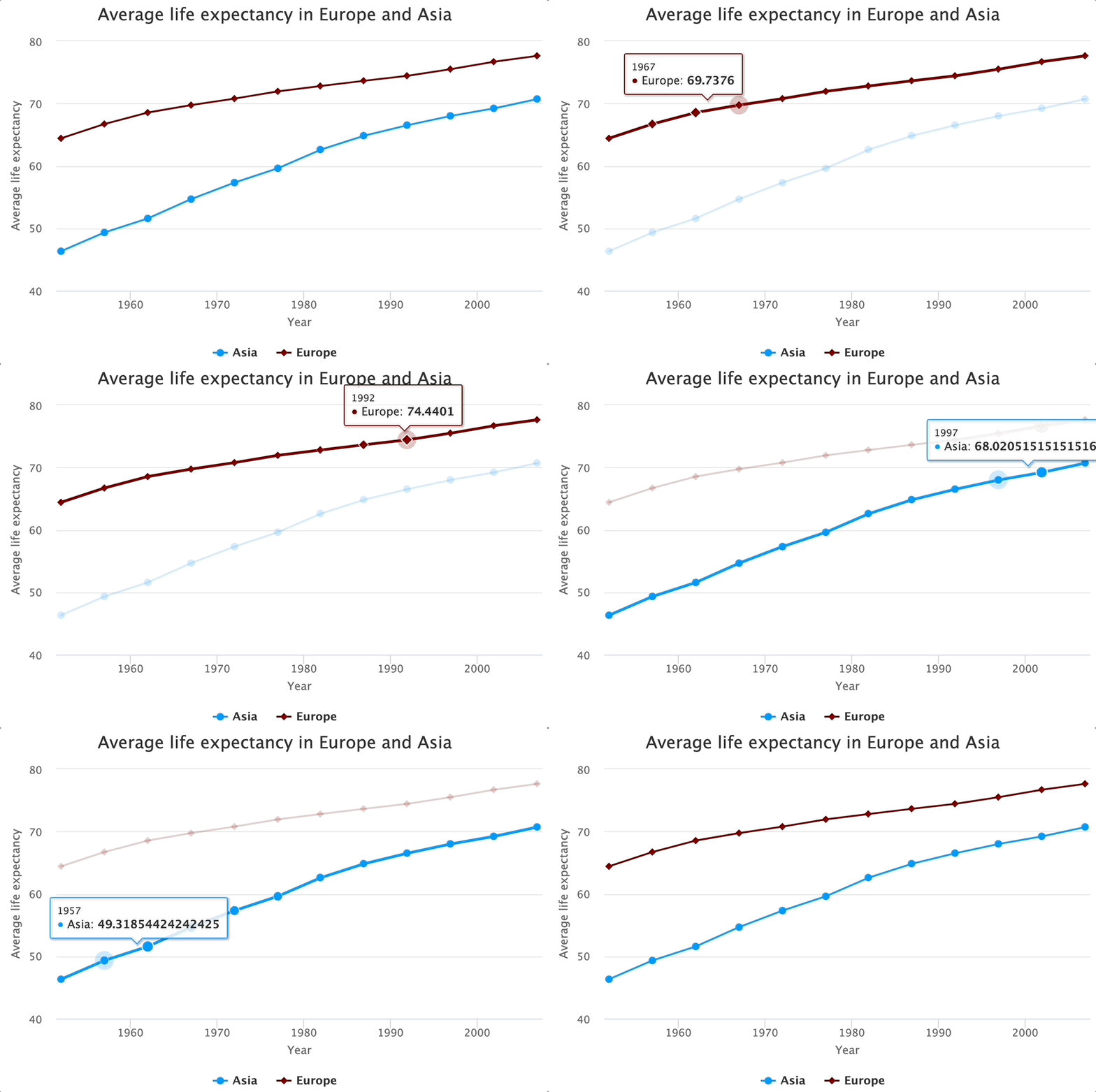
The above code is identical to the one written in the Multiple scatter plot section, with just the chart type being changed. That's the beauty of high-level R packages.
Histograms
Let's now take a look at yet another commonly used visualization type - histograms. Unlike the previous chart types, this one needs only one variable since the goal is to visualize the distribution. You don't need to pass in chart type argument here, just make sure to point to a specific column. Highcharts will take care of the rest.
The functions you see chained are nothing not seen before:
hchart(gapminder$lifeExp, name = "Life expectancy", color = "#800000") %>%
  hc_title(text = "Average life expectancy histogram") |>
  hc_xAxis(title = list(text = "Life expectancy")) |>
  hc_yAxis(title = list(text = "Count"))
We didn't create a custom dataset here to isolate only the most recent year. That's why we're getting these crazy low life expectancies. Give it a try yourself for extra practice points.
Pie Charts
And finally, let's take a look at pie charts. They aren't so common nowadays, especially if the app/dashboard/report was constructed by a data professional, rather than a business user.
Nevertheless, it can't hurt to know it! We'll extract population data for three countries in 2007:
population <- gapminder %>%
  filter(country %in% c("Germany", "France", "Spain")) %>%
  filter(year == 2007)
population
You can now use the "pie" chart type to show country on the X-axis and population on the Y-axis:
hchart(population, "pie", hcaes(name = country, y = pop)) |>
  hc_title(text = "Population pie chart") %>%
  hc_colors(c("#0198f9", "#800000", "#ffcc33"))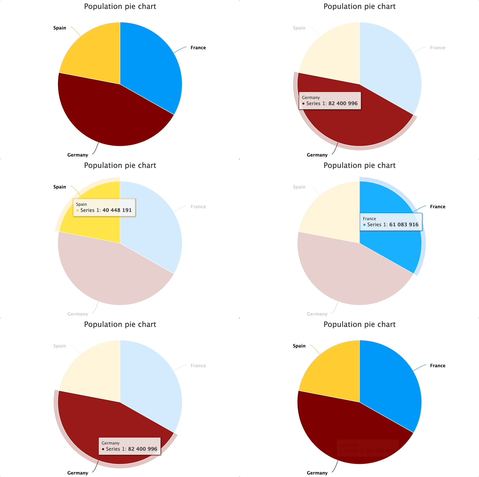
This concludes a rather long section on basic chart types available in R Highcharts. Up next, we'll go over a somewhat more advanced use case of custom-tweaking the tooltip.
Advanced R Highcharts: Tweaking the Tooltip with JavaScript
As you've probably noticed, Highcharts visualizations are interactive by default. They also provide a good-looking tooltip when hovering over individual bars, bubbles, lines, or pie segments.
What we haven't discussed yet is tooltip customization. This will require writing an inline JavaScript function that has access to chart elements.
For demonstration, we'll dial back to the column chart from the first section. Our goal now is to append "years" at the end of the tooltip value. This makes sense because the average life expectancy value is shown by default. By appending custom text, we essentially give more information to the user.
You can use the hc_tooltip() function for the job. The most convenient way is to pass in an inline JavaScript function and access chart properties, such as this.y, and then manually append any text you want to it:
hchart(avg_le_continent, "column", hcaes(x = continent, y = AvgLifeExp), color = "#0198f9", name = "Average life expectancy") |>
  hc_title(text = "Average life expectancy per continent") |>
  hc_xAxis(title = list(text = "Continent")) |>
  hc_yAxis(title = list(text = "Average life expectancy")) |>
  hc_tooltip(formatter = JS("function(){return this.y + ' years';}"))
We now have the information needed, but everything that was visible by default is gone! Maybe you didn't want that, so let's see how to get it back.
You would assume that this.x would return the value of the X-axis for a given column, but that's not the case. It will return a range instead. Further, we'll also include more textual info to fully inform the user what's going on:
hchart(avg_le_continent, "column", hcaes(x = continent, y = AvgLifeExp), color = "#0198f9", name = "Average life expectancy") |>
  hc_title(text = "Average life expectancy per continent") |>
  hc_xAxis(title = list(text = "Continent")) |>
  hc_yAxis(title = list(text = "Average life expectancy")) |>
  hc_tooltip(formatter = JS("function(){return '<b>Continent: ' + this.x + '</b><br>Average life expectancy: ' + this.y + ' years';}"))
We get a multi-line output which is great, but the continent names are missing. As it turns out, you need to access X-axis elements by writing this.point.name instead:
hchart(avg_le_continent, "column", hcaes(x = continent, y = AvgLifeExp), color = "#0198f9", name = "Average life expectancy") |>
  hc_title(text = "Average life expectancy per continent") |>
  hc_xAxis(title = list(text = "Continent")) |>
  hc_yAxis(title = list(text = "Average life expectancy")) |>
  hc_tooltip(formatter = JS("function(){return '<b>Continent: ' + this.point.name + '</b><br>Average life expectancy: ' + this.y + ' years';}"))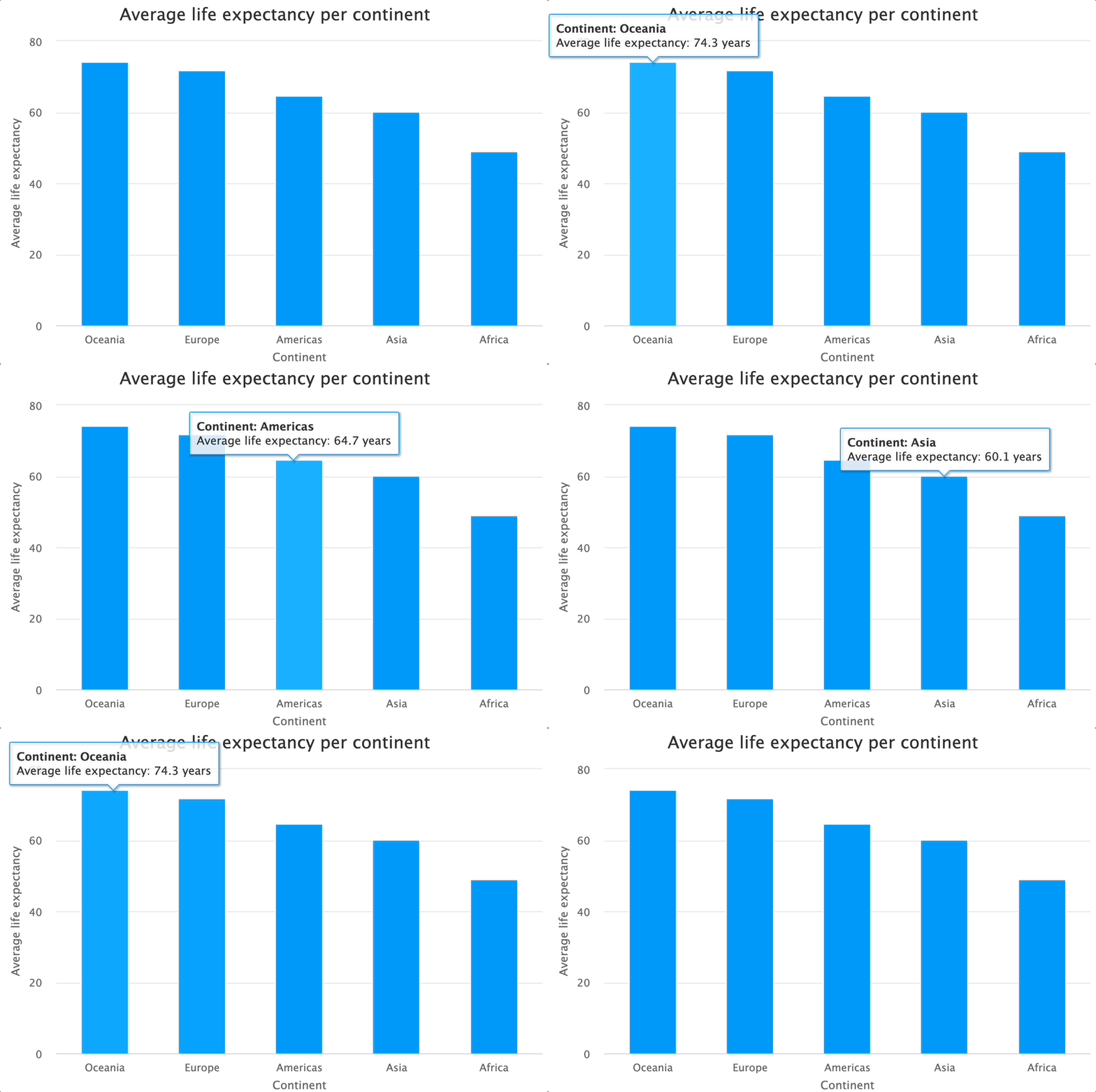
That's how you can take full control of the tooltip's content. You now have the basics of R Highcharts under your belt, so let's call it a day here. The upcoming articles will address more advanced use cases.
Summing Up R Highcharts
Long story short, R Highcharts doesn't lack customization by any stretch of the imagination. You can tweak absolutely anything, and if there isn't a built-in function for the job, you can probably get around with a bit of custom JavaScript.
Today you've learned the basics of Highcharts. It's a foundation that we'll build up on in the upcoming articles covering drill-down charts and R Shiny support. Make sure you stay tuned to Shiny Weekly and we'll make sure to deliver the content ASAP.
Migrating from a BI tool to R? R Esquisse helps you explore data through a Tableau-like drag-and-drop interface.

.png)


.png)