R gganimate: How to Make Stunning Chart Animations with ggplot2

The main criticism people have when it comes to ggplot2 is the static nature of the charts it has to offer. Truth be told, it will never be an interactive visualization king like Highcharts, but it doesn’t mean animation is out of the picture.
Meet R gganimate - a natural extension of ggplot2 that allows you to visualize your data change through time or some other variable, and then render and export the chart as a set of PNGs, or a single GIF/MP4.
You’ll learn all about it today and will end up with some neat looking visualization towards the end of the article. Let’s start small by installing the package first and making your first animated graph.
Is R a good programming language for analyzing huge datasets? It certainly is, but not without some gotchas.
Table of contents:
- R gganimate - Your First Animated Chart in R
- Rendering Options in R gganimate
- How to Make Your R gganimate Charts Stand Out
- Summing up R gganimate
R gganimate - Your First Animated Chart in R
The gganimate package is available on CRAN, which means you can install it by running the `install.packages()` command through the R console:
As soon as you load it, you’ll get a warning message like the one below:

It’s nothing concerning, the package is just informing you that you don’t have the necessary packages to render visualizations as GIFs and MP4s, so they’ll be saved as a sequence of individual images instead.
We’ll cross that bridge when we get there.
For now, focus on the snippet below. It calculates the average life expectancy from the Gapminder dataset represented by continent and year. This sort of aggregation is convenient, as it’ll allow you to display an animated representation of average life expectancy through time for every continent.
Down below, the only new function (assuming you’re familiar with ggplot2) is `transition_time()`. It’s a function from the gganimate package, and it will instruct ggplot2 to render the visualization for each distinct value of `year`. It will also interpolate the values that are missing since population data isn’t available at a single year time step.
The `animate()` function then renders the chart:
Since you don’t have the necessary packages (yet) to render the chart as GIF or MP4, a sequence of PNG images is stored on disk:
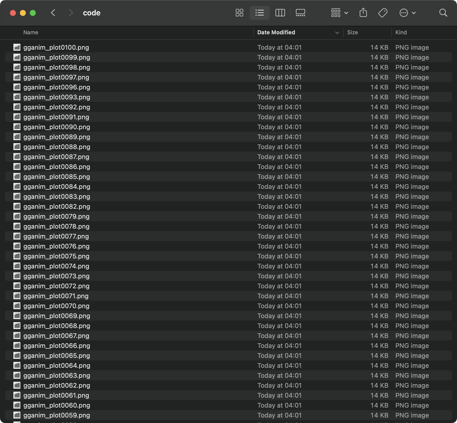
Everything works, but doing animation this way is a nightmare, and something you’ll rarely do.
Let’s focus on more convenient formats next.
Rendering Options in R gganimate
Rendering a gganimate visualization as a GIF or MP4 boils down to calling a slightly different function. For that reason, we’ll show most of the work with GIFs (resizing, changing frame rate) step by step, and only show final implementation with MP4s.
GIF
Exporting GIFs through gganimate requires you to install the `gifski` package first:
Once installed, you can call the `gifski_renderer()` function to save your animated visualization to a file:

It exports a low-dpi 480x480 GIF by default, which isn’t ideal for sharing and publication purposes. Luckily, you can change that.
The following code snippet shows how you can change the total number of frames, frames displayed per second, and the total clip duration:
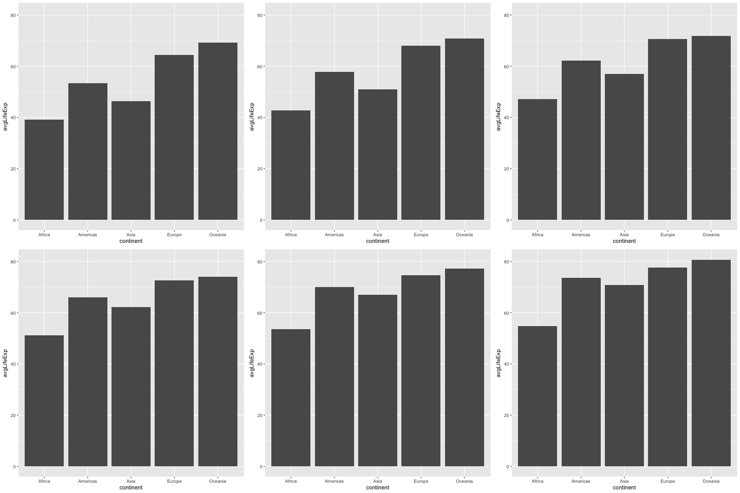
It’s better, but the final output is still a bit small. The `animate()` function also expects values for `width` and `height` parameters, which is just what we’re looking for:

Now the chart looks presentable. Not visually appealing, but has enough resolution for you to share it with your peers.
MP4
When it comes to rendering MP4 files, you’ll have to install the `av` package first:
Once installed, simply replace `gifski_renderer()` with `av_renderer()`. All the other parameters passed to `animate()` remain the same:
Now you know the basics of rendering an animated visualization in R. The only problem is - they look awful! In the following section, you’ll learn how to animate and style various types of ggplot2 visualizations, starting with the one you already have.
How to Make Your R gganimate Charts Stand Out
This section will show you how to build and animate bar charts, line charts, and treemaps with gganimate. If you need a refresher on basic data visualization with R, or are looking for your next chart animation idea, these articles will serve as a great starting point:
- Bar charts in R and ggplot2
- Line charts in R and ggplot2
- Scatter plots in R and ggplot2
- Boxplots with R and ggplot2
- Histograms with R and ggplot2
Let’s proceed by tweaking the chart you already have.
Bar Charts
To start, let’s slightly modify the data aggregation process. The average life expectancy will now be rounded to 1 decimal place, and an additional column will be created representing the average life expectancy as a string - you’ll see why in a bit.
Then in the plotting section, you’ll need to add a couple more layers to change the color and add text labels at the top of bars. Here, you can see we’re using `frame_time` reference in the chart title. It comes from gganimate and is available to you any time you’re using `transition_time()`. In other words, it will dynamically change the year in the chart title.
The animation and rendering code remains unchanged:
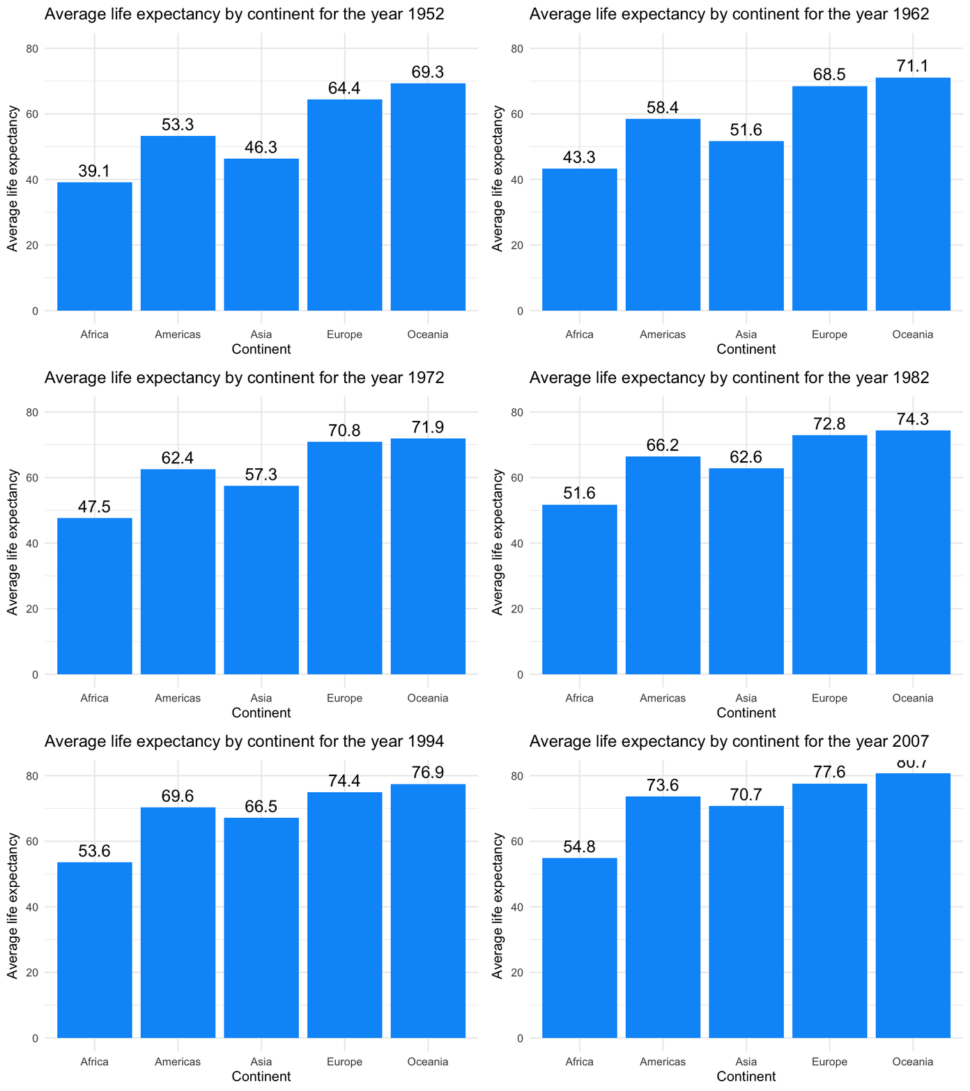
You can see how the title year value is updated for every year, even for the years not available in the dataset. The individual bars update every 5 years since that’s the frequency in the underlying data.
Line Charts
The good thing about gganimate is that you can use it to animate any ggplot2 visualization, provided the data is grouped and organized correctly. We’ll demonstrate that by rendering a line chart showing the average GDP per capita through time, rendered by continent.
There are no significant changes to the code - you’re still aggregating the dataset, creating a chart object, and then rendering it. The main difference is the use of the `transition_states()` function. This one is almost always used with categorical variables. Parameters `transiton_length` and `state_length` control the length of each transition and the length of pause between each transition:
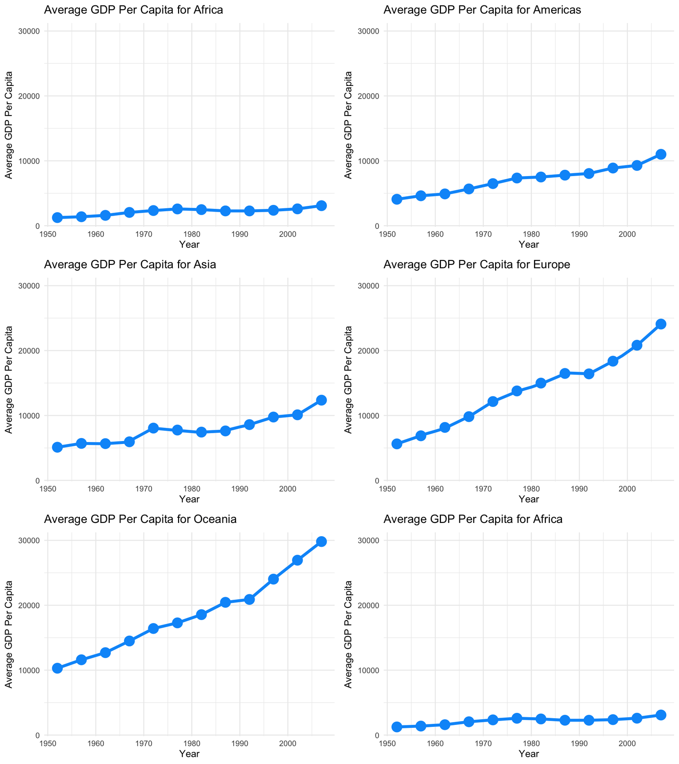
It’s not the best-suited visualization for this dataset, but you get the idea - gganimate is versatile.
Treemaps
And finally, let’s take a look at treemaps. You’ll need an additional package to work with treemaps in ggplot2 and gganimate. It’s called treemapify, and you can install it through the `install.packages()` command.
The code snippet below shows you how to create an animated treemap of the European countries’ population through time. The size of each box corresponds to its share in the overall population, and we’ll also add text labels for a bit more context.
Just like with line charts, you’ll also use the `transition_states()` transition here:
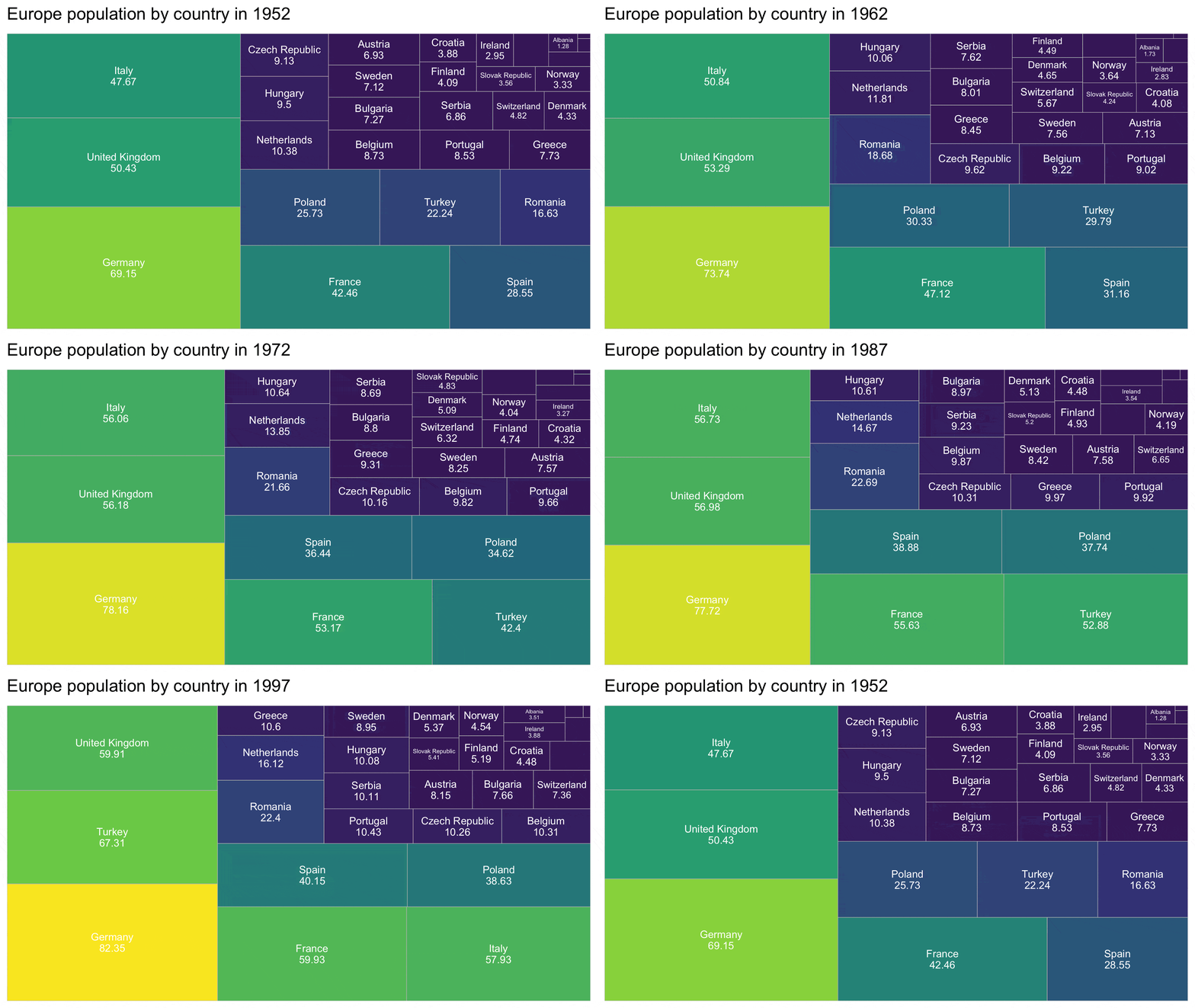
Looks like Germany is in a significant lead from day one! Feel free to play around with the rendered chart resolution, as some of the less populated country names don’t fit into the boxes.
Summing up R gganimate
And there you have it - how to visualize ggplot2 charts. It mostly boils down to organizing your data in the correct way and calling the appropriate transition function at the end of the chart code - depending on the type of variable you’re dealing with. Rendering is quick, easy, and highly customizable, both in the realm of file formats and key characteristics, such as height, width, and framerate settings.
This sort of data visualization may not be applicable to web applications, but it sure has its place in online articles and magazines. Remember, if a picture is worth a thousand words, then animation is worth much, much more.
DuckDB makes R crazy fast. Here’s how it compares to dplyr.


.png)


