R Dygraphs: How to Visualize Time Series Data in R and R Shiny

.webp)
When it comes to finding an R package capable of making interactive visualizations out of the box while also working flawlessly with R Shiny, you don’t have that many options. Sure, there’s Highcarts, but what if you’re looking for something more specialized for time series?
Well, that’s where R Dygraphs chime in! This package serves as an R interface to a popular JavaScript library, and it works like a charm in R scripts and R Shiny. We’ll explore both options today.
After reading, you’ll know how to:
- Plot R time series objects with R Dygraphs
- Style R Dygraphs charts, add title and axis labels, show multiple series, and customize aesthetics
- Tweak the chart interactivity
- Use R Dygraphs in R Shiny
What are race charts and how do you make one in R? Read our guide on visualizing stock data over time with gganimate.
Table of contents:
- R Dygraphs - How to Get Started
- Deep Dive Into R Dygraphs - Visualize Stock Data
- R Dygraphs in R Shiny - Build an App From Scratch
- Summing up R Dygraphs
R Dygraphs - How to Get Started
The Dygraphs package is available on CRAN, which means you can get it by running your typical `install.packages()` command. Make sure to run this first before proceeding with the article:
And now to start using it, you’ll only need one line of code. Well, after the package import, of course. The following code snippet will create an interactive time series chart of the famous Airline passengers dataset:

Can you believe it only took one line of code? R Dygraphs does so much for you behind the scenes. As it turns out, tweaking the chart also requires much less code than the alternative charting packages. Let’s dive into that next.
Deep Dive Into R Dygraphs - Visualize Stock Data
In this section, you’ll learn the essentials behind R Dygraphs. We’ll cover extensive chart creation and styling, multi-series plots, and interactivity - all on stock data pulled straight from the web.
How to Get Stock Data in R
The first order of business is data gathering. Since we’re working with stock data, the `quantmod` package is your friend (install if necessary). It allows you to pull stock data from Yahoo Finance for a given ticker and time frame.
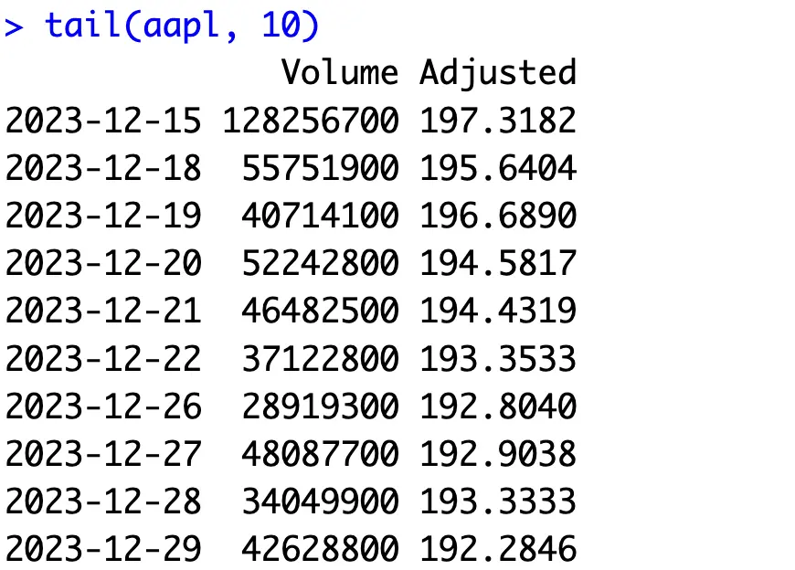
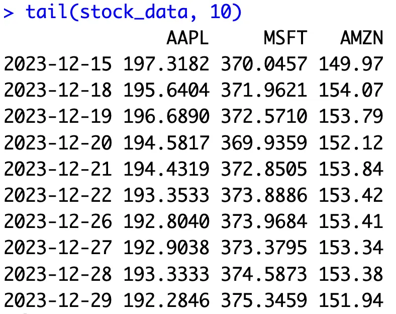
The returned stock dataframe will contain the time period (daily level) as an index column, and several other attributes showing the trade volume, open, close, and adjusted price for the day. We only care about the volume and the adjusted price:
The above code snippet declares a function for fetching stock data and prints the last 10 values for the AAPL ticker (Apple):
Now in R Dygraphs, you only need to call the `dygraph()` function on the column you want to visualize - Adjusted price in our case:
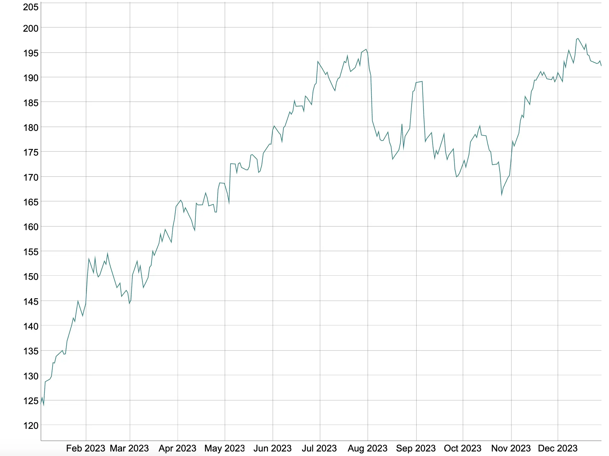
Hovering over the points on the line will show you the corresponding X and Y axis values:
is few and far between. It’s great to see Dygraphs doesn’t belong to this group, and does everything with so few lines of code.
Dygraph Customization and Chart Options
Let’s take a look at some basic tweaking options first. The `dygraph()` function can take a couple of optional parameters. For example, `main`, `xlab`, and `ylab` control the labels for the title, X-axis, and Y-axis.
The `width` and `height` parameters will set the chart to have a fixed size, rather than its content resizing with the window:
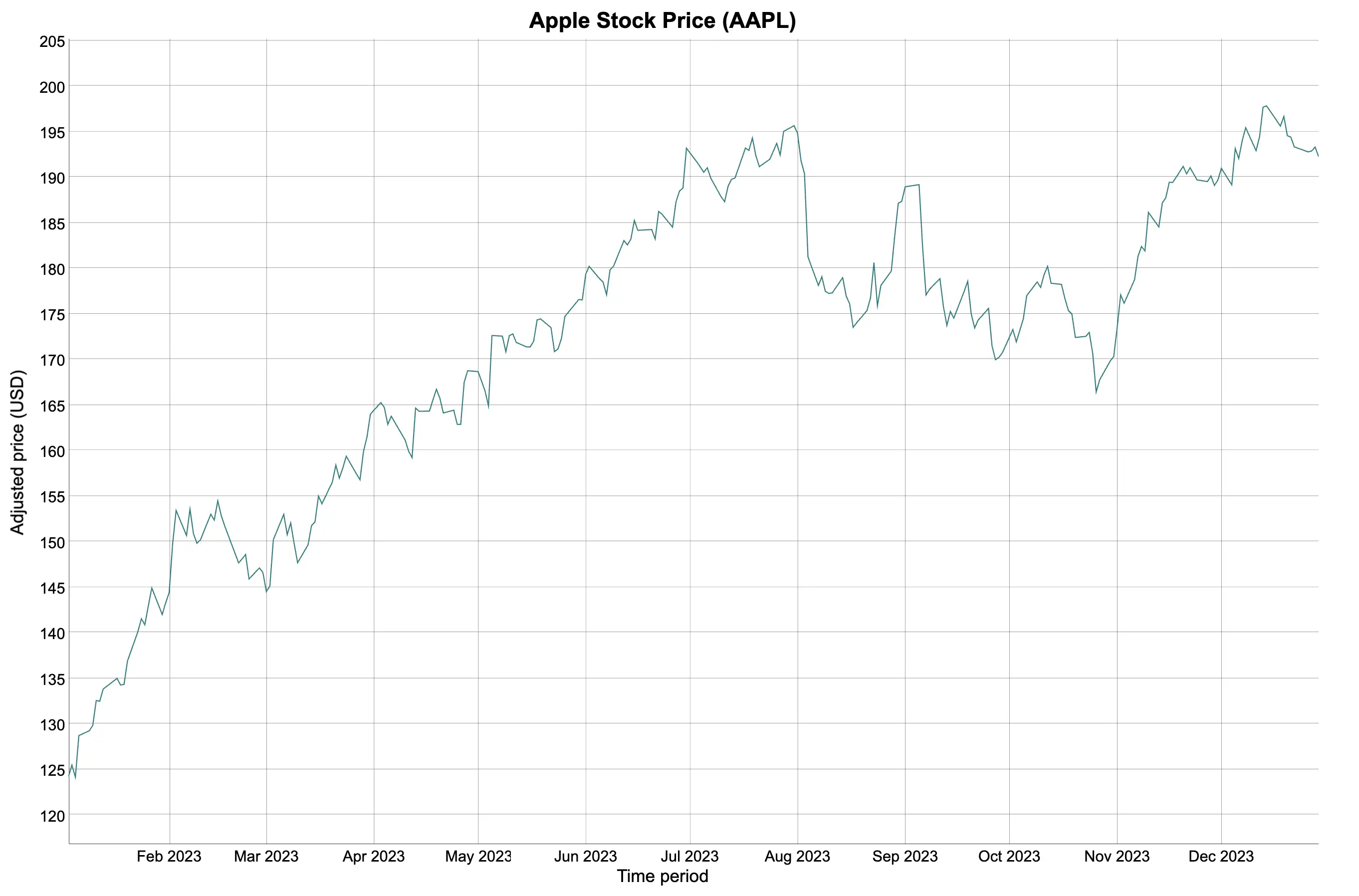
We’ll keep only `main`, `xlab`, and `ylab` moving forward.
The cool thing about R Dygraphs is that it allows you to use the pipe operator (`%>%`) to chain function calls. For example, you can add an additional `dySeries()` function to control how the value axis looks and behaves.
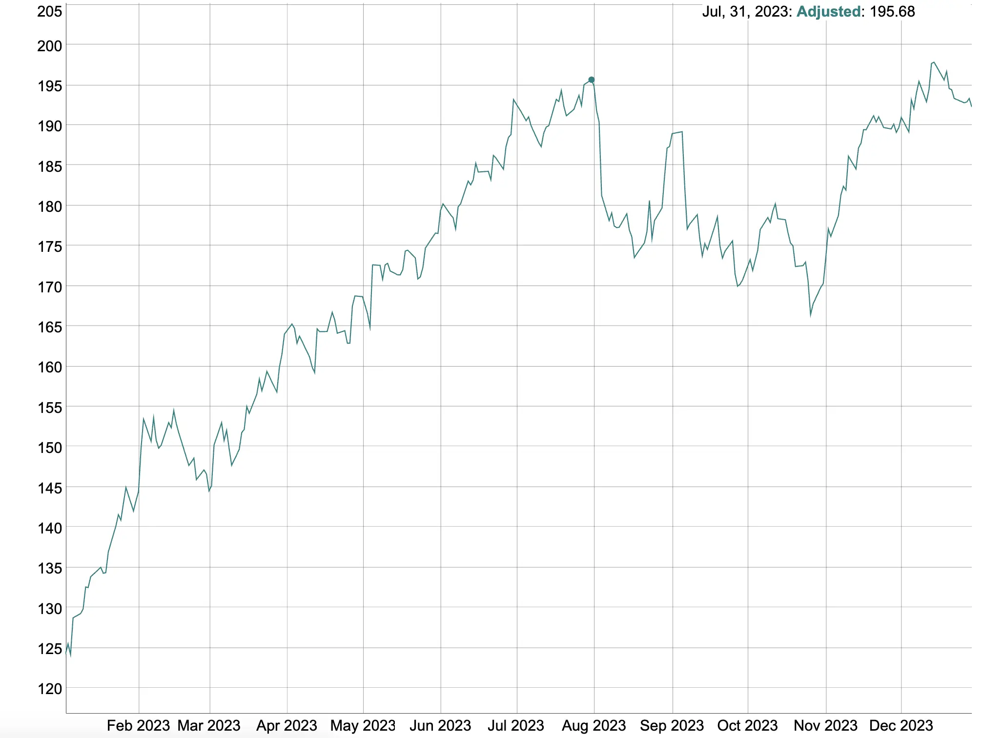
We’ll change the line color and add square points to each data point:
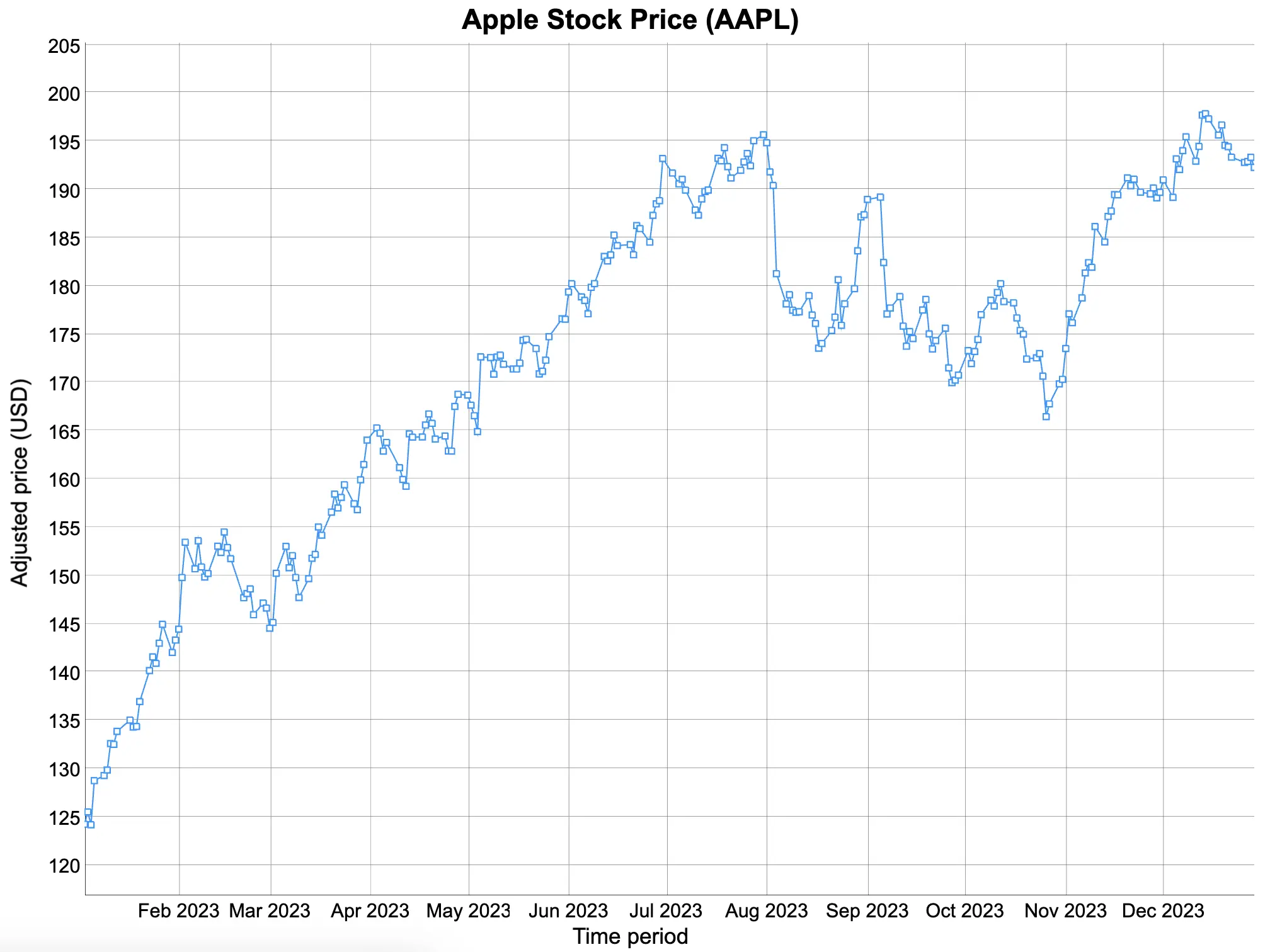
Now we’re getting somewhere!
Dygraphs also make it possible to plot multiple series on a single chart. To demonstrate, we’ll plot the scaled version of the `Volume` attribute as a filled and stepped area chart. The scaling down process is more or less mandatory since their values are on different orders of magnitude.
While here, let’s also change the labels shown on the series legend:

This kind of chart might work, but scaling up/down one variable to accommodate the other leaves a lot to be desired.
Luckily, R Dygraphs has the option to display multiple axis ticks. All you need to do is to set `axis = “y2”` on the series you’re working on second:

You’ve now successfully plotted two variables with different orders of magnitude!
And finally, let’s take a look into interactivity. We’ll fetch stock price information for a couple of additional tickers - Microsoft and Amazon - and concatenate everything into a single XTS object:
You can now use the `dyHighlight()` function to control the highlighting behavior. For example, the below code snippet will increase the width of the highlighted line, add a circle marker, and decrease the opacity of the lines not currently highlighted:
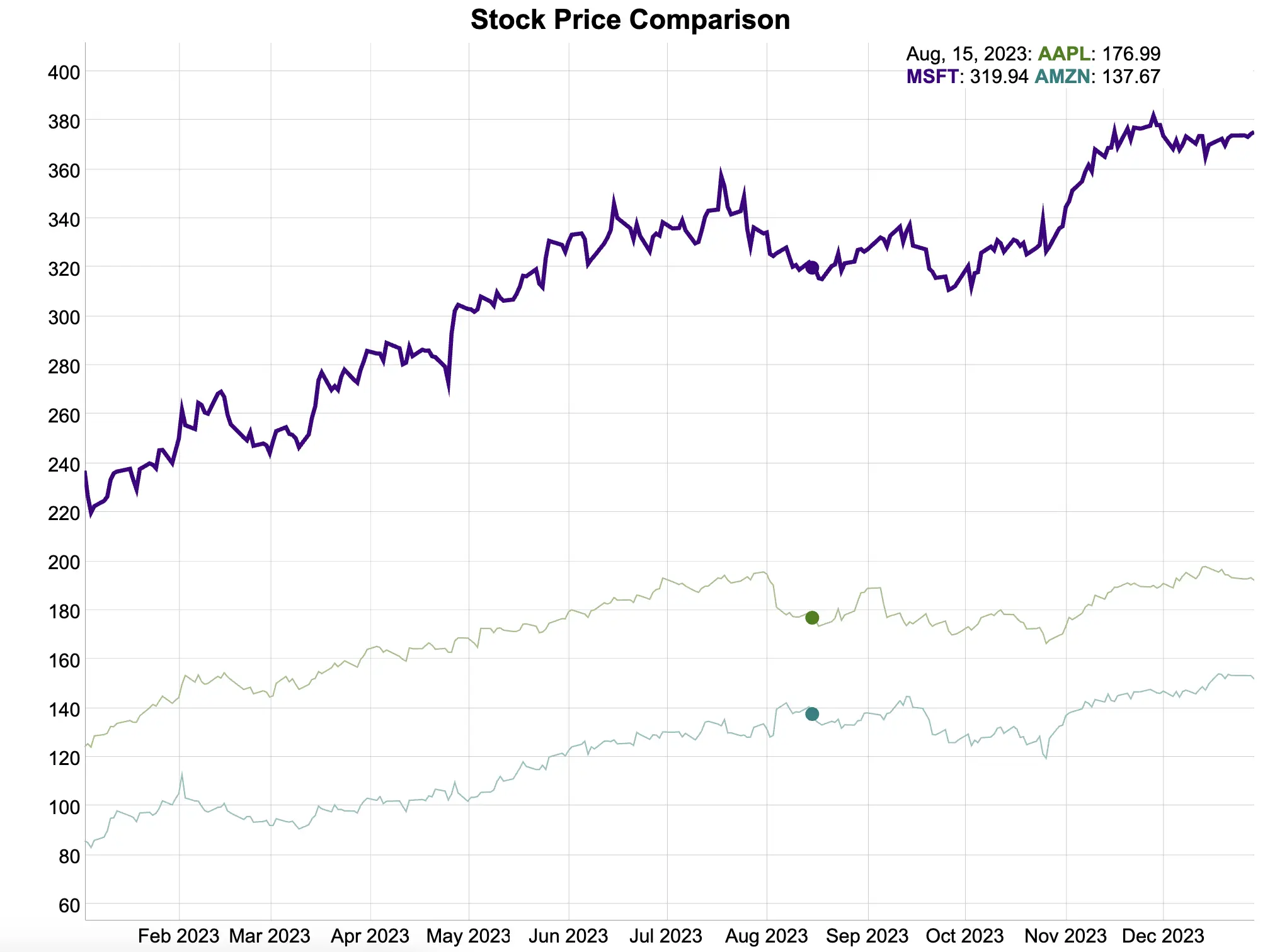
You can also see how highlighting a point on one series also highlights the same point in time on others. R Dygraphs does this synchronization automatically - you don’t have to lift a finger!
And now with the basics of time series visualization under your belt, let’s take a look at implementation in R Shiny!
R Dygraphs in R Shiny - Build an App From Scratch
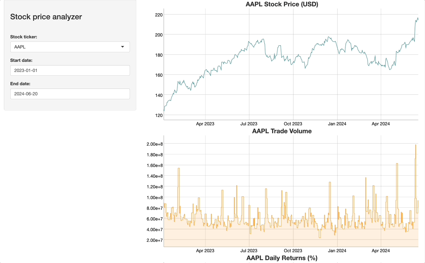
The idea behind the Shiny application you’re about to build is simple:
- Give the user the option to select a stock ticker from a predefined list
- Allow the user to change start/end dates for the stock analysis time window
- Display historic stock prices, trade volume, and daily return percentage
To use Dygraphs in R Shiny, you’ll want to leverage the built-in `dygraphOutput()` function in the UI, and `renderDygraph()` server.
The `get_stock_data()` function will get the stock data for a given ticker and date range for you, and it will also calculate daily returns.
Moving further, the UI code is self-explanatory. It just contains the required components for input and output elements.
The server function is where things get interesting. First, we need to update date inputs on the fly through the `observe()` function, so that the user can’t select an end date that’s lower than the start date (and vice versa). Chart data is stored in `stock_data` reactive value and is referenced in chart code down below:
You’ll see the following Shiny application after running the code:
Everything works like a charm! R Dygraphs integrates nicely with R Shiny, and the only thing you have to worry about is the data format going into the visualizations. It has to be an XTS object - a plain dataframe won’t suffice.
Summing up R Dygraphs
If there’s one thing R doesn’t lack, it has to be options for data visualization. Even when R-native ones aren’t enough, there are plenty of alternatives from different programming languages, such as JavaScript.
R Dygraphs is one such option specializing in time series data visualization. It works exceptionally well with XTS objects and sets the record for the least amount of code the developer has to write. All charts are interactive by default, which isn’t always a given with R, and the package has superb R Shiny support. What more do you need?
What are your thoughts on time series visualization with R Dygraphs? Do you use it daily or do you prefer an alternative package? Make sure to let us know in our Slack community.
Is R the right choice for analyzing huge datasets? Here’s how well it does in a 1 billion row challenge.
.png)

.png)


