R 3D Charts: Top 3 Packages to Master 3D Data Visualization in R

More often than not, two-dimensional charts are all you need. Still, there are instances where adding a third dimension might help - especially with interactive charts. That’s why we’ve decided to showcase three packages that make visualizing R 3D charts a breeze!
We’ll start with a word of caution, primarily focusing on why you should avoid 3D visualizations in most cases. After that, we’ll review three popular packages for visualizing R 3D charts - ScatterPlot3D, RGL, and Plotly.
We’ll only focus on scatter plots since that’s one of the rare chart types that makes sense in three dimensions. Let’s dig in!
Data Science has a new IDE. Meet Positron, an IDE for R and Python from the creators of RStudio.
Table of contents:
- 3D Charts - A Word of Caution
- ScatterPlot3D - The Easiest R 3D Charts Package
- RGL - Adding Basic Interactivity
- Plotly - Best Interactivity and Customization for R 3D Charts
- Summing Up R 3D Charts
3D Charts - A Word of Caution
The first order of business - don’t use 3D charts - unless you absolutely have to or want to. That’s especially true for chart types that don’t benefit in any way by adding a third dimension (bar chart, line chart, pie chart…) since all the information is present in the first two.
That’s not the case with scatter plots, since a third dimension means you can show the influence of yet another variable, so they are a good idea sometimes.
Still, your everyday apps and dashboards should minimize the usage of 3D charts with the ultimate goal of ditching them altogether.
Here are the reasons why:
- More difficult to read: 3D charts distort the data and make it nearly impossible to accurately interpret the values. Perspective and depth play a huge role in this problem, and what makes the matter worse is that you can look at the chart from whatever angle you want to, hence further decreasing interpretation capabilities between different users.
- Increased cognitive load: What people love about 2D charts is how easy they are to look at and interpret. Adding an extra dimension increases the cognitive load significantly, increasing the amount of time needed to draw conclusions from visuals.
- Unnecessary overcomplication - For some chart types, such as bar, line, and pie, adding a third dimension doesn’t add any value since no additional information is presented. You should stick to two dimensions if most of what you show falls into these chart types.
To conclude, if you decide to proceed with 3D charts, be 100% certain you need them, and that the end-user will actually benefit from the added information.
ScatterPlot3D - The Easiest R 3D Charts Package
Alright, let’s now dive into a couple of examples! We’ll use the Iris dataset for the demonstration since it’s well-known and built into R:

The `scatterplot3d` package doesn’t ship with the default R installation, so you’ll have to install it. Simply run `install.packages(“scatterplot3d”)` in the R console and you’ll be good to go.
Onto the first chart now. The `scatterplot3d()` function accepts values for `x`, `y`, and `z` axes:
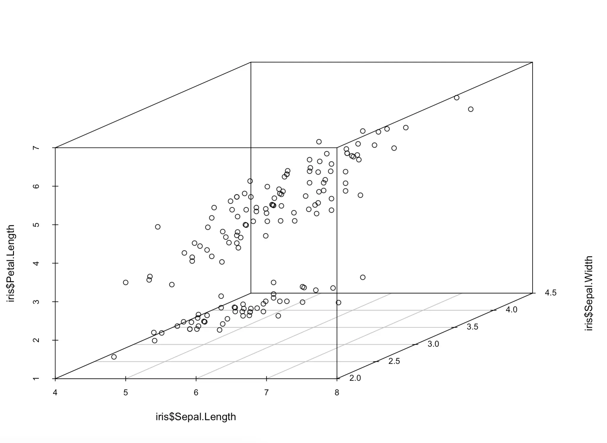
Yes, that’s all it takes to make a 3D chart in R. But you have to agree, it’s awful! You don’t have a clue which dot represents what. Let’s make a couple of tweaks next.
First, let’s begin by changing the angle, marker shapes, and marker colors. The corresponding `angle`, `pch`, and `color` parameters allow you to change them. The latter two need to match the number of unique values of a categorical variable, so keep that in mind:
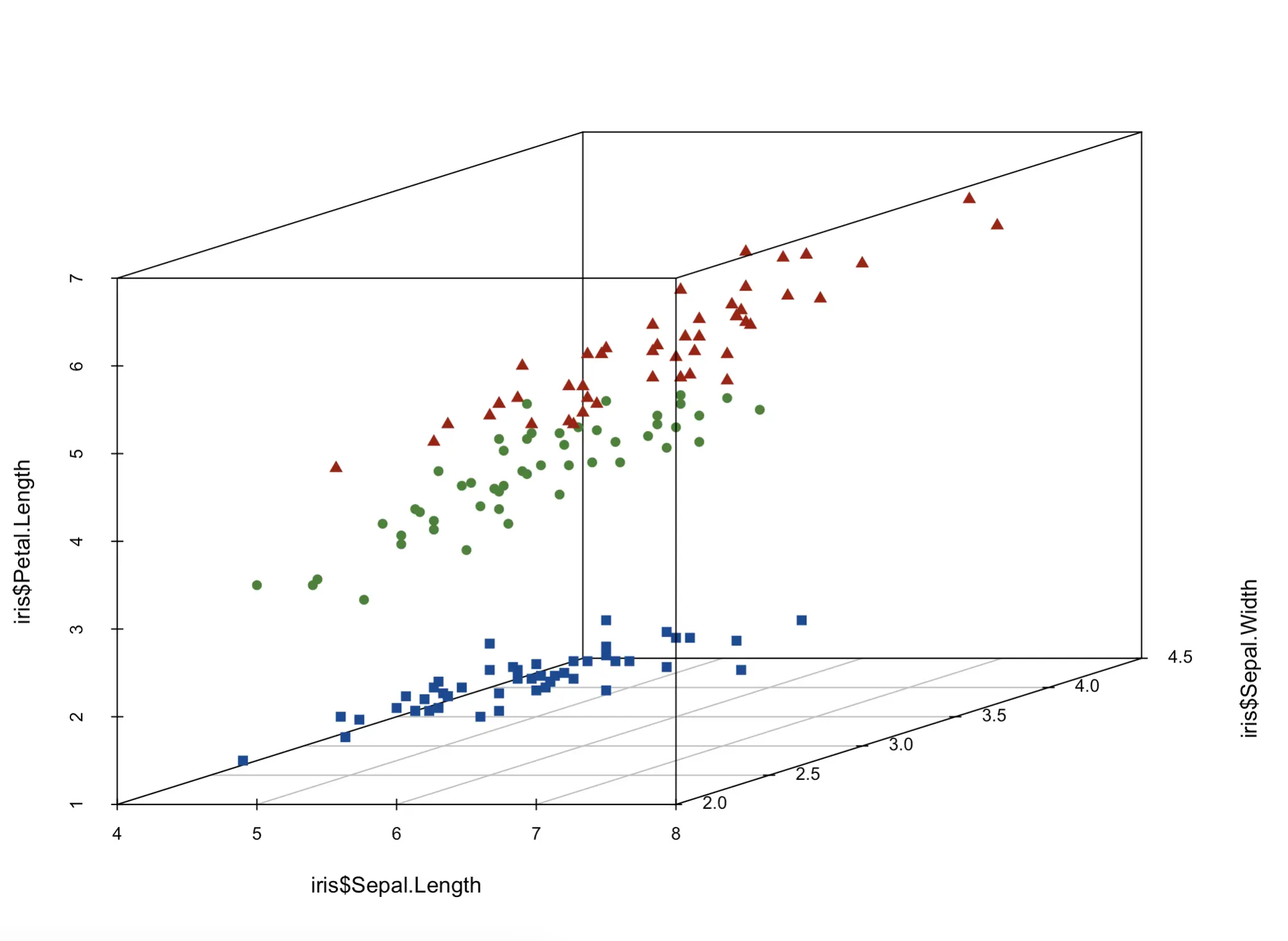
It’s a bit easier to visually separate the dots now, but we’re far from over. A legend would be nice, but first, let’s address these awfully formatted axis labels and add a title:

And finally, we’ll add a legend to know which color and shape represents which flower species. To do so, you’ll need to store the chart in a variable and then call the `legend()` function to, well, add the legend.
You can play around with the positioning however you want, but we found that a horizontal legend positioned below the chart works well:
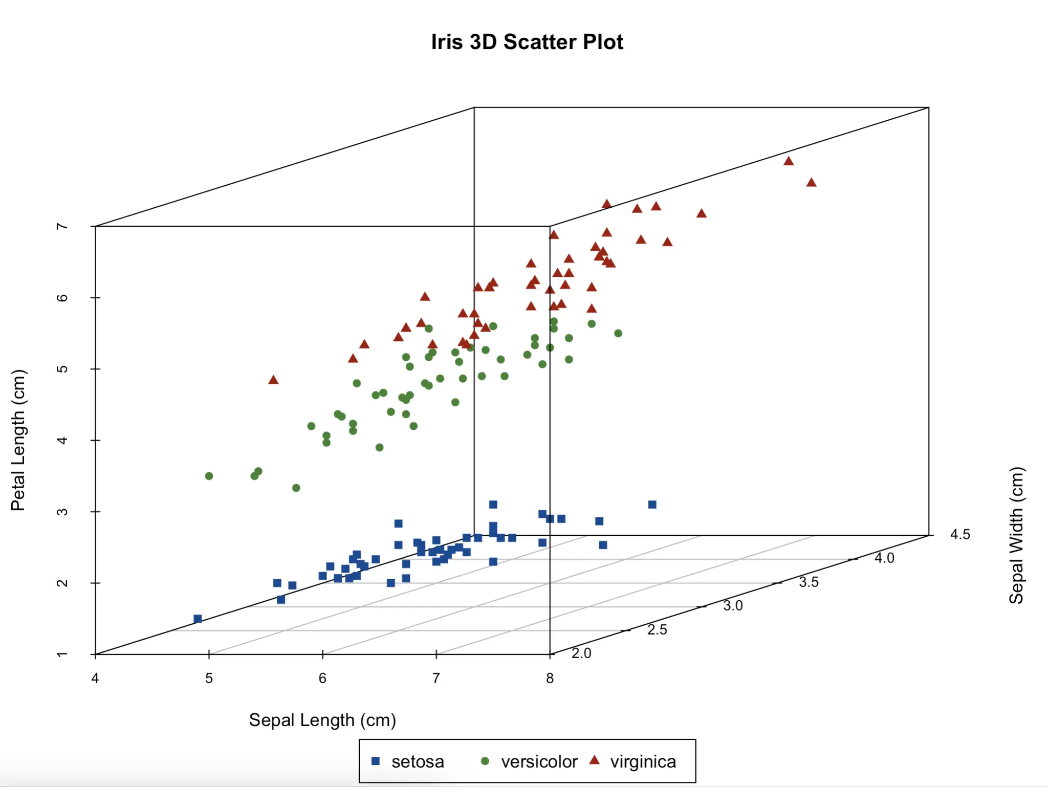
And that’s it!
Sadly, ScatterPlot3D isn’t interactive, which means you’ll manually have to change the `angle` to look at the chart from another side. If that’s a deal-breaker for you, we have a solution in the following sections.
RGL - Adding Basic Interactivity
The RGL package allows you to build interactive 3D charts in R. It also doesn’t ship with the default R installation, so you’ll have to install it with the `install.packages(“rgl”)` command. Depending on your system, that might not be enough. For example, on Mac, you’ll also need to install XQuartz to actually display the charts.
Follow the official installation instructions to get RGL up and running on your system.
Once you do, this is all you need to make a basic 3D scatter plot:
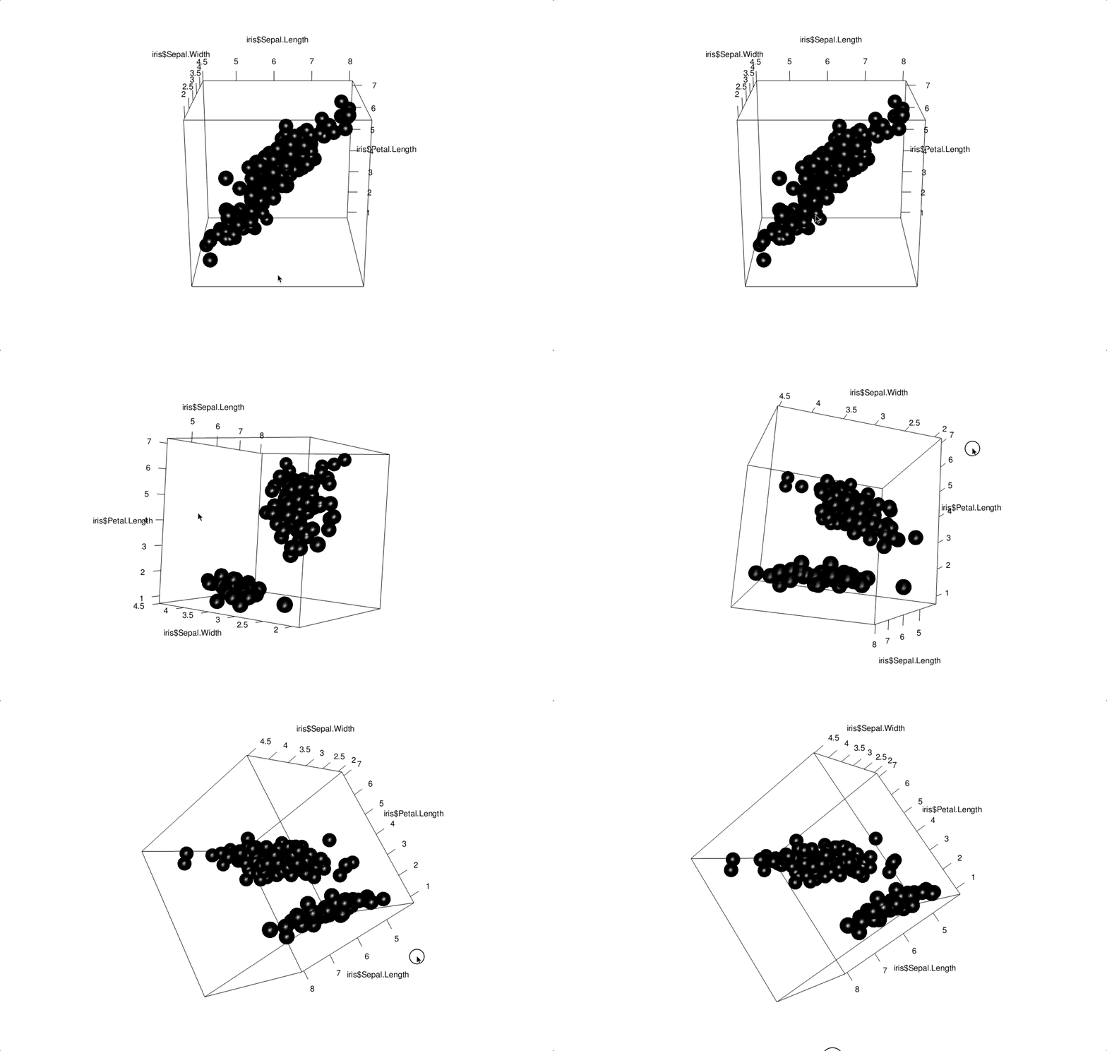
You get spheres as data points (specify `type = “p”` for points). These are too big by default and don’t provide a clear distinction between Iris flower species.
Let’s solve all of these issues next. The additional `col` and `radius` parameters work similarly to our previous example in ScatterPlot3D:
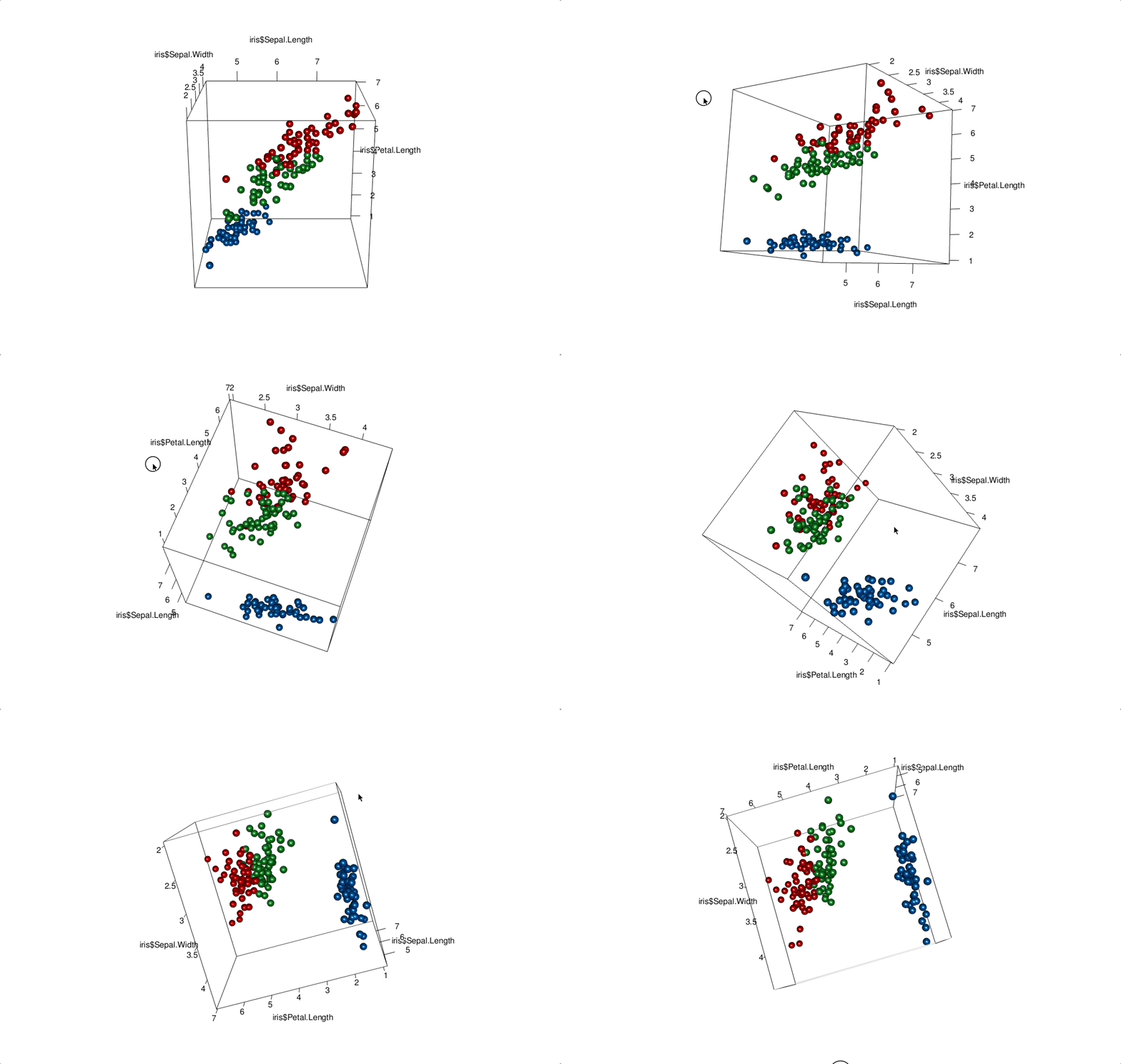
Now we’re getting somewhere! You can also add title and axis labels with the same parameters as in ScatterPlot3D:
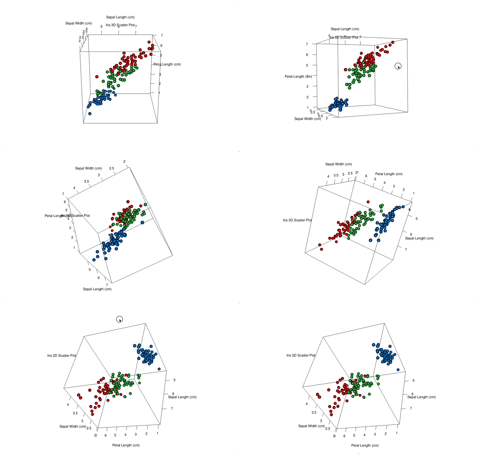
However, the resulting labels don’t look as good, and they change position as you rotate the chart.
The biggest issue with RGL is that it lacks customization. You can’t change marker shapes (or at least not easily), and the overall chart resolution is low. Still, it’s a viable option if you need basic interactive 3D charts in R.
Plotly - Best Interactivity and Customization for R 3D Charts
Finally, let’s take a look at probably the best 3D charting tool in R - Plotly. As you probably know, it’s more of a one-stop-shop for data visualization in R and Shiny, and it doesn’t specialize in 3D data visualization.
You can install Plotly by running `install.packages(“plotly”)` command from the R console.
As for the usage, the `plot_ly()` function has everything you need. The important thing is that you specify `type = “scatter3d”` and `mode = “markers”` to get a 3D scatter plot. We’ll also make the points a bit smaller while we’re here:
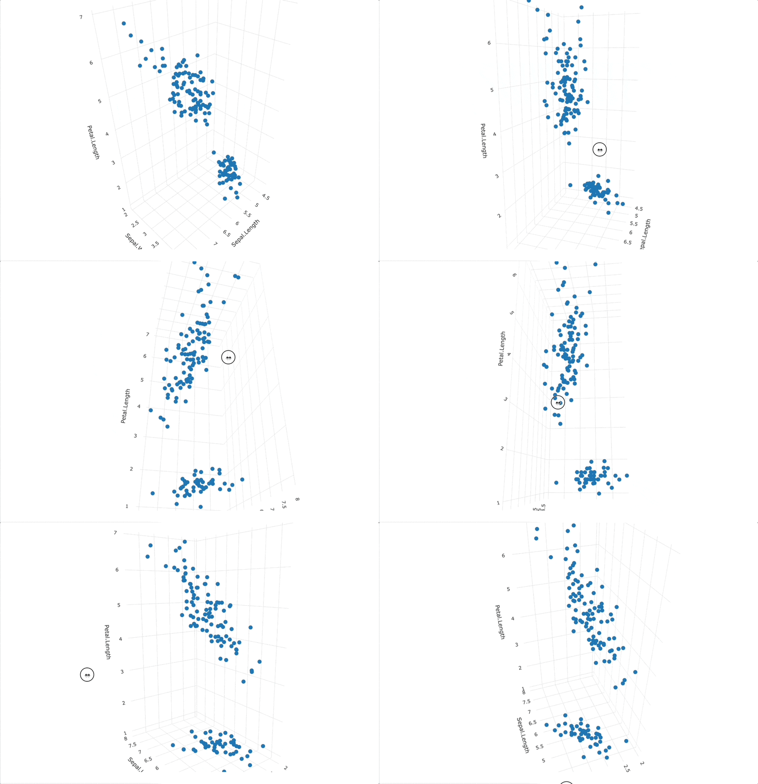
The resulting chart is interactive and data points have built-in tooltips, which is nice. Still, it suffers from the same issue as the previous two packages - it’s not easy to distinguish between categories at first glance.
Let’s fix that by changing the marker symbol and color:
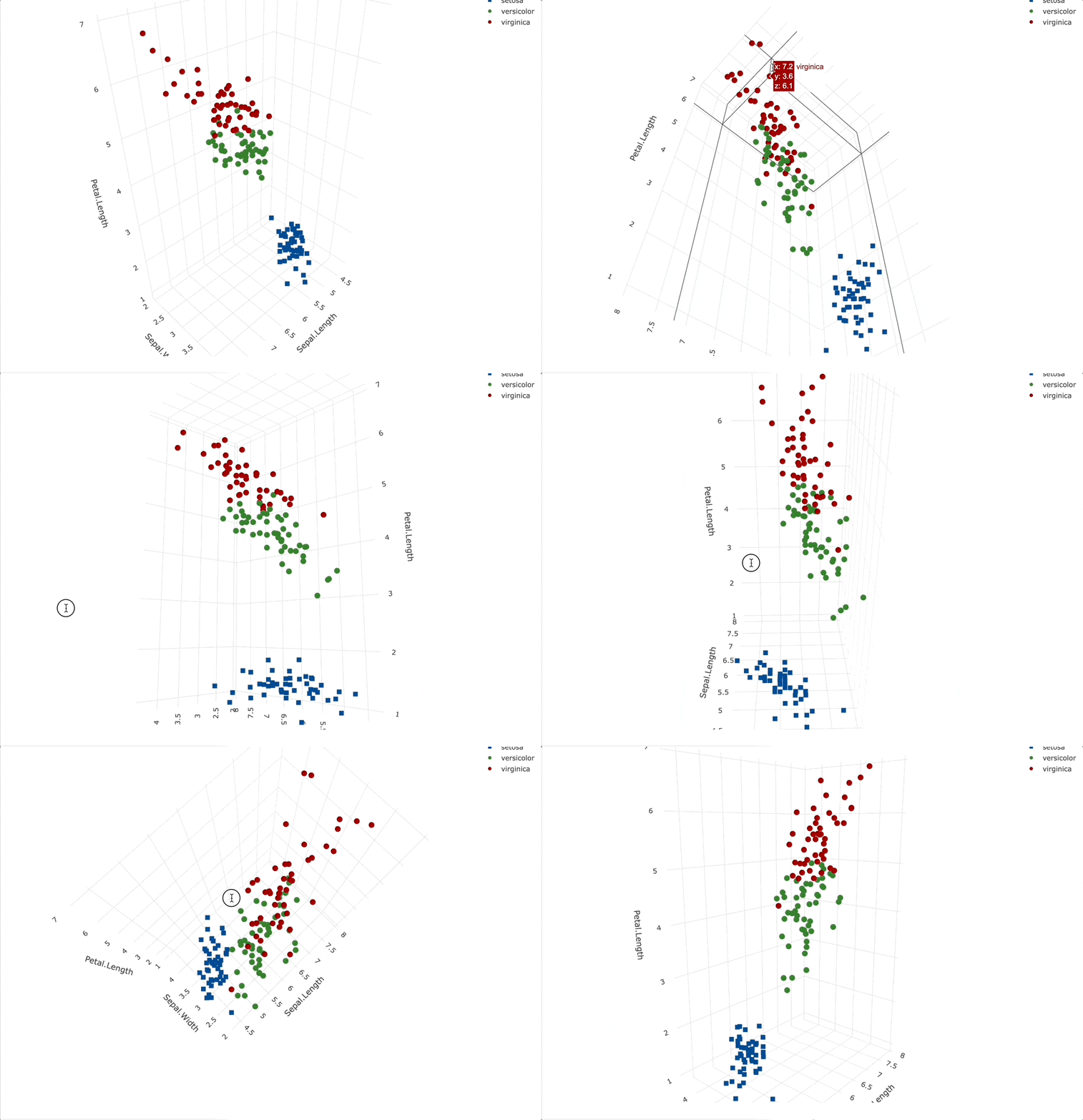
You can see that the legend also pops up by default, which is a nice touch.
Let’s proceed by adding title and axis labels, just like in the previous examples. These are specified by chaining the `layout()` function to the plot result:
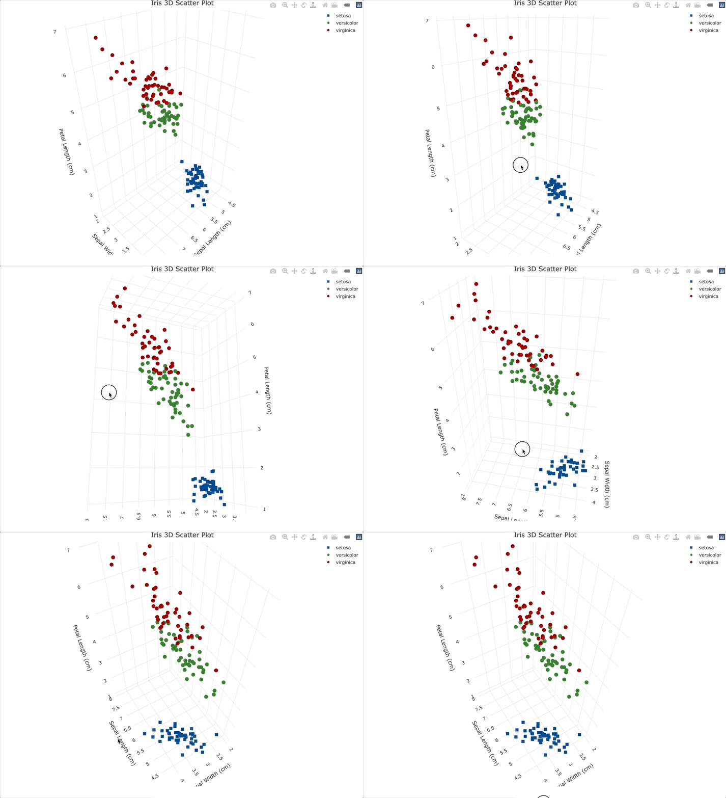
Just like with RGL, the title and axis labels will automatically change the place to the optimal one for the current angle.
While still in the `layout()` function, let’s also style the legend. We’ll move it to the center-right portion of the screen and add a thin border around it:
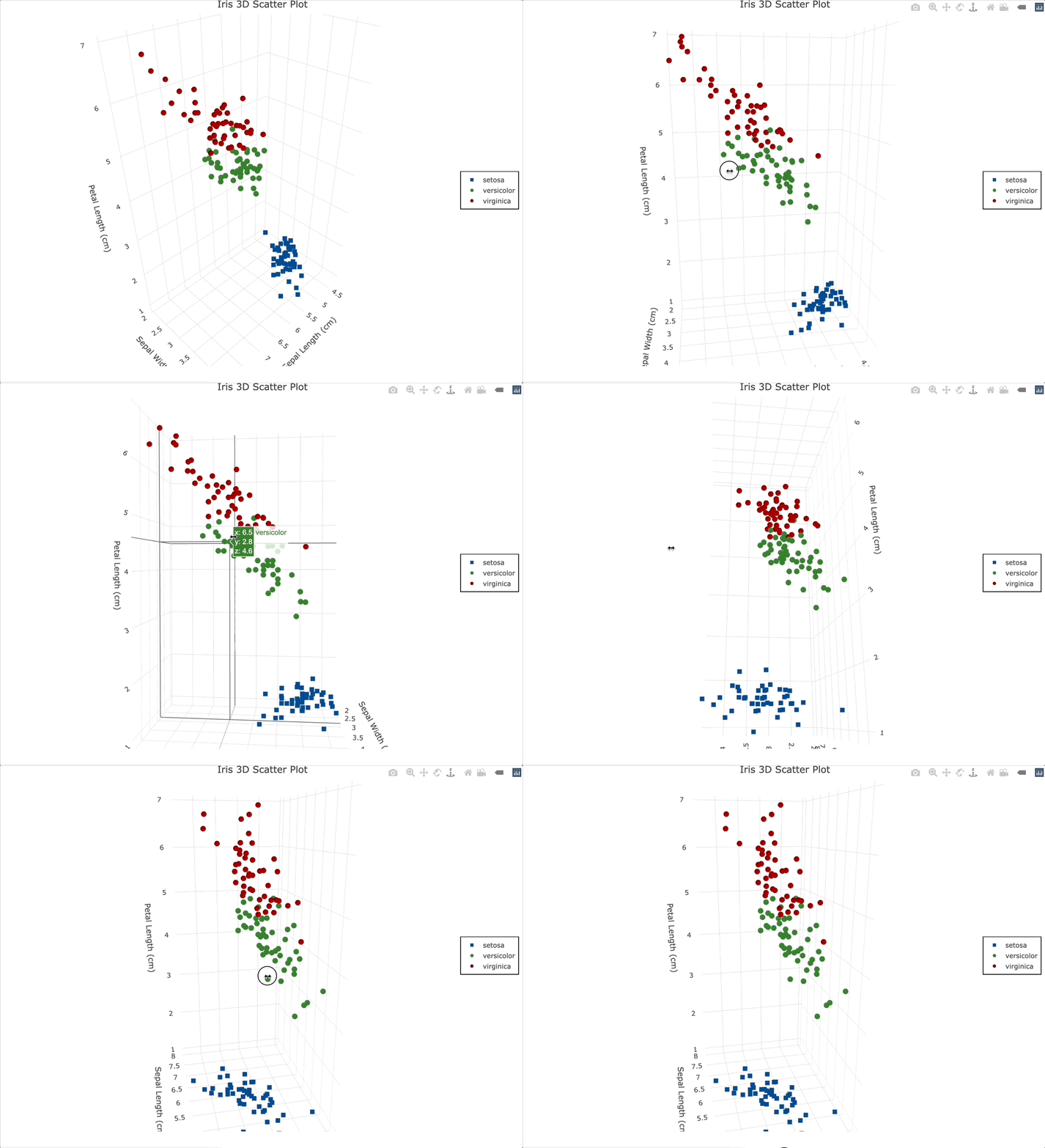
And finally, let’s go over the biggest pro of using Plotly for 3D visualization in R - tooltips. You can create a variable that will hold text that should appear on hover as HTML, and then override the default tooltip behavior by specifying `text = “<your-variable-name>”` and `hoverinfo = “text”` in the `plot_ly()` function.
This way, you can include more information about the individual data point in the tooltip and style it however you like:

That’s it for 3D visualization in R with Plotly. Let’s wrap things up next.
Summing Up R 3D Charts
If you’re looking for the perfect 3D visualization package in R, you have options. We recommend going with ScatterPlot3D if you don’t need interactivity, and Plotly if you do. RGL does support interactive visualizations, but we think Plotly does a better job and offers more customization.
Still, we want to say once again - avoid 3D visualizations altogether if you can! They introduce many issues, such as increased cognitive load and reduced interpretation capabilities. In most cases, they’re not worth it.
What are your thoughts on 3D data visualization in R? What’s your go-to package and why? Join our Slack community and let us know!
Comparing algorithm efficiency in R is easy with Microbench. Read our latest guide to get started.


.png)


