Unveiling Bottlenecks (Part 2): A Deep Dive into Profiling Tools

In our previous blog post, we introduced the concept of profiling for optimizing Shiny app performance. Today, we'll take a deep dive into three powerful tools in this arsenal: reactlog, profvis and shiny.tictoc.
Imagine your Shiny app – users are interacting seamlessly, data is processing swiftly, and visualizations update effortlessly. This blog post has everything you need to know.
We'll demonstrate their functionalities on a more intricate Shiny app, providing insights into their strengths and potential limitations.
reactlog
reactlog acts as a debugger for your Shiny app's reactive behavior. It visualizes a dependency graph, revealing how user inputs and reactive expressions interact. This helps you identify overly sensitive reactive elements that re-run too often and slow down your app. By analyzing the graph, you can optimize your reactive logic and ensure a smooth user experience.
Setup reactlog
- Installation: Run install.packages(“reactlog”)
- Enable reactlog: Run reactlog::reactlog_enable().
- Run your app: shiny::runApp().
- Interact with the app: Use the various input controls and observe the app's behavior. The interactions you perform here will be recorded by reactlog.
- Launch reactlog: Run shiny::reactlogShow() to view dependency graph
Deep dive into reactlog
Status bar

Progress Bar: Visualizing Reactive Flow

- Current Location (Dark Gray Rectangle): This marker indicates your app's current position within the reactive execution sequence.
- Reactive Endpoint Marks (Short Green Lines): These lines highlight points where reactive computations have reached completion (e.g., outputs or observations).
- Idle Periods (Tall Green Lines): These sections represent periods where your app is dormant, waiting for something to trigger a change in reactive values.
- User-Defined Marks (Tall Gray Lines): These markers allow you to designate specific points of interest within the reactive flow for future reference.
- Current Step Details:

The current step section provides in-depth information about the specific reactive step you're currently viewing:
- Step Description: This section clarifies the current stage within the reactive life cycle, helping you understand what computations are currently being executed.
- Time Information: This displays the elapsed time since the very first recorded step, offering a sense of the overall execution timeline.
- Session ID: For multi-user Shiny apps, the session ID identifies the specific user session associated with the current step.
Search Bar:

The search bar helps you navigate potentially complex reactive graphs with ease:
- Search by Name or ID: By entering at least three characters, the search bar highlights all matching elements within the graph, along with their associated family trees (related computations). This allows you to quickly locate specific reactive expressions or outputs of interest.
- Partial Matching: You can leverage partial matching for module names. For example, searching for "input" might highlight elements within the "details" module, helping you narrow down your search based on specific functionalities.
Navigation Buttons: Exploring the Reactive Timeline

The reactlog status bar provides a set of navigation buttons that allow you to move forward and backward through the timeline of your app's reactive computations. These buttons offer different levels of granularity:
- One-step navigation (arrow keys): Move a single step forward or backward within the displayed graph.
- Reactive endpoint jumps: Jump directly to the next or previous point where a reactive endpoint calculation finishes.
- Idle step navigation: Move to the next point where your app became idle.
- User-defined mark jumps (Home/End): Navigate to the nearest user-defined mark placed within your app.
Dependency Graph
Dependency graph can be complex for simple apps and simple for complex apps. It provides a useful high-level view of your app reactivity and can provide good insight on fixing the reactivity of your app. This helps in avoiding unnecessary reactive and observe calls.
Legend:

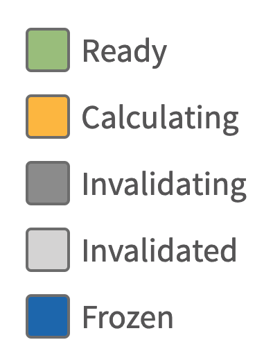
Analyzing Output
- Find Chatty Reactives: Look for nodes with many outgoing arrows (frequently re-evaluated expressions).
- Analyze Dependencies: Check for long chains (potential bottlenecks for calculations).
- Focus on Suspicious Areas: Use filtering and highlighting to zoom in on problem areas.
- Code Optimization: By focusing on path with most time taken, you can prioritize optimization efforts by re-factoring code, optimizing state management, etc
- Jump to profvis next: Combine with profvis for detailed execution times if needed.
profvis
profvis is an R package specially designed for performance profiling in Shiny apps. It takes a different approach than reactlog where it acts like a code execution profiler. Imagine a flame graph – profvis captures how long different parts of your code take to run. This helps you identify bottlenecks, sections of code that consume a significant amount of execution time. By analyzing the profvis flame graph, you can optimize your code and make your Shiny app run faster.
Setup profvis
- Installation: Run install.packages(“profvis”)
- Launch in profiling mode: Setting up profvis is very easy, simply use profvis::profvis( runApp(...) ) ) and later analyze the flame graph. Most complex step ever: Setting up profvis is really difficult and requires a lot of RShiny experience. If you are working on Rshiny since its inception and know how to write profvis::profvis( runApp(...) ) ) then only you’ll be able to use profvis to profile your app
- Interact with the app: Play around with like a normal user exploring different scenarios and use cases.
- Final step: Close the app and on the console, click on “Stop Profiling”. A profiler output window will appear automatically.
Deep dive into profvis
Flame graph
- Horizontal Axis: The horizontal axis of the flame graph represents the passage of time, typically from left to right. The width of the graph is determined by the total time spent executing the code.


- Vertical Bars: Each vertical bar in the flame graph represents a function call stack in your code. The height of the bar indicates the depth of the call stack, with the top-most bar representing the outermost function call.
- Colors: Different colors are used to distinguish between different functions or code blocks. Colors often depict different code categories (e.g., user code, Shiny functions, R base functions).
- Width of Bars: The width of each bar corresponds to the amount of time spent executing the function. Wider bars indicate that more time was spent in that particular function.
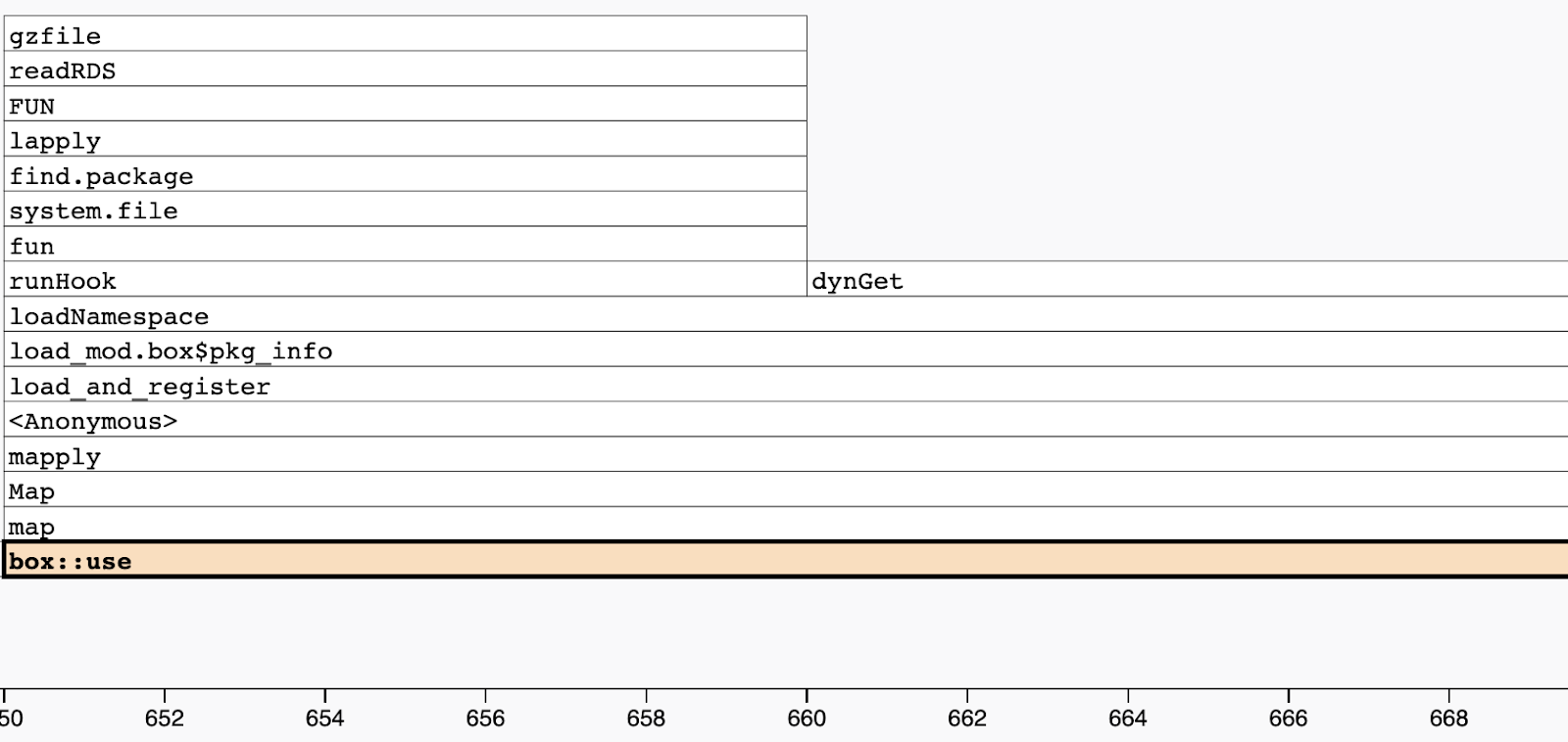
- Code viewer and editor: Just above the flame graph you will see code viewer. Code viewer also provides insights like memory consumption and time taken at line level.

- Clicking on Bars: Clicking on a bar representing a function call often reveals additional information. This might include the function name, self time (time spent within the function), and total time (including time spent in functions it calls).
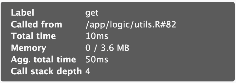
- Clicking on Cells: Single click on cell will move you to the specific function, double click on cell will redirect you to code editor in a separate window, additionally it will expand the bar to provide you a more clear view.
- Data Viewer: In addition to the flame graph, profvis also offers a data view accessible by clicking the Data tab. Here, you'll find a hierarchical table showing the profile in a top-down manner. Click on the code column to expand the call stack, and check the Memory and Time columns for resource allocation insights.

Analyzing Output
Analyzing the Flame Graph:
- Identifying Bottlenecks: Look for sections with the widest bars. These represent functions that consume the most execution time and are potential bottlenecks.
- Understanding Call Stack: Trace the path downwards from the top to identify the sequence of function calls leading to the bottleneck.
- Zooming In: Use interactive features to zoom in on specific sections for a closer look at nested function calls.
- Comparing Runs: You can compare flame graphs from different app versions to identify performance improvements or regressions.
Interpreting the Information:
- Time Spent in Functions: The width of a bar at a specific level reveals the time spent executing that particular function.
- Self Time vs. Total Time: Some profvis implementations differentiate between "self time" (time spent within the function itself) and "total time" (including time spent in functions it calls). This helps identify functions that contribute significantly to bottlenecks through nested calls.
- Code Optimization: By focusing on functions with the widest bars, you can prioritize optimization efforts by re-factoring code, leveraging vectorization, or exploring alternative algorithms.
Prototyping apps in Shiny is fast and easy, but once an app grows, performance issues may arise. Check out the definitive guide to speeding up your R/Shiny app.
Which one is better?
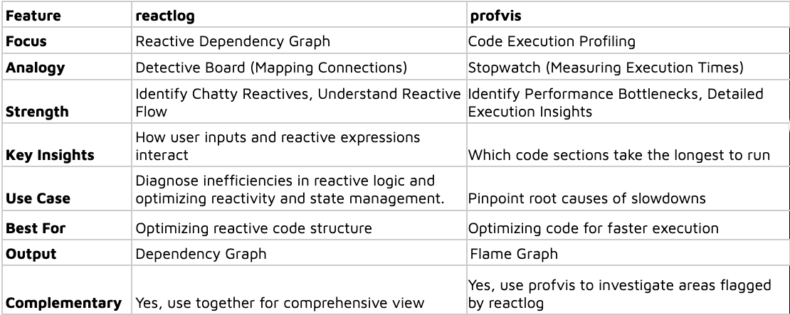
Both reactlog and profvis are powerful tools for optimizing Shiny app performance, but they offer distinct perspectives. Choosing the "better" option depends on the specific issue you're trying to diagnose. Let's delve into their unique strengths and see when each one shines:
Quick Comparison
shiny.tictoc
Sometimes difficult problems have simple solutions. It’s okay if you feel overwhelmed by the above-mentioned packages. If you want to avoid diving into the rabbit hole of profiling and analyzing flame or dependency graphs, we’ve an alternate solution for you to start with. Presenting shiny.tictoc made with 💙 in Appsilon’s laboratory.
shiny.tictoc helps you measure the performance of your app without installing additional package or writing scenarios. It provides a simple visualization that helps you measure how much time it takes to recalculate each output of your app and how long do server side computations take.
Setup shiny.tictoc
- Installation: You DON’T need to install anything 🎉
- Integration: Include a js script in your app’s ui
tags$script(src = "https://cdn.jsdelivr.net/gh/Appsilon/shiny.tictoc@v0.2.0/shiny-tic-toc.min.js") - Run your app: shiny::runApp().
- Interact with your app: Use the various input controls and observe the app's behavior.
- How to view the output? some text
- Open browser tools: Windows: F12, macOS: ⌘ + ⌥ + I
- Run below commandssome text
- Print out all measurements: showAllMeasurements()
- Download all measurements as a CSV file: exportMeasurements()
- Print out summarised measurements (slowest rendering output, slowest server computation): showSummarisedMeasurements()
- Export an html file that visualizes measurements on a timeline: await exportHtmlReport()
Analyzing output
shiny.tictoc outputs looks like this:
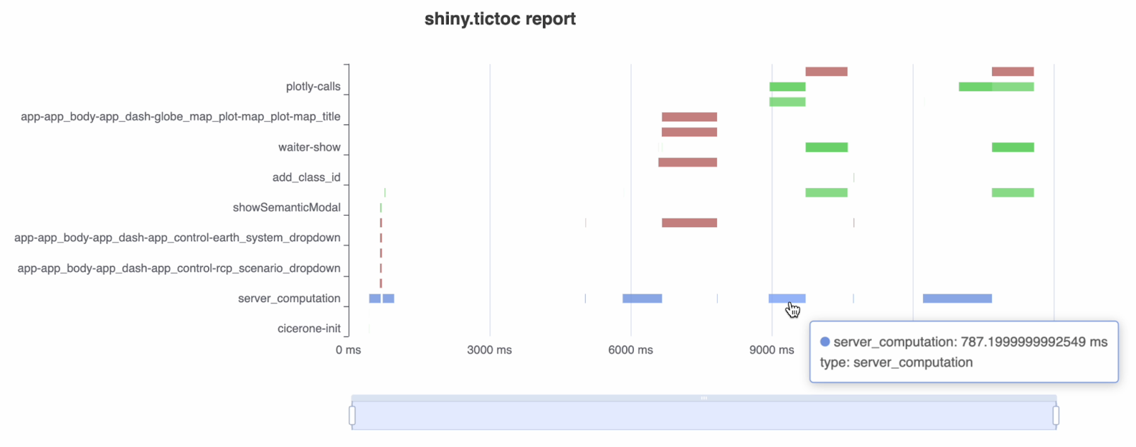
You need to remember a few things before analyzing it:
- X - axis shows timeline.
- Red is for outputs (it looks at the shiny:recalculating and shiny:value events)
- Green is for custom message handlers (looks at the shiny:message event)
- Blue is for general server side calculations (shiny:busy and shiny:idle events)
To learn more about js events in shiny, check out the official documentation.
Why shiny.tictoc?
- Quick profiling.
- Provides a good starting point.
- Can be integrated in production applications. Developers can test the performance of deployed applications.
For more information on shiny.tictoc, check out the official repo.
The Power of Combining Forces
All 3 packages mentioned are not mutually exclusive. In fact, combining them offers a comprehensive view of your app's performance:
- Overview: Get an overview of performance using shiny.tictoc
- Diagnose Reactive Issues: Use reactlog to identify overly sensitive reactive expressions.
- Pinpoint Execution Bottlenecks: Leverage profvis to identify the specific code sections causing slowdowns in the areas flagged by reactlog and shiny.tictoc.
By working together, these tools empower you to not only identify potential problems but also pinpoint their root causes within your code. This holistic approach allows you to make informed decisions for optimizing your Shiny app's performance and user experience.
Stay up to date on the latest in R/Shiny. Register for our weekly newsletter today.


