How I built an interactive Shiny dashboard in 2 days without any experience in R - R Shiny Dashboard Tutorial

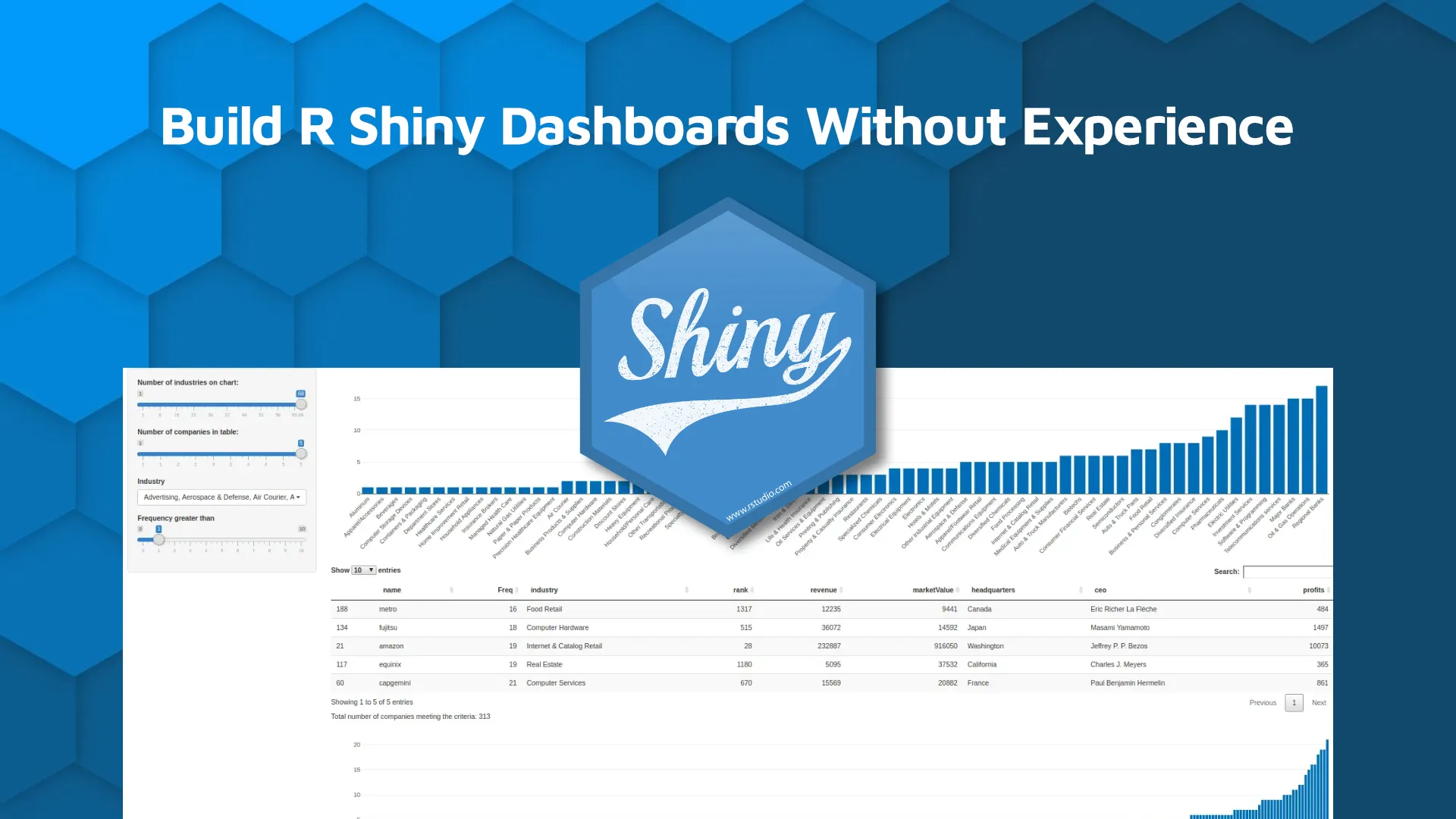
<i><b>Updated: </b>May 23, 2022</i> R Shiny is a great way to quickly display data and create interactive dashboards, and it is the backbone of many of Appsilon's projects. As a Project Leader, I needed to understand the challenges that come with working in this environment, even though I personally have never used R before. In this R Shiny dashboard tutorial, I will discuss my experience with learning R and show you how to build a Shiny dashboard in just two days without any prior knowledge. The only programming language I have ever got any hands-on experience with is Python and I would say that I know it on a “google it and try it" level. I thought learning R would be quite a challenge. Fortunately, I discovered that there are many examples of R Shiny code out there that I could use, so I started immediately. I was really surprised by how easy it is to start writing code in R. The opportunity to apply this knowledge and develop my skills in R Shiny presented itself quickly. I needed to prepare a report for my manager and an interactive dashboard seemed like the best way to present the large amount of data I was working on. <blockquote>Do you want to start a career as an R Shiny Developer? <a href="https://appsilon.com/how-to-start-a-career-as-an-r-shiny-developer/" target="_blank" rel="noopener">Our complete guide for beginners has you covered</a>.</blockquote> Table of contents: <ul><li><a href="#my-journey">My Journey with R and R Shiny Dashboards</a></li><li><a href="#tutorial">R Shiny Dashboard Tutorial - Source Code and Explanations</a></li><li><a href="#summary">Summary of R Shiny Dashboard Tutorial</a></li></ul> <hr /> <h2 id="my-journey">My Journey with R and R Shiny Dashboards</h2> Within just two days I had a functional app that showed all of the data I wanted to display. The dashboard made it easy to analyze the data in a way that would be useful for business decisions. I created something that I knew would be used in the future. <img class="size-full wp-image-13077" src="https://webflow-prod-assets.s3.amazonaws.com/6525256482c9e9a06c7a9d3c%2F65b39d62efd0e52eddb1e56f_1.webp" alt="Image 1 - My dashboard" width="1200" height="483" /> Image 1 - My dashboard On the second day, I already felt more confident and I wanted to develop my dashboard further. And then the problems started. I realized that starting programming in Shiny is easy but it gets tricky if you want to customize the app. I thought it was a good opportunity to learn from somebody more experienced and got help from one of our developers. The results definitely exceeded my expectations. <img class="size-full wp-image-13079" src="https://webflow-prod-assets.s3.amazonaws.com/6525256482c9e9a06c7a9d3c%2F65b79f02cde6db5fddd1238e_2.webp" alt="Image 2 - Dashboard by Pedro, in dark mode" width="1200" height="635" /> Image 2 - Dashboard by Pedro, in dark mode Ultimately, R Shiny is an excellent tool for quickly creating visually appealing and useful dashboards and is relatively easy to learn. However, there are two major challenges to deploying more advanced solutions. First, introducing custom dashboard designs might prove difficult without a certain degree of familiarity with CSS and JavaScript. Second, the process of moving the app to production requires more advanced skills as well. My app is never used by more than 2 users concurrently, so it is not much of an issue. However, making it available to a few hundred people does require <a href="https://appsilon.com/alternatives-to-scaling-shiny/" target="_blank" rel="noopener">extra steps</a>. I still would encourage developers to create Proof of Concept solutions in R - moving them to production certainly is possible. In one of the projects I lead, we created an R Shiny app that is being used by 500 users. Productionisation is a challenging exercise indeed, and it is one of the specialties of Appsilon Data Science. If you want to discuss building enterprise decision support dashboards, feel free to reach out. The slide below provides a hint at what supports a solid production-ready Shiny application. Read on for the details of my experience with code samples which should help you build your first dashboard. <img class="size-full wp-image-13081" src="https://webflow-prod-assets.s3.amazonaws.com/6525256482c9e9a06c7a9d3c%2F65b39d6399485861cb3b91d0_3.webp" alt="Image 3 - What goes into a production-ready Shiny app" width="600" height="337" /> Image 3 - What goes into a production-ready Shiny app <h2 id="tutorial">R Shiny Dashboard Tutorial - Source Code and Explanations</h2> Let's say that we have data that represents a set of industries, companies, and the frequency of a certain event for each company: <img class="size-full wp-image-13083" src="https://webflow-prod-assets.s3.amazonaws.com/6525256482c9e9a06c7a9d3c%2F65b39d641fc8a900c07b0fd5_4.webp" alt="Image 4 - match_name_table and industries_table" width="223" height="292" /> Image 4 - match_name_table and industries_table <h3>UI/Server</h3> To get started I looked into the structure of an R Shiny app. I found out that the main file is divided into two parts, UI, and server. The ui is built from <code>sidebarPanel</code> and <code>mainPanel</code>. The <code>sidebarPanel</code> contains input controls that can be passed to the <code>mainPanel</code>. The <code>mainPanel</code> contains items defined on a server-side that we would like to display in the app. As you can see below, my app contains four inputs, two plots, one table, and a text field. For the sake of clarity, I am not showing the entire code at once. I used (…) for the lines of code that will be explained later. <pre class="language-r"><code class="language-r" data-lang="r">library(jsonlite) library(dplyr) library(data.table) library(shiny) library(shinyWidgets) library(DT) library(plotly) ui <- fluidPage( <br> sidebarLayout( sidebarPanel( sliderInput(...), sliderInput(...), pickerInput(...), sliderInput(...), width = 2 ), mainPanel( plotlyOutput("distPlot"), dataTableOutput("view"), tableOutput("view2"), plotlyOutput("distPlot2"), width = 10 ) )) server <- function(input, output, session) { no_of_companies <- reactiveVal(0, "Number of Companies:") observeEvent(..) observeEvent(...) output$distPlot <- renderPlotly(...) output$view <- DT::renderDataTable(...) output$distPlot2 <- renderPlotly(...) output$view2 <- renderText(...) } <br>shinyApp(ui = ui, server = server) </code></pre> <h3>Sliders</h3> The data set used in the app was quite big and I wanted to give the user the possibility to filter it out using sliders. The first slider allows defining a filter based on the values from the <code>Freq</code> column in the <code>industries_table</code>. <pre class="language-r"><code class="language-r" data-lang="r">sliderInput( inputId = "freq", label = "Frequency grater then", min = 0, max = min(10 , max(as.numeric(industries_table["Freq"][, 1]))), value = 1 ) </code></pre> <img class="size-full wp-image-13085" src="https://webflow-prod-assets.s3.amazonaws.com/6525256482c9e9a06c7a9d3c%2F65b0228eaa4d870bbd4d61db_5.webp" alt="Image 5 - Slider control example" width="280" height="95" /> Image 5 - Slider control example I then realized that the user might want to focus only on the industries which are the most common in the data set. That is why I created a slider that allows the user to select the number of bars shown on the first bar chart. This way the user could see only the top n industries from the data set on the plot. <pre class="language-r"><code class="language-r" data-lang="r">sliderInput( inputId = "no_of_industries", label = "Number of industries on chart:", min = 1, max = length(industries_table["Freq"][, 1]), value = 5 ) </code></pre> <img class="size-full wp-image-13087" src="https://webflow-prod-assets.s3.amazonaws.com/6525256482c9e9a06c7a9d3c%2F65b0228faa4d870bbd4d61ff_6.webp" alt="Image 6 - Slider control example (2)" width="274" height="88" /> Image 6 - Slider control example (2) The maximum value of the second slider is based on the number of rows in the <code>industries_table</code> table, which depends on the first slider input. I needed to update the maximum value for the second slider every time the user changes the value in the first slider. Here I used a reactive expression called <code>observeEvent</code> which allowed me to monitor the changes and update the slider input if necessary. The grayed-out part is responsible for preparing the data and will be explained later. The code below tells us that we will monitor the <code>freq </code>slider and change the maximum and the default values of <code>no_of_industries</code> slider. Then, I added one more slider and observer built in the same way as the one above. <pre class="language-r"><code class="language-r" data-lang="r">observeEvent(input$freq, { min_value = input$freq + 1 max_value = max(as.numeric(match_name_table["Freq"][, 1])) match_name_table = match_name_table[match_name_table$Freq % in % min_value: max_value), ] x <- order_company_per_industry_counts(match_name_table) updateSliderInput( session, inputId = "no_of_industries", min = 1, max = length(x), value = length(x) ) }) </code></pre> I also added a picker which enables the user to see only the companies from the industries in which they are interested. <pre class="language-r"><code class="language-r" data-lang="r">shinyWidgets::pickerInput( InputId = "industries", label = "Industry", choices = unique(match_name_table[3][order(match_name_table[3]$industry), ]), selected = unique(match_name_table[3][order(match_name_table[3]$industry), ]), options = list('actions-box' = TRUE), multiple = T ) </code></pre> <img class="size-full wp-image-13089" src="https://webflow-prod-assets.s3.amazonaws.com/6525256482c9e9a06c7a9d3c%2F65b02291ce89f18bcc07e035_7.webp" alt="Image 7 - Industry selector/filter" width="316" height="166" /> Image 7 - Industry selector/filter <h3>Plots</h3> The first plot I created was a bar chart that shows the frequency for each industry. I used an R Shiny library called Plotly. <img class="size-full wp-image-13091" src="https://webflow-prod-assets.s3.amazonaws.com/6525256482c9e9a06c7a9d3c%2F65b02291b7757cdfbbabd381_8.webp" alt="Image 8 - Bar chart made with Plotly" width="1200" height="315" /> Image 8 - Bar chart made with Plotly I assigned the <code>renderPlotly</code> function to the first output called <code>distPlot</code>. <pre class="language-r"><code class="language-r" data-lang="r">output$distPlot <- renderPlotly({ min_value = input$freq + 1, max_value = max( as.numeric(match_name_table["Freq"][, 1]), match_name_table = match_name_table[match_name_table$Freq %in% min_value:max_value) freq_values <- order_company_per_industry_counts(match_name_table)["Freq"][, 1] industries <- order_company_per_industry_counts(match_name_table)["industry"][, 1] n <- as.integer(input$no_of_industries) freq_values <- freq_values[(length(freq_values) - n + 1):length(freq_values)] industries <- as.character(industries[(length(industries) - n + 1):length(industries)]) xform <- list(categoryorder = "array", categoryarray = industries, tickangle = -45) plot_ly(y = freq_values, x = industries, type = "bar") %>% layout(xaxis = xform) }) </code></pre> The first part of the code deals with data preparation. The idea is to display the data only for companies that have a frequency higher than <code>min_value</code> are filtered out from the <code>match_name_table</code> table. The <code>min_value</code> is defined based on the <code>freq</code> input. Industry names and the number of companies that visited the website are then assigned to the resulting <code>freq_values</code> and <code>industries</code>. The last thing we have to do is to limit the number of bars displayed on the plot to <code>input$no_of_industries</code> elements. Together, we have all the building blocks for our bar chart. A list called <code>xform</code> is used here to maintain the order of the industries and set the angle of the labels to 45 degrees. The default is to display the data alphabetically. <pre class="language-r"><code class="language-r" data-lang="r">plot_ly(y = freq_values, x = industries, type = "bar") %>% layout(xaxis = xform) </code></pre> Is equivalent to: <pre class="language-r"><code class="language-r" data-lang="r">layout(plot_ly(y = values, x = industries, type = "bar"), xaxis = xform) </code></pre> <code>order_company_per_industry_counts</code> is a simple function that counts the number of companies for each industry and orders the data in descending order. The <code>order_company_per_industry_counts</code> method looks like this: <pre class="language-r"><code class="language-r" data-lang="r">order_company_per_industry_counts <- function(match_name_table) { new_table = table(match_name_table$industry) new_table <- as.data.frame(t(new_table)) new_table <- subset(new_table, select = -c(Var1)) new_table <- new_table[order(new_table$Freq),] return(new_table) } </code></pre> <h3>Reactive value</h3> I added one more bar chart displaying the frequency for all companies. I thought it would also be nice to display the count of all of the companies from the plot. To achieve this I needed to use a reactive value. The value was updated in the plot body and displayed as a text. <pre class="language-r"><code class="language-r" data-lang="r">no_of_companies <- reactiveVal(0, "Number of Companies:") output$distPlot2 <- renderPlotly({ ... no_of_companies(nrow(data_plot)) … } }) output$view2 <- renderText({ paste("Total number of companies meeting the criteria:", no_of_companies()) }) </code></pre> <img class="size-full wp-image-13093" src="https://webflow-prod-assets.s3.amazonaws.com/6525256482c9e9a06c7a9d3c%2F65b01d0fb3a2a70e3dfa46e8_9.webp" alt="Image 9 - Another bar chart" width="1200" height="171" /> Image 9 - Another bar chart <h3>Table</h3> I thought that the user may want to see more detailed information about the companies. Here I decided to use the <code>DT</code> library. <pre class="language-r"><code class="language-r" data-lang="r">output$view <- DT::renderDataTable({ req(input$industries) min_value = input$freq + 1 max_value = max(as.numeric(match_name_table["Freq"][, 1]) match_name_table = match_name_table[match_name_table$Freq %in% min_value:max_value), ] comp_data = match_name_table[match_name_table$industry %in% input$industries,] data = merge(x = comp_data, y = select(data_industries, 2,3,8,9,10,11,12), by = c("name"), all.x = TRUE) data <- data[order(data$Freq), ] if (nrow(data) == 0) { print("Please change the Frequency to a smaller value") } else{ tail(data, as.integer(input$no_of_industries_in_a_table)) } }) </code></pre> <img class="size-full wp-image-13095" src="https://webflow-prod-assets.s3.amazonaws.com/6525256482c9e9a06c7a9d3c%2F65b0229384ab67fae7eb240f_10.webp" alt="Image 10 - Table made with DT library" width="1024" height="137" /> Image 10 - Table made with DT library <blockquote>Not a DT fan? <a href="https://appsilon.com/top-r-packages-for-table-data/" target="_blank" rel="noopener">Here are alternative R packages for visualizing table data</a>.</blockquote> The interesting part here is the first line. Before I added it the app was displaying an error every time the industry's input was empty. Function <code>req</code> ensures that values are available before proceeding with an action. <h2 id="summary">Summary of R Shiny Dashboard Tutorial</h2> In conclusion, you can definitely build "usable" R Shiny dashboards without prior R knowledge in only a couple of days. We use the term "usable" loosely because shipping production-ready and scalable dashboards in such as short time frame is a no-go. Do you have a favorite introductory R tutorial? Add it below in the comments. If you're ready to build a production-level dashboard, check out my colleague Pedro's post "<a href="https://appsilon.com/journey-from-basic-prototype-to-production-ready-shiny-dashboard/">A journey from basic prototype to production-ready dashboard</a>." And thanks for reading! <h3>Follow Appsilon on social media</h3><ul><li>Follow<a href="https://twitter.com/appsilon"> @Appsilon</a> on Twitter.</li><li>Follow us on<a href="https://www.linkedin.com/company/appsilon"> LinkedIn</a></li><li>Sign up for our<a href="https://appsilon.com/blog/"> newsletter</a></li><li>Try out our R Shiny<a href="https://appsilon.com/opensource/"> open source</a> packages</li></ul>
Contact us!


.png)