R Highcharts: How to Make Interactive Maps for R and R Shiny

.png)
R Shiny needs no introduction, as it’s one of the go-to frameworks for building amazing applications and dashboards. But most of them lack one thing - interactivity and motion. Truth be told, R’s standard visualization packages such as ggplot2 aren’t interactive, so that’s the main reason why.
Enter R Highcharts - a free package for making interactive and animated visualizations, straight from R! We’ve already discussed in our introduction article, drilldown article , and a dedicated Shiny article, so this one will serve as icing on the cake, as you’ll learn how to add interactive maps to your applications.
After reading, you’ll know how to make choropleth and bubble maps in R and R Shiny. We have a lot of ground to cover, so let’s dig in!
Looking to add interactive Google Maps to your Shiny app? Read our guide to find out how.
Table of contents:
- How to Make Choropleth R Highcharts Maps
- How to Add Points to R Highcharts Maps
- R Highcharts Maps in R Shiny - How to Get Started
- Summing up R Highcharts Maps
How to Make Choropleth R Highcharts Maps
You can think of choropleth maps as a type of thematic map in which certain areas are shaded or patterned in proportion to the value of a variable being represented.
Let’s say you’re a restaurant chain owner in the US and operate in numerous locations across all 50 states - you can use choropleth maps to visually represent the number of restaurants in each state. The darker the shade of color, let’s say blue, the more restaurants you have running there.
We’ll showcase something similar in this section.
The Dataset
To make our choropleth map with R Highcharts maps, we’ll use the US Airports List Dataset:
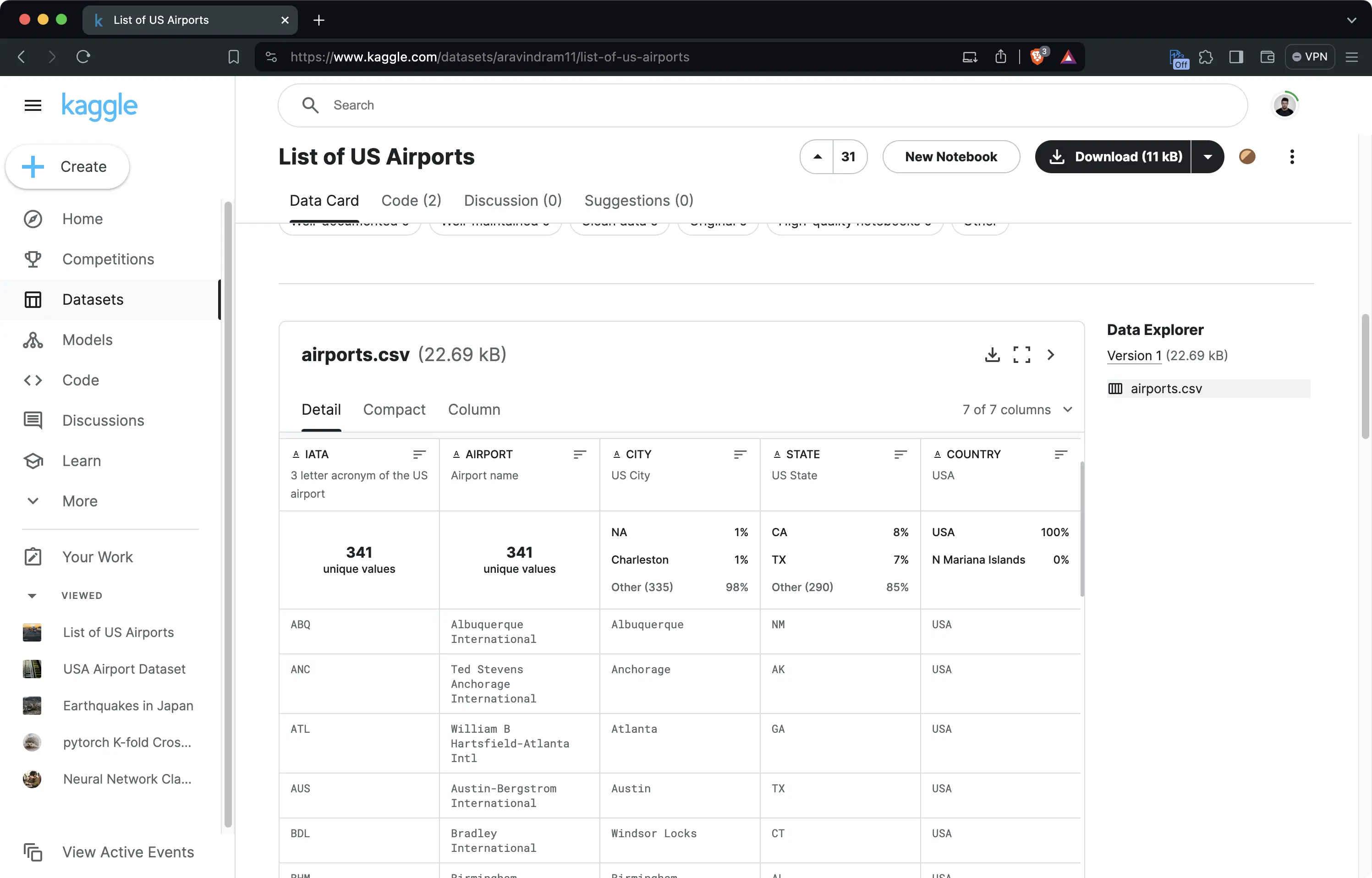
In plain English, it shows the name and geolocation of each airport in the United States and also groups them by state. Sounds like a perfect use case for choropleth maps, doesn’t it?
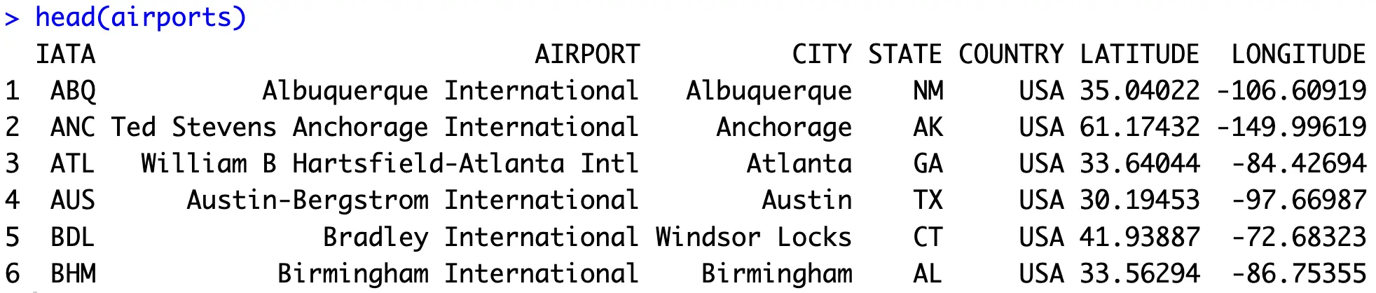
Download the dataset CSV file and load it into R. Simply copy the following snippet - it will also get rid of a couple of missing values:
Here’s what you should end up with:
You now have everything needed to start building R Highcharts choropleth maps, so let’s start with that in the following section.
Base Highcharts Map
The idea now is to start small and continuously build up. You need a base map to get started and the one covering the United States sounds like a perfect candidate.
If you need more map options, make sure to check out the official website. Simply click on the region you’re interested in, open the example, and copy the relevant part of the URL.
For our case, `countries/us/us-all` sounds like a perfect candidate. Let’s wrap it into a call to `hcmap` to see what happens:
This is the output you’ll get:
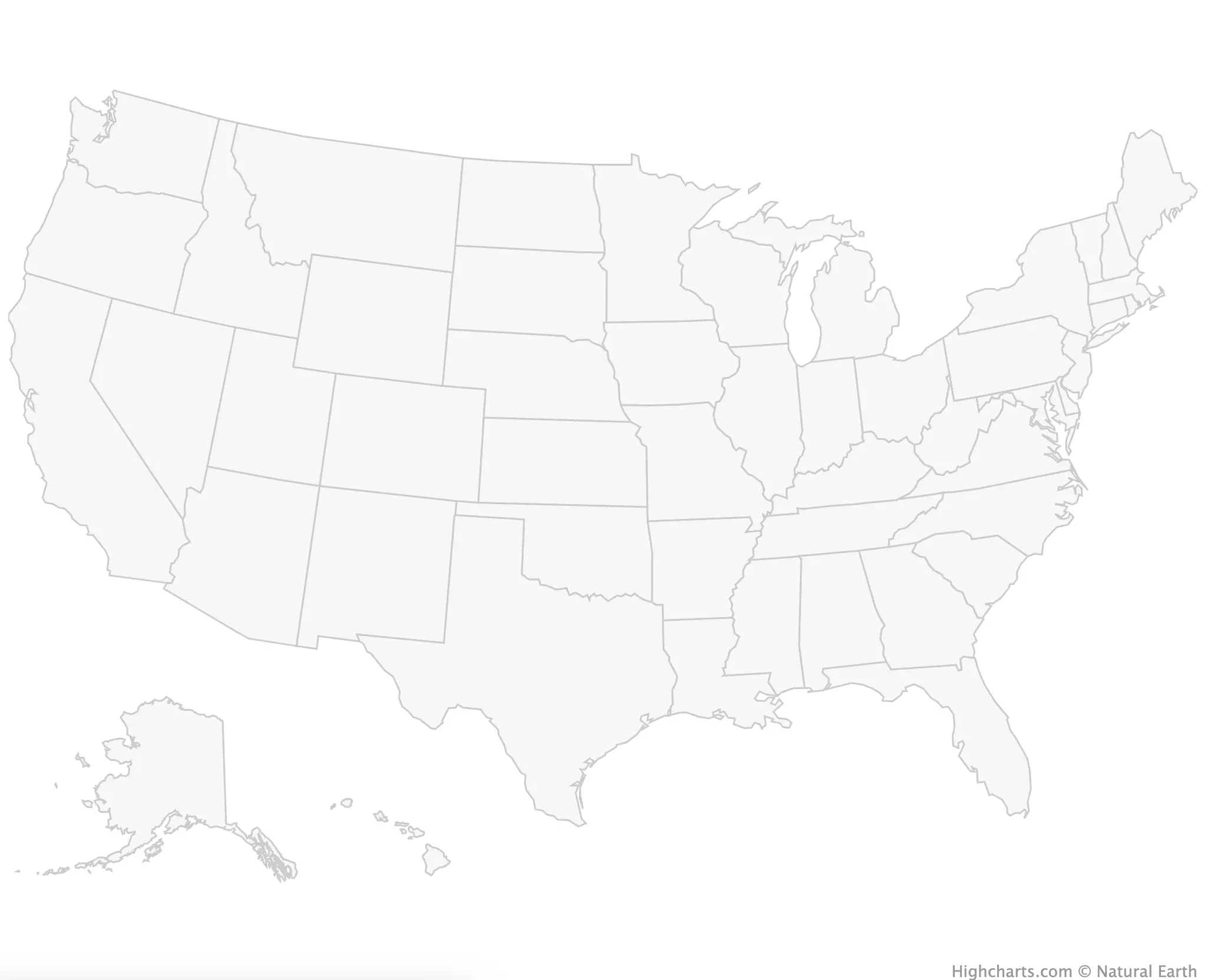
The foundation is there, but we have to build on it. No data is shown currently, and we have no idea what we’re representing. To solve this last issue, let’s add a title and subtitle:
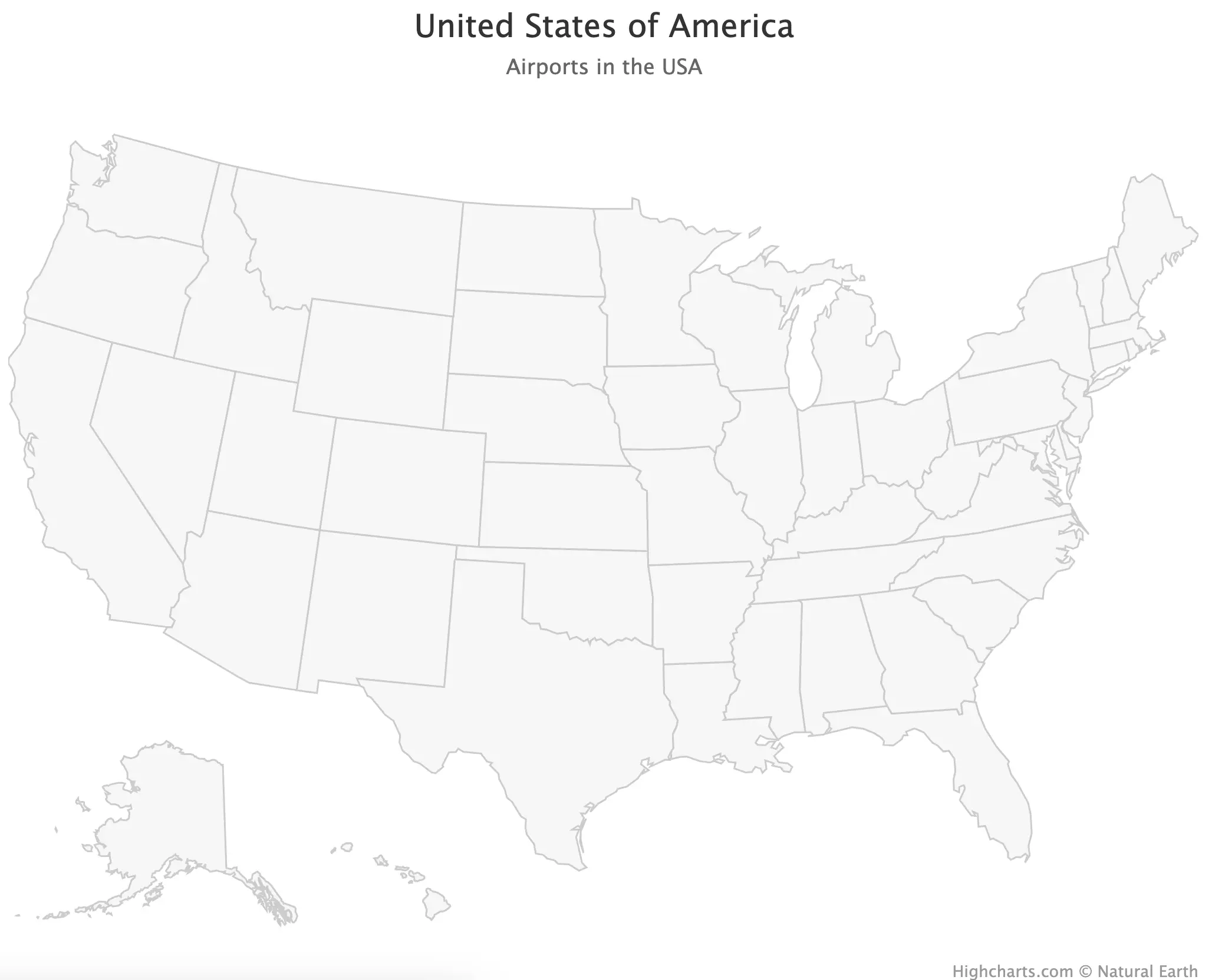
You now know what you should be looking at, but the data isn’t there yet. Let’s fix that next.
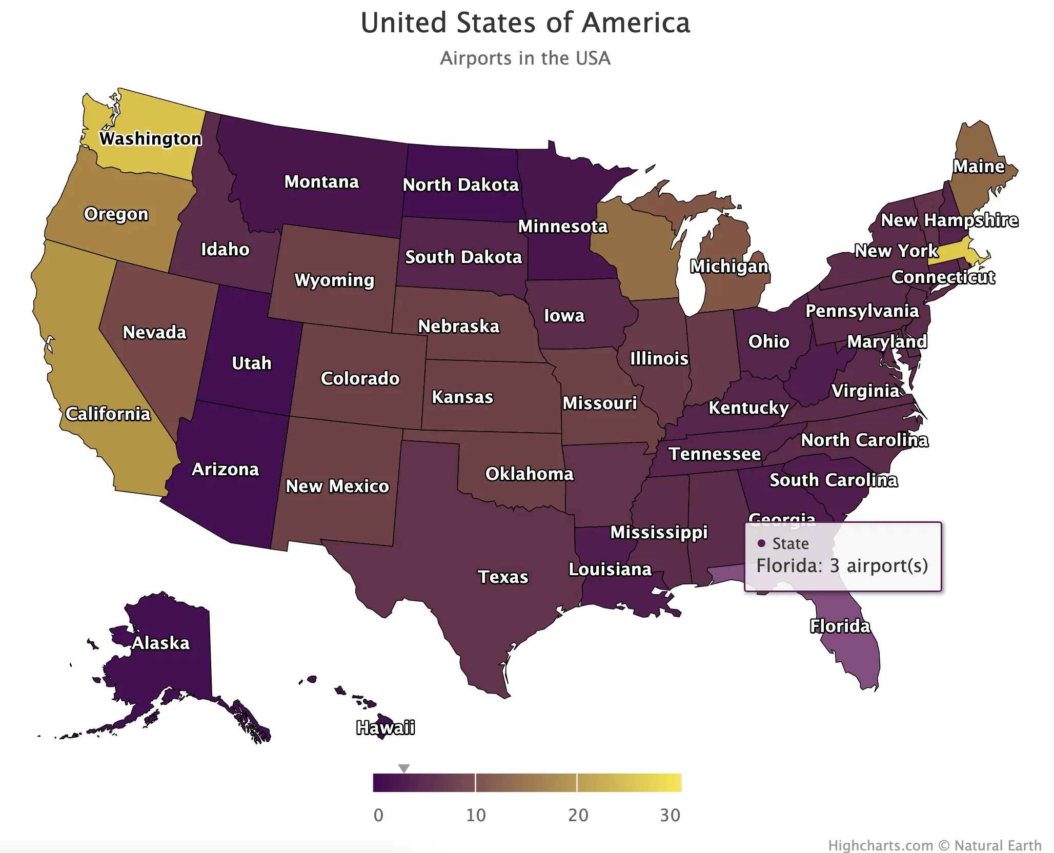
Choropleth Map with Individual State Coloring
The idea now is to group the data by `STATE` and display the number of airports in each. To be more precise, we want to color each individual state. The darker the shade, the more airports the state has.
The `count()` function from `dplyr` does both the grouping and summarization for us:
Here are the results:
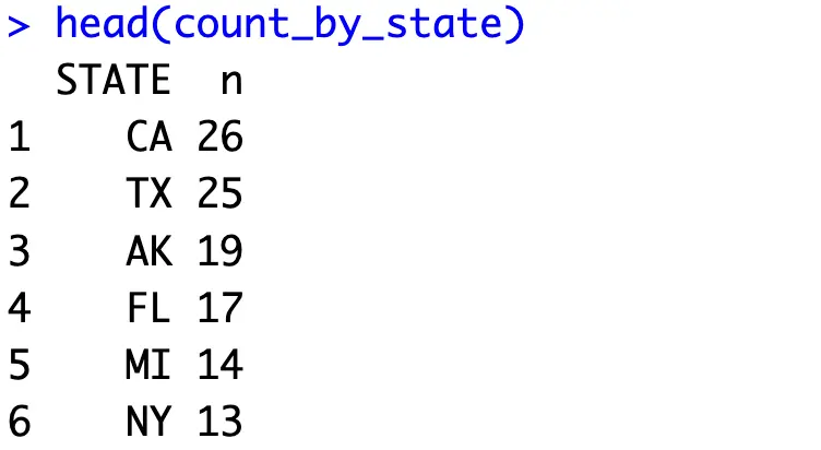
Now in `hcmap()`, you can provide values for `data` and `value` parameters. Pass in your data frame and specify which column represents the values that will be used for coloring. The optional `name` parameter is here to change the series name on a tooltip, but more on that later.
Anyhow, here’s the updated snippet:
Now we’re getting somewhere:
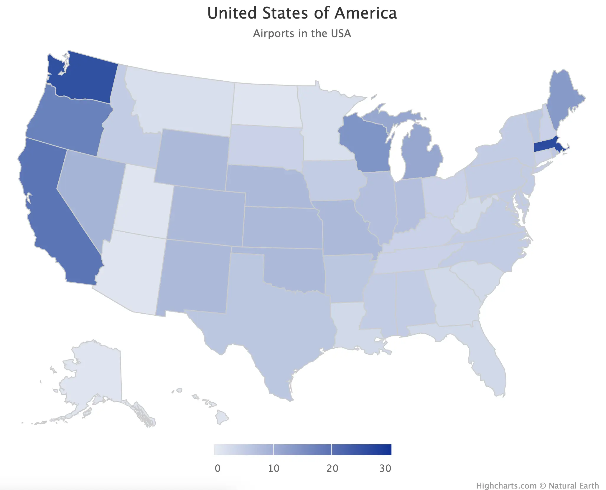
The above results are fine, and you can even see the counts when you hover over individual states.
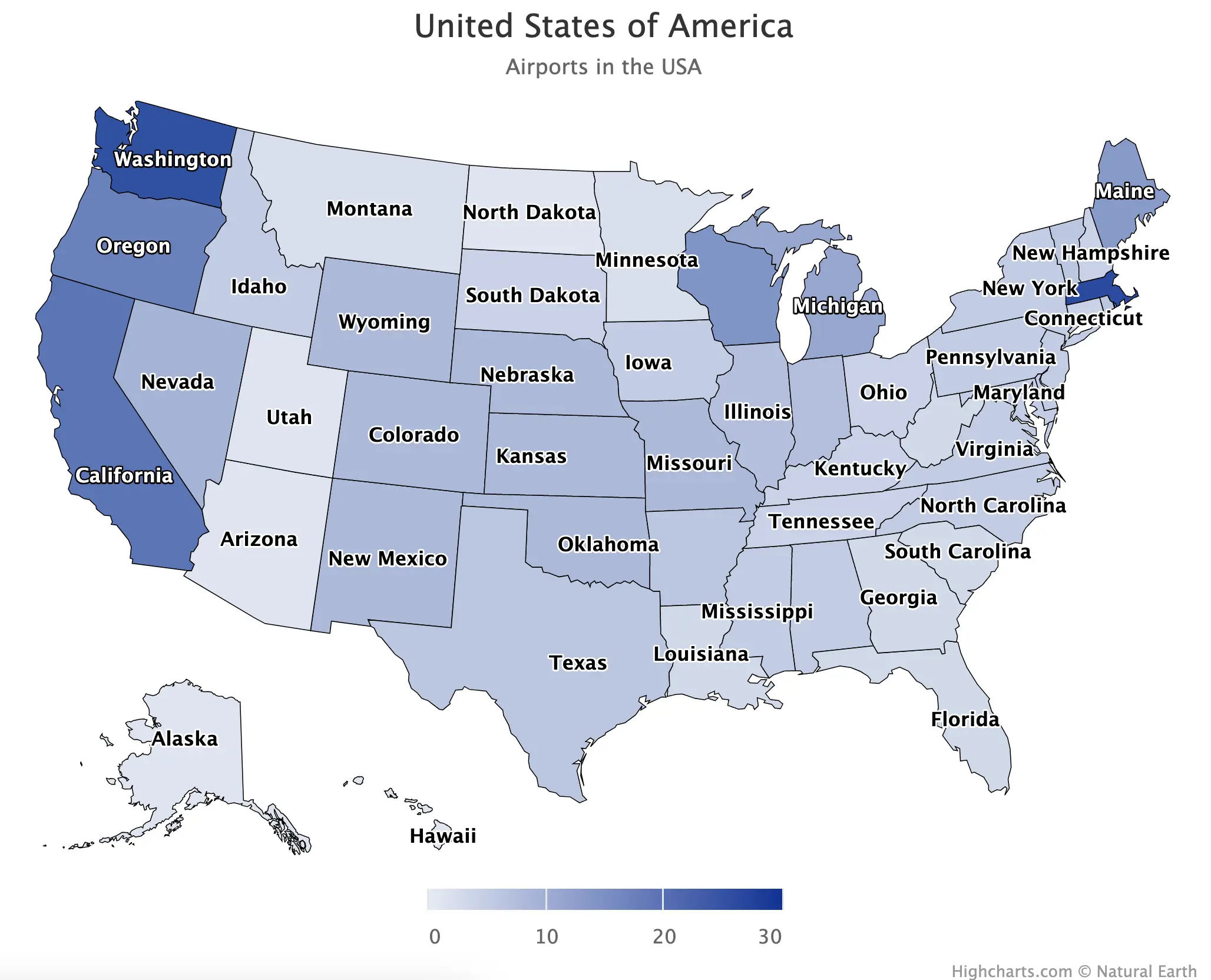
But let’s kick things up a notch. We now want to display state names and draw a distinct line between individual states. This will further enrich the end result and will eliminate all the guesswork from the final user.
The `dataLabels`,`borderColor`, and `borderWidth` parameters are what you’re looking for. The last two are intuitive to understand, but the first needs some explanation. Here, you first need to enable labels and then specify what you want to see on it. Passing in `{point.name}` will return the name of the state in this case:
The map is looking much better now:
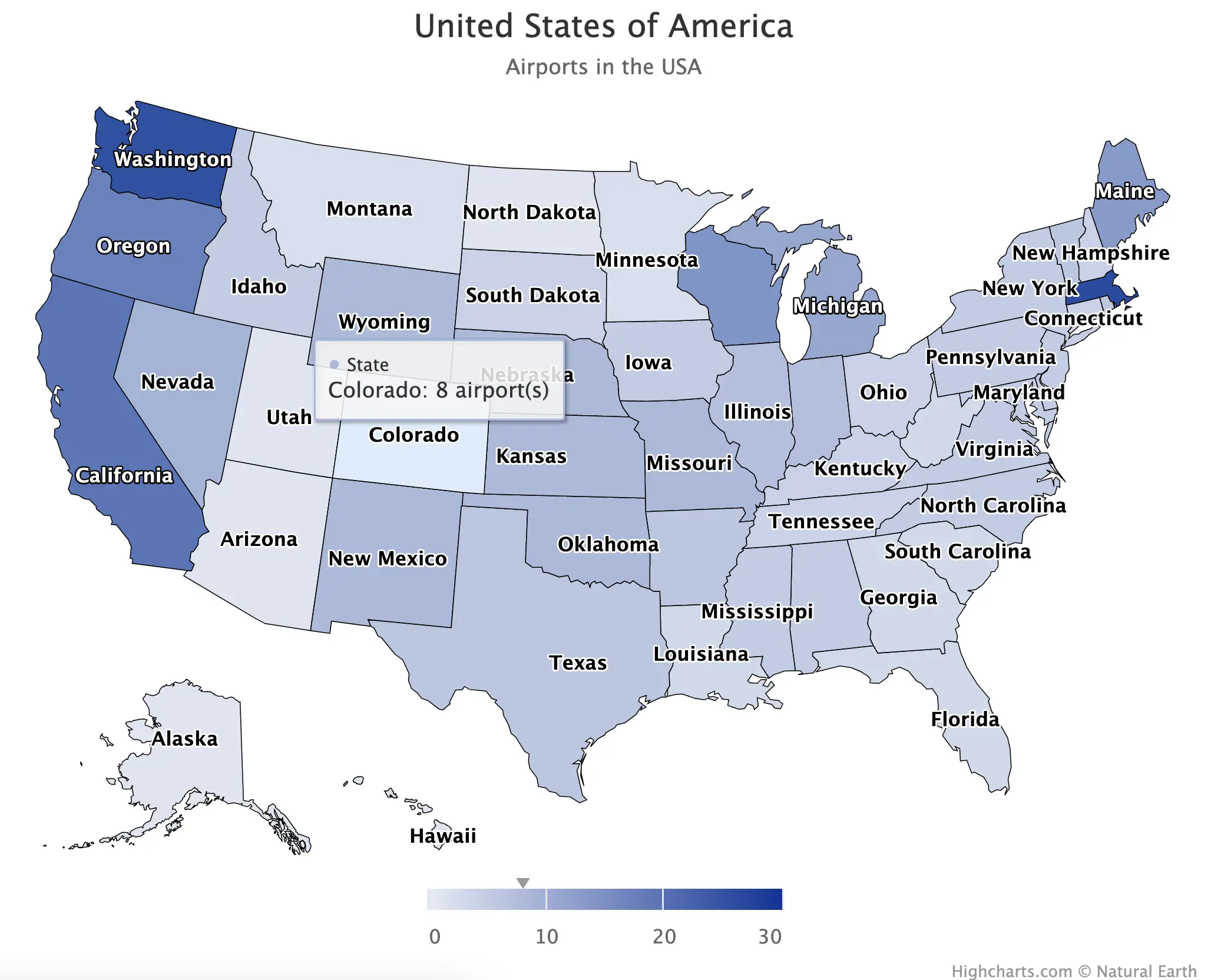
Next, let’s work on the tooltip. The goal is to take maximum control over what’s shown to the user when they hover over individual states. To keep things simple, we’ll only change the suffix through the `valueSuffix` modifier. If you need to, you can also tweak the `valuePrefix` and `valueDecimals` modifiers, but these aren’t applicable in our case.
Here’s the updated snippet:
You can see the code change taking effect when hovering over individual states:
And finally, let’s discuss color. There’s no easy way to change the continuous color scale, unfortunately, so you’ll have to get creative. The `color_stops()` function returns a list of `n` colors you can pass into `hc_colorAxis()`. That’s the only way to modify the color of a choropleth map in R Highcharts.
Setting `n = 2` will give us a nice purple-to-yellow color palette:
This is our final map:
And that’s about it when it comes to choropleth maps in R Highcharts. The other common type is a point map (bubble map), so let’s explore how to work with it next.
How to Add Points to R Highcharts Maps
Bubble maps allow you to add individual markers, or data points, directly to the base map. These are fantastic for our dataset if we want to display the location of individual airports, instead of the overall counts.
Dataset Modifications
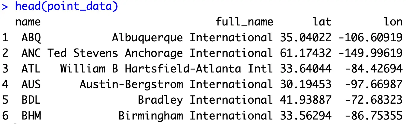
First things first, you’ll need to modify the underlying dataset. You now need access to `lat` and `lon` attributes, since these are required to determine the map location of individual airports. Let’s also keep track of the three-letter airport abbreviations and full names:
You should end up with the following dataset:
That’s all you need to get started with bubble maps with R Highcharts! Let’s explore the basics next.
Create and Style Bubble Maps with R Highcharts
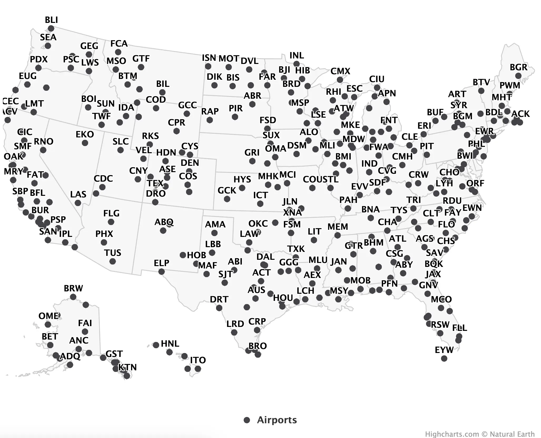
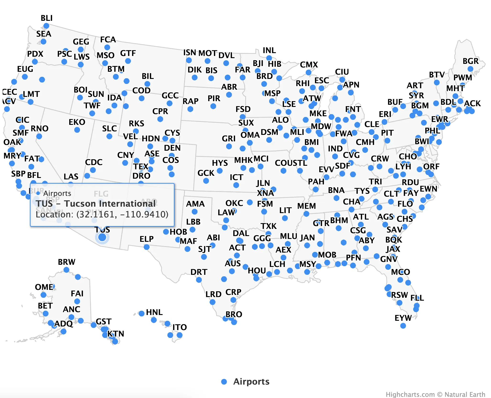
In Highcharts, you can create a bubble map by calling the `hc_add_series()` function and specifying the map `type` as `mappoint`. Also, pass in your dataset, and the library will figure out everything else for you:
Now we’re getting somewhere:
You now have the data points, but hovering over them reveals a mess. It’s a collection of useless data, and you have to change it.
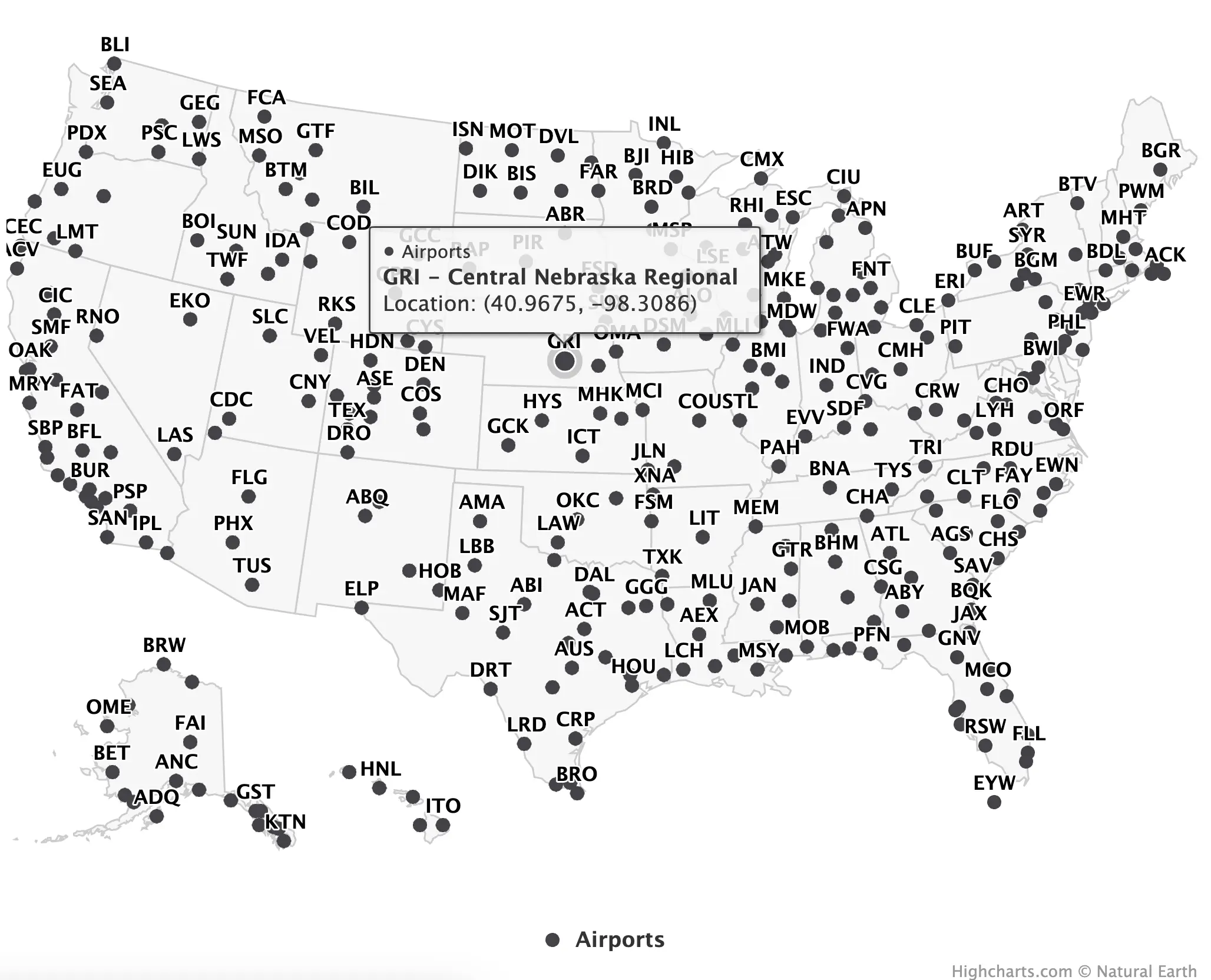
We’ll get more detailed in a call to `tooltip`. The `pointFormat` attribute can accept HTML tags, which means you can take ultimate control over how things look like. We’ll use it to make the first line bold and also to split the contents into multiple lines.
The modified tooltip will show the airport's abbreviated name, full name, and geolocation rounded up to four decimal places:
The map still looks the same, but hovering over data points reveals a night and day difference:
And finally, let’s discuss coloring. The `color` attribute can accept a variety of things, but since we’re showcasing individual locations, it’s best to keep things simple and use one color only. Appsilon’s blue works like a charm:
This is the final R Highcharts bubble map:
You now know how to create choropleth and bubble maps with R Highcharts, but we still haven’t discussed R Shiny implementation. Well, that’s about to change.
R Highcharts Maps in R Shiny - How to Get Started
The R Shiny application you’re about to build is quite straightforward. It allows the user to change the marker color and add/remove states from the visualization. Not the most useful app, sure, but serves perfectly to showcase how to integrate R Highcharts maps with R Shiny.
Here are R Highcharts specifics you should know:
- `highchartsOutput()` - Use this function in your `ui` to create a placeholder for your Highcharts visualization, either a chart or a map.
- `renderHighcharts()` - Use it in `server()` to build a map from reactive datasets/values.
In the `server()` function, you’ll also want to make the dataset and marker color reactive. For the latter, we’re allowing the user to select one of three named colors from the dropdown menu, so `marker_color` needs to map the English name to hex color values.
When it comes to the dataset, you’ll want to use the `%in%` operator to show only the states the user has selected in a multi-select input.
The rest of the code snippet is standard Shiny stuff:
Here’s what you’ll see after running the app:
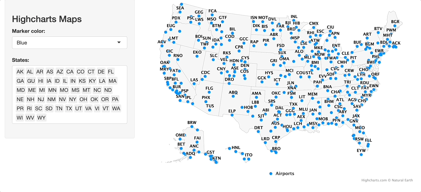
It could use some visual tweaking, but that’s a topic for another time. For now, we can safely conclude that R Highcharts maps have no trouble integrating with R Shiny, so you can have no doubt about using them in your projects.
Summing up R Highcharts Maps
When it comes to building engaging R Shiny apps, interactivity is the key. There’s no reason to opt for static charts if animated and interactive packages exist. R Highcharts is one of these packages, and you now know everything you need to produce full-fledged data-driven dashboards showcasing maps and charts.
Stay tuned to the Appsilon blog and our newsletter, Shiny Weekly, for further guides and tips on R Shiny and Highcharts, as there sure is plenty more to come.
Another superb R package for spatial visualization is Leaflet - Read our detailed guide to get started.
Contact us!